 Lumariver Profile Designer
Introduction
Lumariver Profile Designer is a software that makes profiles for your cameras (still, video/cinema, action/drone) and scanner in DNG Camera Profile (DCP), ICC, and Cube formats, thus supporting virtually all raw converters and video editors that allow third-party profiling. Like any traditional profile maker it can be used for reproduction like copying artwork, but it's also specifically designed to make general-purpose profiles which provide both accurate and attractive colors. The profiles made are ideal for any subject — portrait, product, documentary, wildlife, landscape, architecture, etc — and serves as a sane realistic baseline for your creative post-processing.
While rooted in the still image photography world, Lumariver Profile Designer bridges over into video allowing for the modern multi-media photographer to keep a consistent look — not just over several still cameras but also between stills and video.
The word Designer is in the name for a reason — you can make subjective changes to your profile designing your preferred look, or use one of the look presets, possibly with fine-tuning on top.
It's probably the most advanced profile design software on the market and as such it provides many settings and adjustments, some of them quite technical. However, if you intend to be a casual user you don't need to be alarmed: it has well-tuned default settings so making a profile is only a few button presses away. Just follow the step-by-step instructions in the getting started section.
The software is available for Microsoft Windows (64 bit) and Apple MacOS, in three editions with various levels of functionality.
Features:
- Make DNG profiles, single, dual or triple-illuminant.
- Make ICC profiles, including those with special curve treatment like Capture One requires.
- Make Cube LUT profiles, for video or stills.
- Make general-purpose profiles with a tone curve, using a state of the art tone reproduction operator for natural and realistic yet attractive colors.
- Well-tuned defaults provide easy workflows and excellent results to beginners and casual users.
- A rich well-documented feature set provides advanced users with detailed possibilities to customize both accuracy tradeoffs and make and tune subjective looks, if desired.
- Designed for design
- Load and view additional images to make A/B comparisons between different images and profiles for an efficient design workflow (supports white balance and exposure adjustments).
- Design custom looks with the look adjustments editor.
- Design or load custom curves or use presets in the tone curve editor.
- Several tone operator alternatives with options.
- Several gamut compression options.
- Purpose-made user interfaces to (optionally) manually tune the matrix optimization and LUT optimization.
- Flexible — make everything from simple matrix-only profiles to advanced dual or triple illuminant DNG profiles with multiple LUTs.
- Inspect and compare images with a color value inspector supporting multitude of color spaces and color difference.
- Flatfield correction to handle unevenly lit targets.
- Make reproduction profiles (colorimetric profiles), using a special mode stream-lined for that purpose.
- 2.5D or 3D LUT (general-purpose and reproduction LUTs.)
- Matching statistics for both the matrix-only and LUT parts of the colorimetric base profile.
- Built-in support for many of the most
popular profiling targets.
- Built-in full spectrum reference data, or load your own.
- Define your own custom targets in grid form or free-form.
- Import custom targets with raw data.
- Combine several targets using the multi-target feature.
- Lights: built-in full spectrum standard illuminants, black-body at custom temperature, or load custom spectrum.
- Simulate color appearance differences in different lights.
- Target customization and multi-target merging features.
- Tool to inspect and hand-edit ICC and DNG profiles.
- Create ZIP archives of the projects including all images and files for easy archival and sharing.
Download the software on Lumariver's web site.
Note: the exact feature set available will depend on which edition you purchase.
Why make camera profiles?
Profile making software has existed for years, primarily focused on reproduction, that is making profiles for copying artwork and similar. For that narrow use-case profiling is still absolutely required as bundled camera profiles simply don't have the required colorimetric accuracy. Lumariver Profile Designer can make accurate reproduction profiles for the sake of providing a complete camera and scanner profiling solution, however, the reason it came into existence was for breaking new ground in the area of general-purpose camera profiles — providing an alternative to the "canned looks" the camera makers and raw converters provide.
If you compare the colors coming out from the various camera manufacturers they are very different, even in cases when the identical image sensor is being used. The colors from the same camera used in two different raw converters can also be very different. This is the result of the bundled camera profiles, and the main reason they are so different is that there is a strong legacy from the film days, where the film stock, today represented by the camera profile, had the task to create a look, that is do the post-processing for you as there was limited possibilities to make it on your own with analog techniques.
Many photographers have accepted this status quo, and knowingly or unknowingly choose camera model partly based on what colors that come out of the bundled camera profiles in their favorite raw converter. With this approach you get "locked-in" to a certain brand or model, as if you change camera or raw converter the look of your images will change as a side-effect. You're not in control of your own color.
We think that in the digital era there is a better approach to camera color than inheriting the (by necessity) static thinking from analog film. Digital camera technology is today mature, camera sensor responses between different models and brands are both more flexible and more similar than ever, meaning that the profile has more control than ever over the final result. Why should the camera profile apply a canned look rather than a neutral starting point when we do digital post-processing? Or, if we do like to start off with a preset look to save time, why not be in control of that so we can have it in any raw converter and any camera we like?
The manufacturers use proprietary in-house software to make their bundled camera profiles. Their software is not available to the public. Previous profile makers have focused on the reproduction use case, and handled general-purpose profiles as a secondary case, making them not live up to the highest standard. This have left photographers of all kinds powerless in terms of color, you simply get what you got. The main purpose of Lumariver Profile Designer is to let photographers be in charge over their own color from start to end. This is achieved by the following: 1) in the easiest possible way make profiles with the most neutral/realistic/accurate color possible, but still with attractive contrast (this is not an easy feat!), 2) provide tools for detailed customization of a profile's look so those that want a custom subjective look can make it, and 3) support for virtually any raw converter on the market, both with ICC and DNG profiles, so your color expression is portable between both cameras and raw converters. With version 2 of Lumariver Profile Designer this thinking has been extended into the video realm by providing the Cube profile format.
- Be in charge over your own color!
- If you think it makes more sense to have a neutral starting point for your post-processing than some other's look imposed on you, Lumariver Profile Designer does that for you.
- If you actually want neutral and realistic color in your images, for example for documentary work, product, architecture etc, it's now possible, with any (reasonable) camera in any raw converter.
- Make subjective adjustments to make your own look that suits your own taste rather than someone else's.
- Reproduction: we've not forgot the traditional use case for profile makers — if you copy artwork or need an accurate scanner profile Lumariver Profile Designer does that for you too.
Editions
You can choose to buy one of three licenses for the software:
- Edition: Standard — no video. If you only need to make general-purpose profiles for still images (DNG and ICC) this is the budget alternative. It excludes support for video (Cube format) and reproduction-specific features.
- Edition: Pro — all features except those that are mostly reproduction-specific. It's intended to provide "all you need" for making general-purpose profiles for stills and video, in DNG, ICC and Cube profile formats.
- Edition: Repro (unlimited) — the unlimited full version, which adds multi-target, 3D color correction LUT and custom targets, features related mostly to reproduction photography. In addition to making all features available it adds a slimmed "Reproduction mode" specifically designed for a smooth workflow for the reproduction and scanner use-case. It's recommended for professional reproduction work, scanner profiles, scientific work, or if you just want it all.
Here's a table that shows the feature set differences between the editions:
| Feature | Standard Edition | Pro Edition | Repro Edition |
|---|---|---|---|
| Base feature set | yes | yes | yes |
| Make DNG profiles | yes | yes | yes |
| Make ICC profiles | yes | yes | yes |
| Make Cube profiles (video) | no | yes | yes |
| Reproduction mode | no | no | yes |
| 3D color correction LUT | no | no | yes |
| Multi-target | no | no | yes |
| Custom grid targets | no | no | yes |
| Custom free-form targets | no | no | yes |
| Custom targets with raw values | no | no | yes |
The "Base feature set" in the table above is simply all other features that are not mentioned in the table, ie all features not tied to Cube format (video) or reproduction work.
Note that you can load custom reference values for all editions for any of the pre-existing targets, but you need "Custom grid targets" (Repro) to be able to define new target layouts. If you are unsure what edition you need please run in trial mode as the simplest edition you think you need and test your workflow. The software will then tell you if you try to use a function that need a higher level edition.
"Video support" means supporting the Cube format which is the preferred format in video workflows. You will still load a single frame with the color checker as exported from the video editor of your choice to make a profile in Lumariver Profile Designer, that is you don't load video footage directly.
We often get questions about the "3D LUT". All editions have 3D LUTs when it comes to look, that is tone operator, gamut compression and look adjustments. For color correction though, the Standard and Pro editions only has a 2.5D LUT, while the Repro edition adds the option of correcting color in full 3D. What this means in plain English is that a dark color can have a different correction than a light color with otherwise equal hue and saturation. In the 2.5D LUT all lightness levels of a color get the same correction. A 3D color correction LUT can provide a bit more accurate result in a fixed exposure setup, such as in a scanner and copy setups, and it can compensate for non-linearity issues in the optics. However, for general-purpose profiles used with varied exposures, lights and subject material a 3D LUT is at risk doing more harm than good, so the default setting for color correction in those profiles is a 2.5D LUT also in the Repro edition.
License key and trial mode
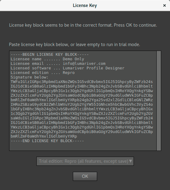
BEGIN LICENSE KEY BLOCK and END LICENSE KEY
BLOCK must be included.
You download the software and purchase license key in the downloads section on the Lumariver main page. The key is delivered automatically via email.
When you start the software for the first time a license key dialog
opens and you get to enter your license key into a text box. The
license key comes in the form of a digital certificate and is
therefore a cryptic text block rather than just a short code. Simply copy
and paste the text from the delivered license key email, including
the starting and ending lines with BEGIN LICENSE KEY BLOCK and END LICENSE KEY
BLOCK respectively, as shown in the example screenshot.
If you leave the text box empty you can run in trial mode as the selected edition. All functions except saving projects and exporting profiles will be enabled. This means that you can run in trial mode to get a detailed view if the selected edition provides the features you need. If you have bought a simpler edition and entered the key and later want to run trial again to test a more advanced edition, you need to remove the license key, which you can do in the "About" dialog (remember to have the license key information safely stored so you can enter it again later).
If you by mistake enter a partially bad license key (by accidentally hitting the keyboard so some stray character gets into the text block for example) the key may in some circumstances already have been stored to disk before the error is detected. If so you need to drop the key before you can try again. That is open the "About" dialog and press the "Drop Key" button, and then restart the software (the required action is described in the error message that will show).
If you load a project that uses features that is not enabled in your licensed edition, those settings in the project are reset on load and a warning message will appear to inform that not all features were supported.
It may seem odd that the "Reproduction" edition is the unlimited one, that is contains all general-purpose functions too, as when you actually do reproduction you use less features (and there is a slimmed mode for that to avoid confusing the user with many functions that won't be used). The reason is that of pricing, the Repro is the most expensive as it's a low volume product targeted at a small group of working professionals, while the general-purpose feature set has a broader user base and therefore can be sold at a lower price. If you are only making general-purpose profiles but still want for example the multi-target feature or being able to use custom targets, you need to go for the "Repro" edition.
Getting started
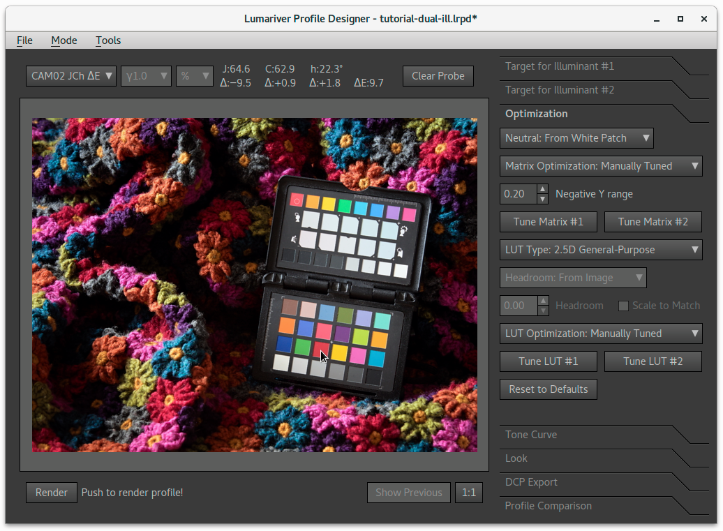
The main window, with the "Render", "Show Previous" and a "Reset to Defaults" button highlighted:
The advanced calculations for making the profile is not real-time, so to actually see the result in the image view, the profile needs to be rendered by pressing the "Render" button in the bottom left corner of the main window.
When a setting is changed you can render a new profile. To be able to quickly make an A/B swap to compare the new result with the previous use the "Show Previous" button.
The software has well-tuned defaults — trust them and only change settings after you have read and understood what it does. Each toolbox tab has a "Reset to Defaults" button to return to the recommended settings.
If you haven't purchased a license key, you can run the software in its trial mode (you get to choose which edition to run as), where all features for the specified edition are enabled, except saving projects and exporting profiles.
While the software is rich in functionality it has well-tuned defaults, meaning that basic profile making is still easy.
- Choose "New Project" in the "File" menu, then choose profile
format (ICC, DNG or Cube Profile) and type (General-Purpose or
Reproduction). This will set defaults and reconfigure the user
interface to show the relevant elements.
- Which format/defaults options that are available depends on edition.
- The "Reproduction" mode hides many functions in the GUI to make it cleaner, simplifying the often repetitive reproduction profile making.
- All features are enabled in the "General-purpose" mode, and while the defaults are then tuned for general purpose profiles, you can manually make a reproduction profile in that mode, so if you have a special need to make a cross-over between reproduction and general-purpose use the "General-purpose" mode.
-
Trust the defaults, and only change a setting after you've read
the documentation and understood what the setting does. For most
needs you can do with the default settings.
- Each toolbox tab has their own "Reset to Defaults" button, so you can return to the recommended settings locally for each tab.
Note that the software is not a real-time raw converter — when the profile is ready to generate you need to press the "Render" button, and when you make changes, you need to press it again to see the result of the updated profile. The look adjustments editor and the tone curve editor do allow for (semi-) real-time updates though, but in general the math involved in Lumariver Profile Designer's profile-making is too complex to be real-time.
When a setting is changed you can render a new profile. To be able to quickly make an A/B swap to compare the new result with the previous profile in a multi-second render there's a "Show Previous" button to show a cached image of the previous result.
Making DNG Profiles
The DNG camera profile format was developed by Adobe and is used by Adobe Lightroom and Adobe Camera Raw. However as the format is openly documented there are also other raw converters that support DNG camera profiles, such as Iridient Developer, DxO PhotoLab and RawTherapee.
General-purpose profiles
Here's a basic workflow for making a general-purpose DNG profile. There's a separate description for making ICC profiles.
- Shoot a target and make a DNG
file of the image,
using Adobe's free DNG Converter if the camera doesn't natively write DNG format.
- Note that even if Lumariver Profile Designer requires the DNG format to read raw images, the resulting profile will work on the plain unconverted raw files as well.
- If you don't want to shoot a target of your own, you may find a target shot on the Internet. For example, the camera review site Imaging Resource share raw target photos (for a fee) of many of their reviewed cameras.
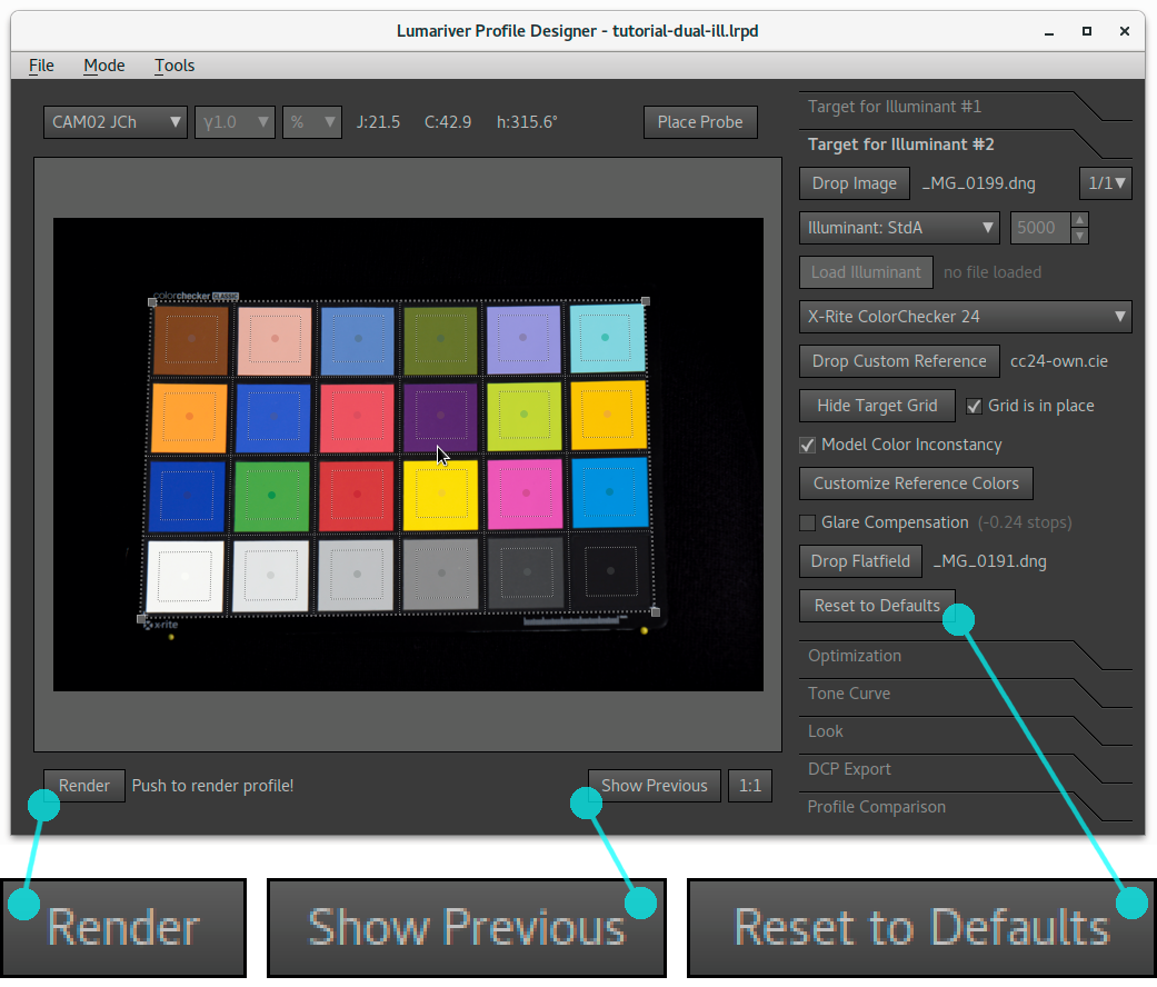
- Start Lumariver Profile Designer, and chose "New Project" and then "General-Purpose DNG Profile".
- Press "Load Image" button and load the DNG file.
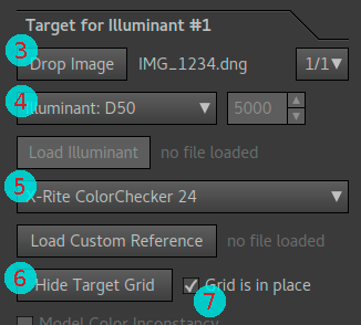
- Select Illuminant (Light) which is closest to your light used in the target image. Usually D50 (midday daylight or flash) or D65 (cloudy).
- Select target used.
- Press "Show Target Grid" and place the grid by dragging the corners into position.
- Check the "Grid is in place" checkbox, and press the "Render" button.
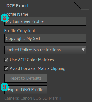
- Go to the "DCP Export" tab, and choose a suitable name in "Profile Name" text box.
- Press "Export DNG Profile" to save the profile.
- It will per default choose the directory where Adobe expects custom profiles to be stored, but you can of course navigate and save it elsewhere if you're using another raw converter that wants the profiles to be stored in some other location (consult the raw converter's documentation to find out where it wants custom profiles to be stored).
The profile is now ready to use. You will likely need to restart your raw converter to make it reload the list of available profiles.
Reproduction profiles
The basic workflow for reproduction profiles is almost exactly the same as for general-purpose profiles, thanks to that the "Reproduction DNG profile" mode will select defaults suitable for reproduction.
- Shoot a target with the desired exposure that you will be using when doing the actual copy work.
- Start Lumariver Profile Designer.
- Create a new project "Reproduction DNG profile" project (via the menu: File→New Project).
- Press "Load Image" button and load the DNG file.
- Select Illuminant (Light) which is closest to your light used in the target image. If flash was used you can leave it at the default, D50.
- Select target used.
- Press "Show Target Grid" and place the grid by dragging the corners into position, check the "Grid is in place" checkbox.
- Go to the "DCP Export" tab, and choose a suitable name in "Profile Name" text box.
- Press "Export DNG Profile" to save the profile.
- It will per default choose the directory where Adobe expects custom profiles to be stored, but you can of course navigate and save it elsewhere if you're using another raw converter (consult the raw converter's documentation).
The profile is now ready to use. You will likely need to restart your raw converter to make it reload the list of available profiles. This default workflow for reproduction makes a 3D LUT and the profile should therefore only be used with the same exposure as used when shooting the target.
Important note for Adobe users: the newer rendering process (2012 or later) will always compress and desaturate highlights to mimic analog film behavior. While this makes general-purpose photography more user-friendly it significantly affects the precision of a reproduction workflow. Therefore we strongly recommend to select the 2010 rendering process (also known as "process version 2") when doing reproduction work, which has linear highlight behavior.
Note that this mimicking of analog film rolloff behavior is a common feature and may exist in other raw converters too. Make sure to turn it off if possible. If you don't know if it's active or not you can compare the output from Lumariver Profile Designer with that from your raw converter and see if the brightness of the white patch matches. Lumariver Profile Designer's renderer is fully linear, and thus if your raw converter makes darker whites there is some non-linear rolloff active.
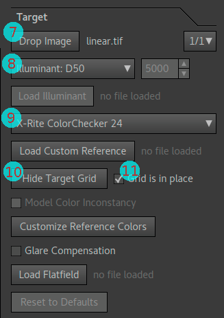
Making ICC Profiles
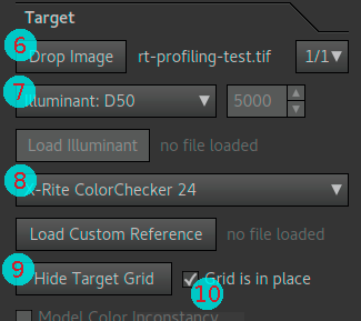
ICC profile workflow on the target tab, steps 6 to 10. Note that "Load Image" button changes to "Drop Image" after the image is loaded, and "Show Target Grid" becomes "Hide Target Grid".
ICC profile workflow on the export tab, steps 11 and 12.
General-purpose profiles
While the ICC profile format is standardized, there is no standard for how the raw converter should pre-process the camera's raw data before applying the profile. This means that an ICC profile made for one raw converter may not be usable in another.
Lumariver Profile Designer supports many types of pre-processing, and can thus make profiles for virtually any raw converter on the market. Most raw converters have no particular pre-processing though and the workflow below is for those. If you are using a raw converter that applies non-linear transfer functions and curves, like Capture One, you will need to look through the tone curve tab settings. For Capture One specifically there are dedicated Capture One workflows to guide you through.
Let's get to it, here's how you make a general-purpose ICC profile:
- Shoot a target, expose the
target well, and make sure that the bright patches don't clip.
- If you don't want to shoot a target of your own, you may find a target shot on the Internet. For example, the camera review site Imaging Resource share raw target photos (for a fee) of many of their reviewed cameras.
- Open the target image in your raw converter, and set a white balance on a neutral patch (unless you have already set a custom reference white balance in-camera from a gray card).
- Use the raw converter's specific "export for profiling" function
to save a TIFF image.
- Refer to your raw converter's documentation to find out how to export an image for profiling. If your raw converter lacks such a function (unlikely), it cannot be used with third-party profilers like Lumariver Profile Designer.
- If it's possible to choose bit depth of the exported TIFF image, choose 16 bit.
- Start Lumariver Profile Designer.
- Create a new "General-purpose ICC profile" project (via the menu: File→New Project).
- Press the "Load Image" button to load the TIFF file.
- Select Illuminant (Light) which is closest to your light used in the target image. Usually D50 (midday daylight or flash) or D65 (cloudy).
- Select target used.
- Press "Show Target Grid" and place the grid by dragging the corners into position.
- Check the "Grid is in place" checkbox, and press the "Render" button.
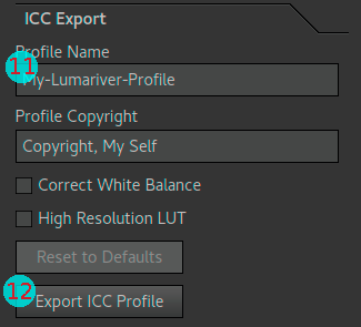
- Go to the "ICC Export" tab, and choose a suitable name in the "Profile Name" text box.
- Press "Export ICC Profile" to save the profile.
- It varies between raw converters where they want third-party profiles to be stored. Refer to your raw converter's documentation to find the right directory.
The profile is now ready to use. You will likely need to restart your raw converter to make it reload the list of available profiles.
Reproduction profiles
- Shoot a target with the desired exposure that you will be using when doing the actual copy work.
- Open the target image in your raw converter, and set a white balance on a neutral patch (unless you have already set a custom reference white balance in-camera from a gray card).
- Use the raw converter's specific "export for profiling" function
to save a TIFF image.
- Refer to your raw converter's documentation to find out how to export an image for profiling. If your raw converter lacks such a function (unlikely), it cannot be used with third-party profilers like Lumariver Profile Designer.
- If it's possible to choose bit depth of the exported TIFF image, choose 16 bit.
- Start Lumariver Profile Designer.
- Create a new "Reproduction ICC profile" project (via the menu: File→New Project).
- Press the "Load Image" button and load the TIFF file.
- Select Illuminant (Light) which is closest to your light used in the target image. If flash was used you can leave it at the default, D50.
- Select target used.
- Press "Show Target Grid" and place the grid by dragging the corners into position.
- Check the "Grid is in place" checkbox, and press the "Render" button.
- Go to the "ICC Export" tab, and choose a suitable name in the "Profile Name" text box.
- Press "Export ICC Profile" to save the profile.
- It varies between raw converters where they want third-party profiles to be stored. Refer to your raw converter's documentation to find the right directory.
The profile is now ready to use. You will likely need to restart your raw converter to make it reload the list of available profiles. This default workflow for reproduction makes a 3D LUT and the profile should therefore only be used with the same exposure as used when shooting the target.
Notes about white balance
In our ICC workflows it's said that the white balance should be set to neutral (color pick a white patch, or use a in-camera custom preset set from a gray card) before exporting the files. In principle it's however not necessary to do so as Lumariver Profile Designer knows which patch that represents white anyway, and will adjust white balance accordingly. Changing white balance can change image brightness slightly though. Different raw converters have different strategies regarding how to either equalize brightness, or not do so. This often relates to the raw clipping level, which Lumariver Profile Designer doesn't have access to in the ICC case as it's operating on TIFF files rather than raw data.
To make a long story short this means that when white balance is changed inside Lumariver Profile Designer the brightness may not exactly match what it is for the same white balance in the raw converter. Thus to make brightness match, the white balance shouldn't be changed at all or only very little, and this is achieved by letting Lumariver Profile Designer work on TIFF files which already have close to the ideal white balance.
For reproduction profiles with 3D LUT this can be important, as the LUT application depends on brightness. In other words when you make a reproduction profile you should always set a neutral white balance. For a general-purpose profile which uses the 2.5D LUT this is less important, but nevertheless it's a good habit to always set the white balance before exporting for profiling when working with ICC profiles.
Making Capture One ICC profiles
Capture One workflow on the target tab, steps 7 to 11. Note that "Load Image" button changes to "Drop Image" after the image is loaded, and "Show Target Grid" becomes "Hide Target Grid".
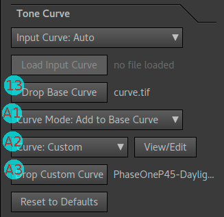
Capture One workflow on the tone curve tab, steps 13, and 14 alternative A: copy the tone curve to be the same as Capture One's bundled camera profile.
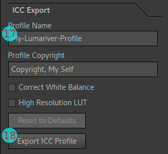
Capture One workflow on the export tab, steps 17 and 18.
General-purpose profiles
Capture One has a quite complex way to handle tone curves, so there are a few more steps to follow. If you're making a profile for reproduction, you can follow the simpler workflow for reproduction profiles instead.
- Shoot a target, and open the
image in Capture One. Make sure the target is well-exposed. As a
rough guide the white patch should end up around value 220 (with
the linear curve) inside Capture One.
- The value doesn't need to be exactly 220, the number is just a rough guide to make sure that the image is not over-exposed or strongly under-exposed.
- If you want to adjust exposure, you must only make real changes when shooting, that is don't use exposure correction slider inside Capture One as that only distorts the embedded curve and makes no real change to the raw image data.
- If you don't want to shoot a target of your own, you may find a target shot on the Internet. For example, the camera review site Imaging Resource share raw target photos (for a fee) of many of their reviewed cameras.
- Set a white balance on a neutral patch (unless you have already
set a custom reference white balance in-camera from a gray card).
- If interested why you should set the white balance, see the specific notes on white balance for an explanation.
- Export the target image from Capture One as a TIFF file, with
linear curve.
- Select ICC profile: "Phase One Effects: No Color Correction", and
curve: "Linear Scientific" or "Linear Response". Then export using "Export variants", and select "16 bit
TIFF", and "Embed camera profile". Let's call
it
linear.tif. - The "No Color Correction" setting can be hard to find: it's buried in "Color > Base Characteristics > ICC Profile > Effects > Phase One Effects: No Color Correction".
- Select ICC profile: "Phase One Effects: No Color Correction", and
curve: "Linear Scientific" or "Linear Response". Then export using "Export variants", and select "16 bit
TIFF", and "Embed camera profile". Let's call
it
- Export the target image again, with the curve you will mainly
be using together with the profile.
- Export this file in the same way, but select the desired
curve, which usually is "Film Standard" or similar name which
represents the "Auto" setting. Let's call
it
curve.tif. - For reproduction work you would use it with linear curve (already exported) so then you wouldn't need to export an additional file.
- Export this file in the same way, but select the desired
curve, which usually is "Film Standard" or similar name which
represents the "Auto" setting. Let's call
it
- Start Lumariver Profile Designer.
- Create a new "General-purpose ICC profile" project (via the menu: File→New Project).
- Press the "Load Image" button and load the linear TIFF file
(
linear.tif).- If you get an error indicating missing transfer function (
TIFFTAG_TRANSFERFUNCTION), see troubleshooting.
- If you get an error indicating missing transfer function (
- Select Illuminant (Light) which is closest to your light used in the target image. Usually D50 (midday daylight or flash) or D65 (cloudy).
- Select target used.
- Press "Show Target Grid" and place the grid by dragging the corners into position.
- Check the "Grid is in place" checkbox, but don't press the "Render" button just yet.
- Go to the "Tone Curve" tab.
- Press "Load Base Curve" and load the
curve.tifhere. - Now you have two alternatives, either exactly copy Capture One's
curve from the bundled camera profile, or replace with a curve you choose
in Lumariver Profile Designer.
- Bundled camera profile = the one bundled with the Capture One raw converter, that is the one used when not having a custom camera profile.
- Alternative A, copy the curve from Capture One's bundled
camera profile:
- Select "Curve Mode: Add to Base Curve".
- Select "Curve: Custom".
- Press the "Load Custom Curve" button and load the original bundled ICC camera profile. Read how to find Capture One bundled ICC camera profiles.
- Alternative B, replace with a curve chosen here: leave at "Curve Mode: Replace Base Curve", and change to "Curve: C1 Film" (for example). A word of warning: this method might cause banding in the highlights in cases when the replacing curve is of lower contrast than the curve used in the bundled camera profile. Note that "C1 Film" is just a typical Capture One Film curve, it may not match the "Film" curve Capture One uses for your particular camera. Therefore it's safer to use alternative A or C (this alternative is quite safe if the base curve is a low contrast linear curve though).
- Alternative C, same as Alternative A but select "Curve: Linear" instead of loading a custom curve. This will generally result in a profile with a little lower contrast than the bundled camera profile.
- Press the "Render" button.
- If the image now becomes white or otherwise heavily distorted, see troubleshooting.
- Go to the "ICC Export" tab.
- Choose a Profile Name.
- The name is stored in the ICC profile, but is not actually shown in Capture One, which instead shows the filename. The name is however also used as default filename suggestion when exporting the profile, so it's a good idea to set it.
- Press "Export ICC Profile" to save the profile.
- Lumariver Profile Designer will per default choose the directory where Capture One expects custom profiles to be stored.
- Choose filename wisely as that is what will be shown inside Capture One. The default suggested filename is taken from the description.
- If you choose to follow the Capture One camera profile naming convention the profile will appear together with the bundled camera profiles inside Capture One.
The profile is ready to use. Restart Capture One to make it appear. It will show under ICC Profile / Other, or if you named the file according to the Capture One's naming convention it will appear among the main profiles for the camera.
Reproduction profiles
The workflow for making a reproduction profile in Capture One needs fewer steps than the general-purpose as we don't need to worry about the curve.
- Shoot a target with the desired
exposure that you will be using when doing the actual copy work.
- If you don't have a specific reproduction standard to follow for how bright to expose, adjust exposure so the white patch end up at around 220 with linear curve. Only make real in-camera exposure changes, never use the exposure correction slider inside Capture One.
- Set a white balance on a neutral patch (unless you have already set a reference white balance in camera from a gray card).
- Export the target image from Capture One as a TIFF file, with
linear curve.
- Select ICC profile: "Phase One Effects: No Color Correction", and curve: "Linear Scientific" or "Linear Response". Then export using "Export variants", and select "16 bit TIFF", and "Embed camera profile".
- The "No Color Correction" setting can be hard to find: it's buried in "Color > Base Characteristics > ICC Profile > Effects > Phase One Effects: No Color Correction".
- Start Lumariver Profile Designer.
- Create a "Reproduction ICC profile" project (via the menu: File→New Project).
- Press the "Load Image" button to load the linear TIFF file.
- Select Illuminant (Light) which is closest to your light used in the target image. If flash was used you can leave it at default D50.
- Select target used.
- Press "Show Target Grid" and place the grid by dragging the corners into position.
- Check the "Grid is in place" checkbox, and press the "Render" button
- Go to the "ICC Export" tab and press "Export ICC Profile" to
save the profile. Choose filename wisely as that is what will be
shown inside Capture One.
- Lumariver Profile Designer will per default choose the directory where Capture One expects custom profiles to be stored.
- If you choose to follow the Capture One camera profile naming convention the profile will appear together with the bundled camera profiles inside Capture One.
The profile is ready to use. Restart Capture One to make it appear. It will show under ICC Profile / Other, or if you named the file according to the Capture One's naming convention it will appear among the main profiles for the camera. This default workflow makes a 3D LUT and the profile should only be used with the same exposure as used when shooting the target.
If applicable to your copy setup, you should probably use the LCC feature (flatfield correction) of Capture One to make sure the light is even in the target and copy images. See Capture One's documentation regarding that feature. Lumariver Profile Designer also has flatfield correction but it will only correct for the target, and in a copy setup you will want to correct for the subjects as well.
Troubleshooting
Here are a few common problems when making Capture One profiles, and how to solve them:
- Error message when opening the TIFF file, saying that the
transfer function (
TIFFTAG_TRANSFERFUNCTON) is missing.- This means that Capture One did not embed the encoding curve (transfer function) in the exported TIFF file. This is required by any third-party profiler software to know how the data was encoded, otherwise a correct profile cannot be generated.
- Make sure the export settings are correct (see workflow description). The transfer function is only included when exporting with ICC Profile: Embed camera profile in the Export Variants dialog.
- Some versions of Capture One may require that the curve is set to something else than "Auto". Note that the "Auto" setting is automatically selecting one of the other curves, usually "Film Standard" (or similar name), so you should be able to set the same curve using its actual name.
- If Capture One is stubborn and still doesn't include the transfer function despite the correct settings (seems to happen in rare cases), you can try starting a new Capture One session and re-open the image from scratch and export again.
- If nothing seems to help, contact Phase One's support. Embedding the transfer function is a "hidden" feature that has existed in Capture One since many versions, and the purpose of it is to support third-party profile making software.
- If you don't trust Lumariver Profile Designer's error
message (Phase One's support has bounced issues with their
software back to us before), you can use the well-known
command line tool
exiftool, just runexiftool yourfile.tifin the terminal and look for the "Transfer Function" tag in the output. It must be there, otherwise the file cannot be used.
- Image turns white or becomes heavily distorted after the profile
is rendered.
- This error usually means that the transfer function in any
of the imported TIFFs
(
linear.tiforcurve.tifin the workflow) is distorted, due to incorrect settings when exporting from Capture One. - December 3, 2018: Capture One v12 was recently released.
Unfortunately v12 has currently a buggy transfer function export
causing all sorts of strange distortions of the curve (you get
a different oddly shape curve for each export), or even
crash on export. Until Phase One fixes the bug you must use
use an older version for export (v11 or older). The profile
made from a file exported with an older version will still
be compatible with v12 as the profile format hasn't changed.
- If you don't have an older Capture One version installed you can find them at Phase One's support page (their "Software Archive" downloads).
- It may still work with v12 in some environments. We don't know the exact nature of the bug.
- We have reported the issue to Phase One so hopefully a fix will come quite soon.
- If your camera is only supported in v12 there is unfortunately no other option than to wait for a fix. (You can in theory manuall add a transfer function using the tool in Lumariver Profile Designer, but they vary slightly between cameras so it's not possible to be sure that you got it right.)
- Make sure the export format is TIFF 16 bit. 8 bit TIFF or any other format will not work.
- Make sure no adjustments was made to the file before export, except for white balance. Settings like exposure and contrast will distort the transfer function.
- After the profile is rendered and you see the error, you can go to the tone curve tab and open the tone curve dialog (View/Edit button), and see how the curves look by looking at "Target TF" and "Base Curve" in the Templates drop-down list, see Capture One curve handling for a typical example on what shapes the curves should have.
- If the problem sticks, try making a new Capture One session and re-open the file from scratch and export it again.
- This error usually means that the transfer function in any
of the imported TIFFs
(
Other ICC raw converters
In this section we provide some workflow comments on a selection of additional raw converters which use ICC profiles. We have not mentioned raw converters for which the generic ICC workflow works as-is and do not require additional documentation.
If you have trouble making a profile for some specific raw converter not mentioned here, let us know.
DxO PhotoLab
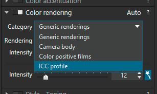
DxO PhotoLab. To apply a rendered profile, select "ICC Profile" in the "Color rendering" tab. It will open a file dialog where you can pick the profile rendered in Lumariver Profile Designer. Make sure you select the "Linear RAW" mode when asked.
The most recent versions also support DNG camera profiles (DCP), not shown in this screenshot which is from a less recent version.
In general you can use the generic ICC workflow when making profiles for DxO PhotoLab (previously known as DxO OpticsPro). The most recent versions of DxO PhotoLab also supports DNG profiles, so you can make that using the generic DCP workflow. It seems that the better choice is to use the newer DCP support rather than making an ICC profile, as black subtraction can be better controlled with a DNG profile (if you want to minimize black subtraction/crushing, make a DCP with black subtraction disabled).
Here are some notes for ICC profile making:
- Use the menu option "File → Export Image for ICC Profile
→ Export as linear RAW..." to export a TIFF image for
profiling.
- As usual, set the white balance (if not already set) before exporting.
- Also make sure that all other adjustments are disabled (DxO PhotoLab enables a whole range of adjustments per default, so go through and turn them all off before exporting, only leave white balance on).
- Only the "Linear RAW" mode is supported by Lumariver Profile Designer automatically, not the "Realistic" mode. If you want to use the "Realistic" mode anyway, you need to use the Add transfer function to TIFF tool to manually add a 2.2 gamma to the file before opening it in Lumariver Profile Designer.
- DxO applies quite strong black subtraction (so much one could call it black crushing) so the result inside DxO will be slightly more contrasty than the preview render in Lumariver Profile Designer. Enable "DxO Smart Lighting", for example with "Uniform", "Slight" or "Medium" setting to reduce black crushing. If you have persistent problems with this, try making a DNG profile instead, with black subtraction disabled.
- You may need to design your own curve which is significantly brighter than the default curve to better match DxO's native exposure.
Since DxO PhotoLab doesn't provide any tag to identify in which mode the image was exported, embeds no transfer function, and on top of that attach a misleading ICC profile, we have for DxO PhotoLab simply hard-wired Lumariver Profile Designer to the Linear RAW mode, but by manually adding a transfer function with 2.2 gamma you can use Realistic mode. Linear seems the better mode of the two for profiling though, as the realistic mode has a rather small gamut and seems to be more intended for looks rather than camera profiles.
Due to all the "smartness" in DxO exposure there is no way to get the exact same render as in Lumariver Profile Designer, therefore we cannot recommend DxO for reproduction. However you can get good results for general-purpose profiles. The DNG profiles seems like they may provide more exact rendering but we have not made any investigation exactly how accurate it is: contact DxO and ask for details if you do need to use it for reproduction.
Iridient Developer
Iridient Developer supports both DNG and ICC profiles. DNG profiles are easier to use and generate, using the generic workflow. Thus we recommend to make DNG profiles for Iridient Developer unless you have some specific interest or need to make ICC profiles. Here's the workflow for making an ICC profile:
- Start Iridient Developer
- Open Preferences and check "Enable advanced settings options" (otherwise the necessary color management settings won't be visible).
- Open the target image
- In the "Exp" tab, edit "Camera Curve" so it becomes linear.
- Set white balance on the most neutral patch
- On the "Out" tab, check "Disable color management processing". The image will become very dark, this is normal as it now shows linear "raw" data.
- Still on the "Out" tab, press "Process and Save As..." button and save the image as 16 bit TIFF. Colorspace settings etc doesn't matter.
- Open Lumariver Profile Designer and make an ICC profile using the generic ICC workflow. Be sure to set a good "Profile Name" in the export tab so you can find the profile inside Iridient Developer.
- Go back to Iridient Developer, and enable color management processing again.
- Go to "Color" tab and select the newly exported profile in the "Input Profile" drop-down.
Read the excellent Iridient Developer manual if you want or need more in-depth information on how it manages color and custom profiles.
Hasselblad Phocus
Hasselblad Phocus is the dedicated raw converter for Hasselblad cameras. For its general-purpose profiles it has its own proprietary format, and there is no support for third-party profilers to enter that pipeline. However, it does support making standard ICC profiles via its "Reproduction" tool. The purpose of this tool is to make reproduction profiles, although you can make general-purpose profiles too.
Recent versions of Phocus has built-in camera calibration support so you can make reproduction profiles without using any third-party profiling software. It's very easy to use, but does not have the same control and flexibility as Lumariver Profile Designer provides.
Note that the most common way when Hasselblad users want to use custom profiles is to use some other raw converter, such as Adobe Lightroom, rather than Phocus. Should you still wish to use Phocus here are some brief notes for making an ICC profile:
- Start Hasselblad Phocus and import the target image.
- Add the Reproduction tool if not already added.
- Set the Reproduction tool settings to "Working Space: Hasselblad L*RGB", "Color Calibration: Factory", "Input Profile: Factory", "Response: Reproduction Low Gain".
- Set white balance using a neutral patch on the target.
- Make sure no other adjustments are made, and export 16 bit TIFF ("TIFF-16").
- Open Lumariver Profile Designer and make an ICC profile using the generic ICC workflow. Be sure to set a good "Profile Name" in the export tab so you can find the profile inside Hasselblad Phocus.
- Install the ICC profile and restart Hasselblad Phocus.
- To use the new profile, use the same Reproduction tool settings except change "Input Profile" to your custom one.
Note that if you make a general-purpose profile with a curve, the curve will be stored in the ICC profile itself so you should still use "Reproduction Low Gain" as response. In theory you could make a general-purpose profile with a Capture One-like workflow (that is not store the curve in the ICC profile, but still design the profile to be used with a curve), the problem is that Hasselblad Phocus does not embed any transfer function so there is no easy way to extract the built-in curve from the factory response.
Scanner profiles
A profile for a scanner is made in the same way as a reproduction camera profile, so see those specific workflows in the DNG reproduction or ICC reproduction sections. Most scanner software make TIFF files so it's nearly always an ICC profile you will make.
It may be more common in scanner software that the resulting TIFF file lacks tags for the transfer function (usually a plain gamma curve). One known example is the Epson Scan software which embeds no tags whatsoever in the TIFF file for the "no color correction" setting, but still applies a 1.8 gamma. In these cases the files cannot be used directly in Lumariver Profile Designer, but you need to add the required information to the TIFF file. This is done using the tool for adding missing transfer function to TIFF files. See the section missing transfer function for further details.
Another error state with some scanner software is that they add a misleading ICC profile to the exported TIFF, for example while the file may be encoded with gamma 1.0 the ICC profile says it is gamma 1.8. Then you must either strip away the ICC profile using some third-party tool, or again add a transfer function using the above mentioned tool, as the transfer function will override the ICC.
ICC profiles can have either .icc or .icm
as filename suffix. Lumariver Profile Designer chooses
the .icc suffix per default. However, some older scanner
software may require the .icm suffix, if so change the
suffix to .icm when choosing filename when the profile is
exported.
Making Cube LUT profiles (video)
The Cube profile format is a text based format primarily used in video/cinema editors. In popular video terminology "LUT" is what a Cube profile is called. As Lumariver Profile Designer works in both the stills and video world "LUT" is a bit too generic, so here we call it a "Cube profile", or "Cube LUT" together to avoid ambiguity.
Generic workflow
Below is a generic workflow for making a Cube LUT to be used with your video/cinema/stills camera in any software supporting a Cube LUT format.
- Choose which format you will be recording in. This should preferably be some form of log format, in order to preserve full dynamic range and color information.
- Film a target, with an exposure as if filming a real scene (that is normally exposed target, not overly bright or dark).
- Start your video editor and import the footage with the target.
- Export a TIFF still image of the target. Make sure there is no LUT active so the exported TIFF represents the unprocessed video.
- Start Lumariver Profile Designer.
- Create a new "General-purpose Cube profile" project (via the menu: File→New Project).
- Press the "Load Image" button to load the TIFF file.
- Set the "Input Gamma" so it matches the format used in the
recording. It is important that this is exactly right.
- The most common log gammas used by various video cameras are available built-in, but you can also load custom gammas.
- The "From Target Image" setting will only work if the TIFF file has a transfer function embedded, and most video editors won't embed that at export (and the embedded transfer function doesn't support log gammas anyway).
- Select Illuminant (Light) which is closest to your light used in the target image. Usually D50 (midday daylight) or D65 (cloudy).
- Select target used.
- Press "Show Target Grid" and place the grid by dragging the corners into position.
- Check the "Grid is in place" checkbox.
- Go to the "Tone Curve" tab and choose "Output Gamma" (and
type) so it matches the gamma used in the video project the
profile is intended for.
- This choice (along with the "Output Gamut" picked in the next step) is important and depends on which use case the LUT will be involved in.
- Go to the "Cube LUT Export" tab, and choose a suitable name in the "Profile Name" text box.
- Choose "Output Gamut" so it matches the gamut used in the video project the profile will be used in.
- Press the "Render" button to render the profile.
- Press "Export LUT" to save the Cube LUT profile.
Cube LUT use cases for video
Cube LUTs can be used in many places and for many purposes in the video rendering pipeline. For Lumariver Profile Designer there are generally two use cases that come into mind:
- Convert camera input to "final" display/monitor output.
- This corresponds to what a general-purpose stills camera profile does.
- Typical use case is to match the video look with your stills camera (both using Lumariver Profile Designer profiles).
- Gives you a neutral final look directly for fast production times where follow-on color grading is none or minimal.
- Manufacturers of professional grade cameras usually provide LUTs for this type of conversion, and while usually more neutral than we are used from in the stills camera world, Lumariver Profile Designer can still provide an advantage in terms of neutral realism and matching footage from several cameras.
- Convert camera input to some pre-grading state, that is an
output that is suitable for follow-on color grading.
- This loosely corresponds to what a reproduction stills camera profile does.
- The LUT will generate a scene referred image put into a gamut and gamma of your choice. Typically the gamut is very large, and the gamma is either linear or some sort of log curve — whatever that matches your preferred grading space in your video editor.
- Typically the base scene referred output will be colorimetric as a reproduction profile, that is no tone curve, tone operator or subjective adjustments, but in some cases you may still want some of that in the LUT.
For the display LUT you will choose the same gamut and gamma as used in the output of the video project you are working on, for example Rec.709 / 2.6. The profile is designed as a normal stills camera general-purpose profile, with a tone curve, tone operator, gamut compression, etc.
For the grading LUT the gamut chosen is typically very large and the gamma may be a log curve or linear, depending on preferred workflow in the video editor. It's common that the purpose of the profile is to provide scene referred data. Say if you are used to grading Arri Alexa log footage you can convert any other camera footage to having the same look by using Arri gamut and Arri log gamma as output gamut and gamma.
In video there is sometimes an interest to use the LUT to correct the exposure and/or white balance. This way you can get the footage tuned to a specific reflectance and white depending on the exact lighting condition in the shoot (assuming you profile from a target recorded at the scene). Settings for this is available in the export tab.
Davinci Resolve
Davinci Resolve is a Hollywood-grade video editor, perhaps most well-known for its color grading abilities. To make a Cube profile with Davince Resolve, you follow the generic workflow.
To export a still image for profiling you use the "Grab Still" feature in Resolve and save it as a TIFF image, make sure no LUTs are pre-applied (unless intended). With this TIFF there will be no meta data so inside Lumariver Profile Designer you need to manually specify the input gamma, and then what type of output color space and gamma that will be used to match your Resolve project.
Once the profile is generated, you save the file in a directory known to Davinci Resolve for storing custom 3D LUTs and then you use the LUT functionality inside to apply the new Cube profile.
Knee highlight compression
A key difference between a typically exposed still image and video log footage is that the still image puts its extended dynamic range into the shadows, while log footage puts it into the highlights. That is as dynamic range has improved, still images has got cleaner and cleaner shadows, while video footage has got more and more highlight range.
In other words video footage is typically "under-exposed" if we look at it as a stills photographer. One reason for this is that video needs short exposure times (to fit many frames per second) and cannot use flash. Another reason is that when making video footage you often need an exposure that can deal with varying lighting condition without clipping as you move around the camera in the scene, meaning that you need lots of highlight range. There's also a different post-processing tradition in video, there's not the same digging into shadows as in the stills world so the increased shadow noise is not really a problem.
As a result log video footage has usually a very large highlight range. In video a common reference unit for exposure is "reflectance", where 100% perfect white (full reflectance) is 1.0. Values larger than 1.0 are produced by light sources. Raw still images are typically exposed such that they clip at about 2.0 reflectance. When a contrast curve is applied to that we get without further processing a suitable brightness and midtone contrast to be used directly in printed material and on standard displays.
Video log footage on the other hand may clip somewhere in the range 16 to 64, that is 3-5 stops more highlight range than a still image. If we would apply a typical still image contrast curve to that the overall brightness would be very low as much of the range would be occupied by highlights, which may not even be present in the image unless we have shot in very contrasty conditions.
Thus we need to handle this extended highlight range in some way. There are a few different approaches:
- Clip away the extended highlight range to make the output look the same as if it would be exposed as a normal still image. This will provide maximum overall contrast on standard displays.
- Compress some or all of the extended highlight range into the top range of the output. It will provide great highlight detail, but a bit lower overall contrast on standard displays.
- Adapt output for HDR displays and put the extended highlight range into the HDR range. On HDR displays we will then both have great highlight detail and high overall contrast.
Note that even if we choose to clip highlights, any modern video post-processing software will make it possible to bring in those highlights before the Cube LUT is applied, so a clipping approach may be suitable even if we want to retain some extra highlights in certain shots, which then can be brought in manually in post-processing.
If we compress directly in the profile, it will by nature be static and compress regardless if there actually is any extended highlights in the shot or not. For HDR displays this is how it is supposed to be (the display's extended highlight range should be inactive unless there actually is extended highlights in the shot), while for standard displays it may be a problem, at least if we want to maximize available contrast. Some amount of compression is often fine though even with standard displays, and can be an element of a refined less contrasty look.
If we compress rather than clip, we use normal contrast in most of the available output range, up to a "knee", where the output curve sharply (but smoothly) flattens out to compress the remaining range. It's called a knee as the sharp bend in the tone curve looks like a knee.
This compression range and knee position is controlled by the knee range and knee output level settings. In the documentation for these settings you can find guidance for suitable values.
Shooting targets
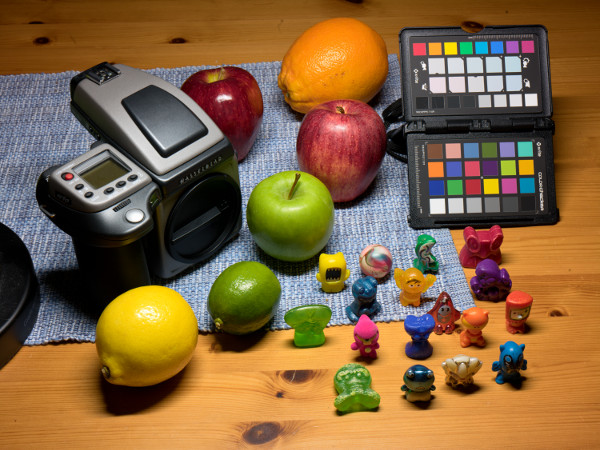
A typical casual target shot. Despite its imperfections this works well, thanks to that the target is matte (reduced glare problem), and the uneven light in the corner is not that much of a problem when making a general-purpose profile (which per default doesn't correct lightness) — in other words the standard workflow for a general-purpose profile using a matte target, such as the shown ColorChecker Passport, is very robust. This makes it feasible to make a quick target shot on location to make a custom profile for a specific lighting condition.
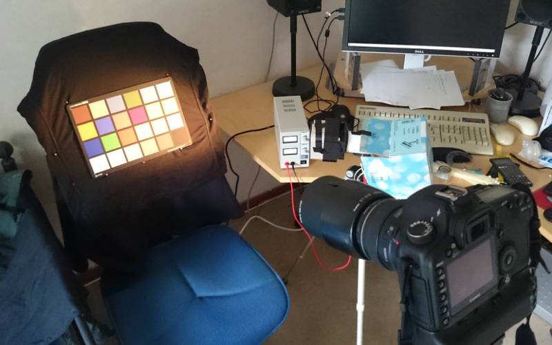
A carefully tuned shooting setup before closing the windows and turning off the room's lights, making the room go pitch black, except for the single voltage-tuned Solux halogen lamp, used to simulate daylight. The single-light setup requires flatfield correction to correct for the uneven light.
If you are going to shoot glossy targets which are prone to glare an indoor setup with controlled lighting is highly recommended.
When making a general-purpose profile with default settings from a matte 24 patch target the software is very robust. Even a rather poorly executed target shot can result in a great profile. This robustness makes it feasible to make a quick shot of a color-checker on location to later make a custom profile for a specific lighting condition. For artificially lit scenes where you can't control the type of lights this can be very useful, as many indoor lights are narrow band and can make odd colors with a general-purpose profile made for high quality light.
However if you're really picky about the end result, or use high saturation glossy targets, or make profiles for reproduction you must put great care into shooting the target(s). Shooting a target is not really about photography, it's a scientific measurement and as such the goal is to minimize the measurement error.
Glare is by far the most difficult and perhaps the least known problem when shooting targets. Glare is when you see the light source partially reflected in the target patches, brightening and desaturating them. Think of the target as a mirror, or even temporarily replace it with a mirror just for visual testing of your light source placement. If you look through the camera viewfinder on that mirror you should ideally only see dark/black surfaces — then the glare is minimized. The target is not as reflective as a mirror though, but a glossy target is still quite reflective, and even matte targets has some of it too so this should be considered for any type of target. The worst case is if you see your light source in the mirror. The light source(s) must be on the sides, outside the "family of angles". Professional setups use two or more lamps to achieve even illumination over the whole surface. If you only have one lamp even illumination is not possible, but you can compensate that with the flatfield correction feature, and with that will get just as good result as with a costly professional setup.
Similar to glare is flare, caused by light leaks into the camera (always cover up the viewfinder if it's an optical one!) and stray light coming onto the front lens element especially from the sides (always use a lens shade, it may be worthwhile to lengthen it with some black paper or use flags to block out any stray light). Some lenses are more prone to flare than others. A modern prime lens with semi-long focal length is usually the best alternative, while wide angle lenses are the worst.
The ideal situation is a pitch-black room with light only on the target (or very strong lights and short exposure time, making the room "pitch black" relatively speaking, which is the typical case when using flash), lit from the side(s), camera with covered up viewfinder and elongated lens shade. Often you don't have the luxury to make such a setup though, but at least try to make it as good as the situation allows. It doesn't need to be perfect. The most difficult case concerning glare is if you need (or want) to shoot outdoors, where the light comes from everywhere. In that case you should only use matte targets as glossy ones makes the glare challenge too difficult.
Concerning artificial lights for lighting the target, flash is the standard (good daylight simulator too), but working with halogen lights or high CRI LED lamps are popular alternatives. A carefully voltage-tuned halogen light is still the gold standard in terms of even spectrum, but can be a bit messy to work with.
Let's summarize with a checklist:
- Place the light(s) outside the family of angles, use very low angles, say 30-35 degrees if possible.
- Minimize stray light with dark textiles behind the target, extend lamp shade on the light, block light going backwards.
- Use two lights one from each side to get even light, or use the flatfield correction feature if you have only one.
- Try to keep the environment dark, and only have light on the target.
- If shooting outdoor with real daylight as light source, don't use glossy targets, as with the light everywhere the glare is almost impossible to control.
- Use a lens shade, possibly elongated.
- Shoot at a semi-small aperture, f/8 135 equivalent (minimizes vignetting, makes it possible to use longer lens shade).
- Don't use a wide-angle lens, but rather a longer lens, such as 85mm 135 equivalent (minimizes risk of flare).
- Let the target cover say 1/3 of the image diagonal to minimize vignetting effect further, or use the flatfield correction feature.
- Make sure the sensor is free of dust spots.
- Seal off the optical viewfinder (if there is any).
- Expose well, but make sure that there is no (raw) clipping of
the target patches. It's better to be on the safe side than trying
to make a perfect ETTR exposure.
- If you are making a reproduction profile to be used in the same setup later the exposure of the target should match the exposure used when the profile is used in copy work later on.
Concerning flatfield correction you can use that feature in Lumariver Profile Designer to even out uneven light and vignetting, but there are also some raw converters that provide the same functionality, such as Capture One which calls it "LCC". You can go either way, but if you will be doing reproduction work in the exact same setup it is more natural to use the raw converter's flatfield correction in target shooting as the same will be used when doing the copy work.
Profile-making theory
If you follow any of the step-by-step guides in the getting started section you don't need to know anything about how camera profiling works to make a great profile for your camera. However, if you start to dig into the many manual adjustments Lumariver Profile Designer makes available to you it comes in handy to have a some basic understanding of how a profile is made and what it does. The purpose of this section is to give that background. Don't worry if you don't understand all aspects of it though, in the end it's the visual end result that matters.
The basics
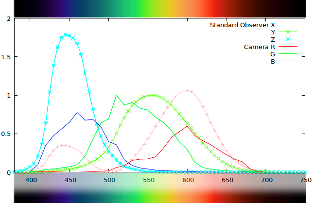
The three-channel sensitivity over the visible spectrum for the modeled human eye, the Standard Observer (X, Y, Z), and the color filters for an example camera (R, G, B).
The basic task of a camera profile is to convert the R, G, B response so it becomes as similar as possible to X, Y, Z. With that accomplished it can as an additional layer add things like a tone curve and various subjective color adjustments.
Objects in a scene reflect light with varying intensities over the visible spectrum. Our eyes can be seen as three-channel devices where one channel collects mostly long wavelengths (red), one mostly medium wavelengths (green) and one mostly short (blue). Light bouncing off each object will thus excite those three channels to a varying degree and send a "tristimulus value" to our brain which will interpret that as a color.
The response of each "channel" in the eye has been found with visual experiments as early as 1931 and standardized as the 1931 "standard observer" which forms the basis of color science. Using a measurement device, a spectrometer, we can measure wavelengths and calculate what the standard observer response would be, which is specified with XYZ tristimulus values, where X roughly corresponds to blue, Y to green, and Z to red. This is colorimetry, measuring and quantifying colors.
There's more to color than this measurable three-channel response though — before the response becomes a visual color to our inner eye the brain makes various adjustments based on lighting conditions. The adjustment that has most effect is our brain's chromatic adaptation which makes us see a scene relative to the light, so an object that reflects all wavelengths equally (a white object) looks white even if the light (scene illuminant) is warm (yellow) or cool (blue). Although more complex, our chromatic adaptation is similar to a camera's automatic white balance function. In a scene with a warm light the XYZ value for a particular color would contain more X (more red) and if it's lit with cool light it would contain more Z (more blue), that is different XYZ values for the same color. The brain will take all surrounding colors into account and figure out what the light is and then balance for that, so despite the different XYZ value the result is the same visual color (within some limits). This chromatic adaptation function of the brain has through additional experiments been modeled with "chromatic adaptation transforms" (CATs), standardized formulas that can convert XYZ values as seen in one light to what they would be in another. For example convert from indoor tungsten light to outdoor daylight.
This model of the eye-brain's color vision using a "standard observer" and a "chromatic adaptation transform" is not intended to be a replication of the actual processes in our eyes and brain, which is much more complicated and still not fully understood, but just to end up with (about) the same result in terms of colors. Color science as such is thus not an exact science — the design of the models both take into account to match the visual experiments made and to have desirable mathematical properties (like linearity) so they can be more easily used in computer software.
Before displaying a color on a computer screen it's converted to an XYZ value (in some form). A single XYZ value cannot be converted to a visual color without knowing which light (illuminant) it is relative to, as chromatic adaptation needs to be taken into account. In standardized color profiling (cameras, printers, displays) the reference illuminant is a form of idealized midday daylight, called D50, which is one of several standard illuminants used in color applications. That is the XYZ value must be transformed to match D50 if not already relative to that, and for that the mentioned CAT is used.
So what do we need the camera to do in this context? From the sensor we just need standard observer XYZ values, and we need to know the light (which can be simplified to just a white balance). With those two pieces of information we can accurately recreate colors in the computer.
In other words, a camera must be able to capture three channel values that can be converted to XYZ. The obvious solution would be to let the camera have the same color filters as the standard observer ("the eye"). For practical reasons this is never the case though: it's hard to manufacture filters that would have the same response, and cameras have many other aspects to consider such as keeping a high sensitivity in low light. Most cameras capture three channels though, some sort of red, green and blue, and this means that we can with a straight linear conversion get pretty close to the standard observer's XYZ values. Like this:
	    X = R * M1,1 + G * M1,2 + B * M1,3

	    Y = R * M2,1 + G * M2,2 + B * M2,3

	    Z = R * M3,1 + G * M3,2 + B * M3,3
That is we make a mix of the camera's R, G and B channels to get the corresponding XYZ tristimulus value, and the mix is decided by a 3x3 matrix of constants. Here's an example from a real camera:
	    X = R * +0.80 + G * +0.01 + B * +0.14

	    Y = R * +0.30 + G * +0.80 + B * -0.10

	    Z = R * +0.05 + G * -0.25 + B * +1.02
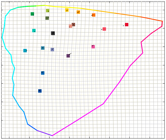
This chromaticity diagram shows an outline of the most saturated reflective colors that exist (known as "Pointer's gamut") and the squares represent a ColorChecker target's color patches and their positions. Those are first mapped out with the matrix to their approximate positions. The LUT then uses those as handles and moves them into their accurate positions, stretching the whole color surface like a "rubber sheet" as seen in the gray grid.
Note how soft and smooth the bends in the gray grid is. This is required to make the color gradients render smoothly, so the LUT does make a tradeoff between accuracy and smoothness.
That is to calculate X (mostly red) we take a large portion of the camera's red (0.80), almost no green (0.01), and add a little blue (0.14). It may be surprising that blue is added, but if you look at the diagram you see that the X response has a sensitivity bump in the blue range too.
To make the result as accurate as possible the matrix should be derived for the specific light it's supposed to be used in, for example daylight (cool) or indoor tungsten light (warm). While a linear matrix will bring the camera quite close to being a "colorimetric measurement device" (that is measuring XYZ values), an even better match can be had if we on top add some non-linear corrections. You can see it as a rubber sheet mapped out over all colors which then is stretched here and there to move colors into the final correct positions. This can be made as a lookup table of corrections, called LUT (LookUp Table) for short.
To avoid problems with gradient smoothness (where a color smoothly transitions into another color, for example in background out of focus areas in a colorful photograph) the stretches in the LUT must not be too sharp or aggressive. A matrix is always 100% perfect regarding gradients (as it's linear = no stretches or bends) but has limited accuracy, while the LUT (non-linear = can bend and stretch) makes a tradeoff between accuracy and smoothness.
The foundation of a camera profile consists of that linear matrix, possibly with a non-linear LUT on top. In fact if the profile is intended for reproduction this is all that's needed, as reproduction is about matching colors as accurately as possible, or in other words as accurately as possible convert the camera's RGB into color science's "colorimetric" XYZ values. This base profile which has no tone curve and no subjective adjustments is often called a "colorimetric profile", as it presents just pure "measured color". Such a profile is put together like this:
- Shoot a raw image under a known light of a known multi-color grid target, such as the classic 24 patch ColorChecker.
- For the target, have a reference file which specifies the standard observer's XYZ values, or even better the spectral reflectance of each patch (can be measured with a spectrometer commonly used when profiling printers). This way the profile making software knows what colors that should be seen from the target under a specific light.
- Extract the camera's raw RGB values for each patch from the target image. Now the profile maker has the camera's RGB values matched with the standard observer's XYZ values.
- The task of a colorimetric profile is to map the camera's raw RGB values into XYZ values, and to make such a profile the profile making software will through advanced mathematical models (involving various types of automatic trial-and-error methods) devise a linear matrix and possibly make a non-linear LUT on top for further improvement of the accuracy.
Summary:
- The eye can be modeled as a three-channel device, a "standard observer", that registers XYZ "tristimulus values" from the light spectrum reflected off objects.
- The brain adapts to the scene's light through "chromatic adaptation" which is similar to a camera's "auto white balance", that is white stays white even if the light changes color. This can be mathematically modeled with a Chromatic Adaptation Transform (CAT).
- A digital camera also registers three channels split in red/green/blue, which produces raw RGB values similar to but not equal to the standard observer's XYZ values.
- With a 3x3 matrix of constants the camera's RGB values can with decent accuracy be converted into standard observer XYZ values, also known as "colorimetric" values, measured colors.
- With a non-linear lookup table (LUT) the matrix result can be further improved, by stretching and bending colors into more accurate positions, while trading gradient smoothness with accuracy.
- The base of a camera profile is to find the linear matrix, and then add non-linear LUT improvements on top.
Tone operators
An example image rendered with a linear tone curve using an accurate colorimetric profile. The exposure has been increased to make the image easier to compare with the others that have tone curves (as the tone curve has a strong brightening component).
This image should be used as reference when evaluating accuracy of colors. However, it does look flatter than the eye experienced in the brighter real scene, which is a normal appearance phenomenon. This means that we need to apply some sort of curve even when we want a neutral realistic look.
Same profile, but now with the default Adobe tone operator ("ACR"). We don't get the hue shifts of the standard RGB curve, but still note the garish colors. Light colors are also desaturated, not so easily seen in this picture although the white shirt has lost much of its original slight blue cast. Desaturation issues can more clearly be seen in light blue skies for example.
Same profile, with the tone curve applied on the luminance channel (aka "luminosity"), while hue and saturation are kept constant. Intuitively one may expect this to be truest to the original, but as seen it looks desaturated. This is because in human vision color appearance is tightly connected to scene contrast, so if you increase contrast also saturation must be increased to maintain the original appearance.
Same profile, here with Lumariver Profile Designer's built-in Neutral tone reproduction operator. Color appearance is now very close to the original linear curve, but we have increased the global contrast so the photo displayed on a screen appears truer to the real scene.
A profile used for reproduction, that is copying artwork and similar, uses the camera as a "colorimetric measurement device", that is for each color it needs to output the corresponding XYZ value the same way a spectrometer would do, so you can create a print with colors that generate the same XYZ values. However this will not yield pleasing results when photographing real scenes, such as an outdoor landscape. The reason is that the viewing conditions and media are wildly different which triggers different responses in our eyes and brain. The most obvious difference is dynamic range.
When copying a painted artwork you can often print on the same canvas as used in the original painting, so the dynamic range from the darkest black to the brightest white will be exactly the same. In a real scene the dynamic range can be many times more than what's possible to view on screen or a print. This means that a bright outdoor scene will look flat and dull in a photograph if a reproduction profile (colorimetric profile) is used. The solution to this is as old as photography — increase mid-tone contrast (at the cost of compressing shadows and highlights) with an S-shaped tone-curve. A simple solution it may seem, but a key issue we then stumble upon is that our color perception is tied to contrast: if contrast changes, the color perception changes. Broadly speaking if contrast increases then saturation decreases, which means that we need to increase saturation to compensate.
Traditionally in computer-based color this has been achieved by simply applying contrast separately on R, G and B channels. In addition to being computationally inexpensive it causes saturation to increase as a side-effect (Why? As the channels end up at different positions in the curve, one channel may be reduced at the same time as another is increased — channel separation and thus saturation increases). The drawbacks are that it also causes hue shifts and the saturation increase is a bit too strong and arbitrary. In any case this is a simple "tone reproduction operator" (or "tone operator" for short), that is a way to transform the original linear color representation to something that works for the media the image is presented in.
The "tone reproduction operator" term is broader than just a method to apply an S-shaped contrast curve; what we call tone-mapping in the photographic community the color science community calls a "spatially varying tone reproduction operator". However, in the context of camera profiles there is no possibility to make anything "spatially varying" (that is varying over the image surface and varying depending on image content) as they are just static tables, so here a tone operator equals a tone curve plus an algorithm to apply it.
Note that in Lumariver Profile Designer the tone curve is separated from the tone reproduction operator. That is you subjectively choose the curve (from a preset, or manually design one), and then you choose which tone reproduction operator to use when applying that curve.
The shape of the tone curve decides overall contrast and brightness, how open shadows are etc, and thus have a very strong effect on the final look and should therefore be chosen with care.
The visual effect of using different tone curves and tone operators is very large compared to say the effect of using a LUT to correct color errors versus just using a matrix. It's often an overseen aspect of profile making, due to the fact that most profile making software available for purchase have been designed for reproduction work as their main or only purpose (which does not require any tone curve or tone operator). It's mainly the camera manufacturers and the big players in raw conversion that has worked with this issue using proprietary in-house methods.
A simplistic tone operator, like the basic RGB curve, will severely hurt any color accuracy that was in the base colorimetric profile, and one that doesn't take into account the various smaller perceptual phenomena of human color vision will make the result look flat and dull. The quality of a general-purpose camera profile is thus highly dependent on the performance of the tone reproduction operator used.
With Lumariver Profile Designer the default operator is the "Neutral Tone Reproduction Operator", which is an advanced design that intends to keep perceptual hue and saturation true to the original.
Summary:
- Mainly due to large dynamic range differences between a real scene and a screen or print, a profile designed for general-purpose photography must apply a curve with a "tone reproduction operator" that increases midtone contrast, otherwise the image will look flat and dull.
- Increasing midtone contrast is usually achieved with an S-shaped tone-curve.
- The exact shape of the tone curve has profound effects on the look of the image and should be chosen with care.
- In human color perception contrast and (mainly) saturation is interconnected, meaning that if contrast is increased, the apparent saturation is decreased.
- Whenever a contrast curve is applied, there must be compensations mainly in saturation (but also other smaller aspects) to perceptually maintain the original colors. How this is done is decided by the "tone reproduction operator".
- There are no standardized tone reproduction operators, every camera manufacturer and raw converter maker, and profile making software do it in their own proprietary ways.
- The effect of a tone curve and tone operator is much larger than for example the color corrections a LUT does. The secret of a great general-purpose profile thus lie in the quality of the tone operator algorithm.
- As most profile making software have been mainly designed for copy work where tone operators aren't used, high quality algorithms are rare.
Subjective color
Anyone who has studied the colors coming out from in-camera JPEGs of various cameras and/or the colors of bundled camera profiles with some raw converters have noticed that colors differ quite a lot. Why is that?
This is often explained with that the camera sensors are different (have different color filters etc), and while this is true, cameras of today are much more similar than in the early days of digital photography, and you can clearly see huge differences of the same camera raw image developed in different raw converters. Simply put: 90% of the color sits in the camera profile, and 10% in the hardware. So why are camera profiles so different?
One answer to that is that there are no standardized tone reproduction operators and each manufacturer comes up with their own proprietary solutions, which are bound to differ a bit. However if the manufacturers actually tried to maintain neutral color they would look much more similar than they do, so the key reason is that the camera profiles have subjectively designed color, and as everyone's taste is different the results end up being diverse.
While cameras have been digital for many years the analog tradition in terms of color interpretation is still very much alive. In the film days the post-processing possibilities where very limited, so the task of the film was to add an attractive "look" suitable for the subject. There were films suited for saturated landscape images, films adapted for portrait photography and so on. Today many manufacturers see the role of the camera profile to be that of film, to add a specific look, despite the fact that with digital post-processing there's all thinkable possibilities to apply this to taste at a later stage. This is the main reason why profiles from different manufacturers yield so different results.
There is however also a space of subjectivity between the neutral tone operator and the saturated filter-like looks; when you with small almost imperceptible changes improve the perceptual quality of certain subjects without noticeably degrading performance for others. For example you could slightly warm up midtones and highlights while cooling down shadows to make sunlit landscapes look more natural. This type of very subtle adjustments has been a corner-stone in many higher end digital medium format manufacturers profiles, and this is also an area where Lumariver Profile Designer provides presets and tools for making the best looking yet neutral and realistic profiles. While you can design those stronger "filter effect" type of looks also with Lumariver Profile Designer, our recommendation is to make the subjective adjustments subtle and leave the look to subject-dependent post-processing using the very able tools and presets available in any modern raw converter.
Summary:
- Differently designed camera profiles is the primary reason colors come out so differently between cameras. Simply put: 90% camera profile, 10% camera hardware.
- Many manufacturers see the role of the camera profile to be that of analog film stock — to add a more or less strong "filter effect" subjective look suitable for some specific subject material. This approach is legacy from the analog days.
- There is a middle way to subjective color — making only subtle adjustments that enhance the look in typical lighting conditions and for typical subjects, without noticeably hurting other subjects or neutrality. This is the approach favored by Lumariver Profile Designer. The stronger "filter effect" looks are then left to the presets and adjustment tools of the raw converter where they arguably better belong in the digital era.
Profile layers
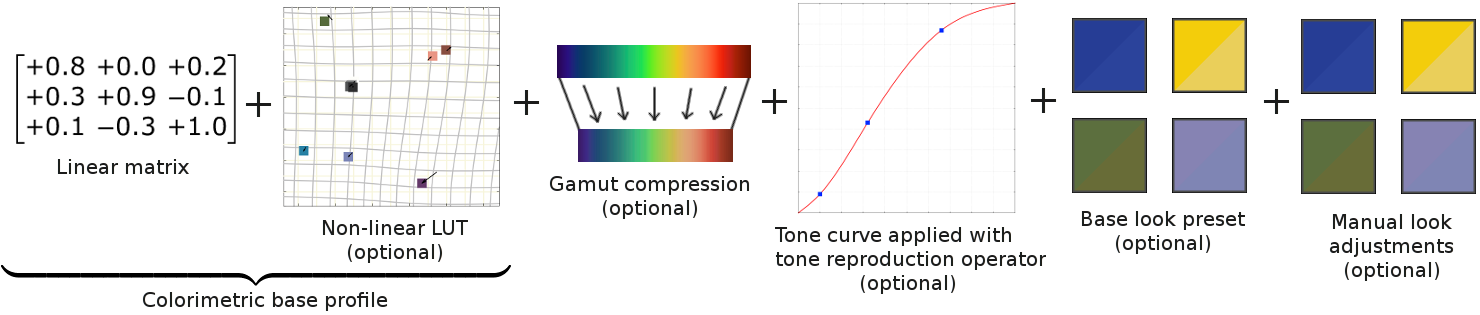
In Lumariver Profile Designer a profile is conceptually layered in the following way:
- Colorimetric base profile
- Matching colors with a linear matrix (mandatory)
- Improvements of matching using a non-linear LUT (optional)
- Apply gamut compression (optional)
- Apply a tone curve with a tone reproduction operator (optional)
- Apply a look preset (optional)
- Apply any manual subjective adjustments (optional)
All layers combined form the final profile. For reproduction work you will only need a colorimetric base profile, and for a general-purpose profile you will apply gamut compression, a tone curve with a tone operator and possibly a look preset and some further subjective adjustments on top. The user interface tabs split these design steps like this:
- Target and Optimization tabs deal with the colorimetric base profile.
- The Tone Curve tab deals with just the tone curve.
- The Look tab deals with gamut compression, tone reproduction operator, look preset and manual adjustments.
A key concept with Lumariver Profile Designer is that you always start with a colorimetric profile, that is an "accurate" profile. The default tone reproduction operator keeps that accuracy as much as it is possible, that is it doesn't add any subjective elements. Through the look preset and the manual look adjustments the software provides access to subjective designs, but it should be said that it's ideally used in situations when there is at least some interest in keeping some of the accuracy of the colorimetric base profile. In other words, it's great at making tuned looks anchored in realism, but not specifically designed for making wild "filter effect" type of looks.
Scene and output referred
When camera profiles and color management are discussed, the terms "scene referred" and "output referred" sometimes comes up. What are these and how do they relate to the Lumariver Profile Designer profiles? If the image is "scene referred" (without adjustments) it means that it contains the actual colors and light levels measured in the scene. That is if you make a colorimetric profile in Lumariver Profile Designer and apply that to your raw image, the result will be a scene referred image. In other words a "colorimetric profile" is a "scene referred profile". You can apply subjective adjustments in scene referred space, so a scene referred profile is not necessarily a colorimetric one.
An "output referred" profile transforms scene referred data so it fits the output medium, such as a display with sRGB gamut or the gamut of a fine art paper used in printing. This usually means applying contrast with some sort of tone operator and gamut compression. That is if you make a "general-purpose profile" in Lumariver Profile Designer (which adds those mentioned things) you get an output referred profile. However, this type of camera profile is only loosely output referred, that is it's not locked to a specific output gamut but instead flexible enough to be used with several different output media. The raw converter and/or printing system takes care of the final conversions required to exactly fit the output gamut.
In articles discussing camera profiles it's sometimes said that DNG camera profiles are scene referred and ICC profiles are output referred. This refers to historical use of both profile formats. Today DNG profiles and ICC profiles can be both, and Lumariver Profile Designer does not differ between formats; both type of profiles can be made for DNG, ICC and Cube formats.
Video log gamma
Lumariver Profile designer has its roots in still image photography and many of its users are still image photographers from the beginning. The Cube LUT format enables profiles for video projects, and if you are new to the world of video there are ome new technical aspects to familiarize with. Most notable is the log gamma encodings.
Video cameras normally exposes darker than still cameras and has thus a huge highlight range. This is to avoid clipping in dynamic scenes, and is also a side effect of the required short exposure times (to keep frame rate). Smaller cameras (drones, action cameras) may still have rather limited highlight range though due to smaller and simpler sensors.
Due to the large highlight range, linear encoding or normal display gamma would make the raw footage appear very dark. Therefore video-specific "log" gammas are used to encode raw video footage, which encodes the full range with a very low contrast to keep as much detail as possible. The log encoded video can be directly used for monitoring while shooting, and the experienced operator can then judge the lighting more accurately than if a display encoding would be used.
While some cameras can record in dedicated raw video formats with full sensor range, corresponding to raw format for still cameras, it's much more common to encode raw footage with standardized streaming formats in 8 - 12 bits, to reduce storage space and make the workflow more efficient, and then a log gamma is required to minimize quantization losses. That is log gamma has the dual purpose of encoding to fewer bits while keeping detail and provide a video stream suitable for monitoring.
The actual shape of the log gamma varies depending on manufacturer and model, but one dominant component of shape is often the mathematical natural logarithm function, "log" for short, hence the name.
Log gamma can also be called "reflectance gamma" as they are typically defined as an encoding of actual scene reflectance, while gamma in the stills world is usually decoupled from exposure.
Extended workflows
The getting started section shows the basic workflows for making general-purpose or reproduction DNG or ICC profiles. Here we will look into how these workflows can be extended using more of the rich functionality available in Lumariver Profile Designer.
Active design
Lumariver Profile Designer has "designer" in its name for a reason — it allows for precise manual design of the look of the profile. Naturally, this is mostly used when making general-purpose profiles which by nature have some subjectivity built in.
When planning to put effort into manual design, you should start off with as good quality target shot as you can, so the profile doesn't suffer precision errors caused by a bad target photo that you will struggle to manually correct.
- Follow the advice in the shooting targets section.
- If possible use an indoor setup with a good daylight simulator rather than outdoor shots, as glare is often a significant problem outdoors.
- Consider using the flatfield correction feature. A single-light indoor setup with flatfield correction can produce very accurate results.
- A high quality target shot is more important than having a custom measured reference file for your target. However if you have the equipment to measure your own target, it's wise to do so.
- Measuring the illuminant spectrum is generally overkill, but again, if you have the instrument to do it, it doesn't hurt to provide it.
If you're making both a daylight and an indoor/tungsten profile, it's wise to start with the daylight profile. Cameras usually struggle much more with colorimetric matching in tungsten, and there's also more chromatic adaptation effects, so you need to make more compromises. Getting started and gaining experience with a daylight profile before getting into the more difficult tungsten profile is thus a good idea. The more the camera needs to struggle, the more it makes sense to make manual optimization of the matrix and LUT as there will then be many very different-looking ways of making the tradeoffs, that is there's more taste involved.
Having a handful of test images loaded in the profile comparison tab is very useful when doing active design. Not too many though, as that will easily lead to fatigue. It's better to use a limited set of test images, and when satisfied test the profile in your raw converter with a larger number of images, and if you discover a problem in some image, include that in your test set and make adjustments. The actual target image is usually not that useful for visual evaluations. You can indeed see tendencies in certain colors (say if red renders warm or cool) on a color-checker, but the eye-brain needs a more complex real subject to really get a feel for the rendering. The effects of the tone curve and tone reproduction operators are much more visible in real images. Also note that as the tone operator will desaturate colors close to clipping and possibly make other modulations a brightly exposed color-checker (that is with many patches close to clipping) may actually look rather inaccurate when viewed through a general-purpose profile.
When actively designing a profile, it's advisable to do it in a certain order:
- Adjust the base colorimetric profile so the approximations are
according to your taste.
- First do matrix optimization and then LUT optimization adjustments.
- The automatic optimizer does a good job, so it's not certain that you actually want to make any adjustments at all, but you should at least review the result. That is set to manual tuning, open the dialog and see if you want to change the defaults.
- When satisfied with the colorimetric base profile matching,
export a profile with linear tone curve and no look or gamut
compression for later reference.
- This profile can be used when you want to check what a color "really is" in a test image, which can be useful when testing out tone operators, gamut compression and look adjustments.
- Choose a tone operator you prefer. Using the default neutral one is a good starting point, you can change this later.
- Design a tone curve.
- The shape of the tone curve has a major impact on the look. It's often under-appreciated but is actually one of the more important design aspects.
- Control the brightness, shadows open or dark, strong or weak contrast.
- Tone curve design is documented separately.
- With tone curve set, review the look settings again. Tone operator (with variant), gamut compression and base look. The defaults is an excellent choice, but feel free to choose any of the other alternatives. Look at your reference test images in the profile comparison tab when making choices.
- If desired, start making adjustments with the
look adjustments editor. Working with various
reference images in the profile comparison tab is very useful in
this context.
- When you start adjusting colors, be sure to understand first if you are 1) compensating for errors in the colorimetric profile, 2) compensating for undesired effects in the tone operator, base look and gamut compression settings, or 3) making an actual subjective adjustment. If you're compensating colorimetric matching errors, it's generally better to adjust the matrix or LUT optimization, and as a last resort adjusting the target itself. If you find yourself compensating any of the look settings, maybe you should try other options, unless you really are satisfied with the baseline look and just want to adjust it a little.
- Duplicate some reference images and use earlier saved base colorimetric profile as reference on them (as described in the profile comparison section) is highly useful to make A/B comparisons with the subjective profile to spot differences.
- When satisfied, export the finished profile and use it in your
raw converter with a larger number of test images. If you find a
problem image, you can include that in your Lumariver Profile
Designer project and go back and make more adjustments.
- Be aware that as profiles are static there is no profile that can be "the best" for all images out there. There must be tradeoffs. Subjectively adjusting hues to be more flattering for a particular image, may cause them to become less flattering in another. It's safest to keep adjustments subtle and generic.
If you have the Reproduction edition you could consider using some features from there. While it generally doesn't make sense to use the 3D LUT for a general-purpose profile (as you want the profile to be exposure-independent), you could for example use the multi-target feature to for example combine a robust matte color checker with a glossy high saturation target to improve hue accuracy of high saturation colors.
Consider going through the advanced tutorial as an exercise before making your first actively designed profile.
Tungsten considerations
Low temperature light, 2700-3000K, will yield a quite strong effect concerning color inconstancy, a chromatic adaptation side effect. You can visually see the effect in the customize reference colors dialog by toggling model color inconstancy on/off. When being faced with such lights in real scenes there's also often "partial chromatic adaptation" effects meaning that white will not be experienced as pure white but rather have slight tint (usually warm tint). This cannot be modeled in the camera profile, but instead you use "creative white balance" in the raw converter to taste to simulate that effect on a case-to-case basis.
In real indoor light settings it's common with mixed light temperatures, and having lights with peaky spectra leading to poor color rendering. In such settings any sort of "accuracy" with a generic profile is impossible. (If you need accuracy in poor spectrum light you may consider making a specific custom profile from a color checker shot made at the scene.)
The color inconstancy modeling and the effects of partial chromatic adaptation, together with that cameras struggle more in this light makes the tungsten case more tricky and less accurate. If you to that add the often very bad light conditions you have in real scenes it will be very challenging indeed.
We recommend against using unknown and mixed lighting as reference images (unless you do design for that particular venue), and if you refer to your color memory as reference make sure to consider that you may have experienced partial chromatic adaptation and you then need to use creative white balance to match.
Using the model color inconstancy setting is generally a good idea, but be aware as soon as you do the colors you see on screen won't match the colors on your actual target, unless viewed in tungsten light. Side-by-side comparing your computer monitor with a tungsten lit still life color-checker scene is generally not possible unless you bring the white point of your screen close to the tungsten light source.
If you're making a multi-illuminant profile, it's not unlikely that you end up with a situation where you want different subjective adjustments for tungsten as compared to daylight. There's only one look table though so you must settle with one type of adjustment. It's usually best to prioritize the daylight in that regard, as tungsten situations are commonly plagued with other issues liked mixed poor CRI light anyway. Another solution is to simply make two profiles, one for daylight and one for tungsten.
Reproduction
When doing reproduction work the key to great quality is in having a well-made copy setup. There are guidelines in the shooting targets section, but if you aspire to be a great professional reproduction photographer you should read additional sources and perhaps take a course. A high quality reproduction setup used in the proper way is absolutely necessary to achieve high end results.
Some stress that it's difficult to shoot targets well and thus hard to make a high quality reproduction profile. While you could agree with that, we believe that if you can shoot the subjects well you can also shoot the target. So as long as you can set up and operate a professional grade copy setup, you can make reproduction profiles too.
In this section we will go into some extended features you may be interested in using in various reproduction scenarios. Note that when you start a "Reproduction" project, the GUI will be shown with considerably fewer features, the tone curve and look tabs are gone for example. The reason for this is to make the GUI less cluttered with functions that aren't used in normal reproduction workflows. However, if you want to make some sort of cross-over profile, for example a reproduction profile with gamut compression, you simply start a "General-purpose" project and configure that with the settings you want (the "General-purpose" mode exposes all functionality, so you can make a reproduction profile in that mode as well). For the extended features described here you can do with the regular reproduction mode though.
In reproduction you often know what you will copy, and in that case you should ideally choose a target that uses the same color pigments as the objects copied, to minimize the risk for metamerism. For scanners and copying prints this is usually feasible (media and pigments often known and the same or similar for each print), while for varied types of subjects it may be harder. In that case using a larger semi-glossy target is a typical choice, like the X-Rite ColorChecker SG.
In reproduction the 3D LUT is default. This means that it can make different corrections for the same color with different brightness. Ideally you should thus have a target which have color scales from dark to bright, like an IT8.7 target. If the target doesn't have that the 3D LUT generator will automatically fill out the gaps though, so it's not a requirement. If your camera and setup has good linearity (minimal glare and flare), and the spectral shape of the colors doesn't vary much with brightness, a sparser target will do fine.
In addition to a base target you can use the multi-target feature to extend with an additional target, or important spot colors.
Here follows a list of suggested features to consider for and extended reproduction workflow. It's not described in the same detail as the basic workflow in the getting started section — the idea is that you get used to the basic workflow, and then extend with features suggested here as needed:
- Consider using multi-target feature
to add spot colors for example for company logotype colors.
- Using free-form targets you don't even need to have a grid of patches, any flat uniform colored surface will do.
- If your raw converter supports flatfield correction, consider
using that as you then will get correction (for uneven light and
vignetting) for both target and the subjects. A well-made pro
grade copy setup has very little light variation so flatfield
correction can be considered a bit overkill, but if it's easy to
apply it certainly doesn't hurt.
- Using Lumariver Profile Designer's built-in flatfield correction feature is more suited for exposure-independent general-purpose profiles as you only correct the target, not the subjects.
- Individual color reference files measured from your particular target(s) should be used if you want to reach the "gold standard".
- In most cases you should strive to have the light close to D50
(5000K). If you have the equipment, do measure the light and provide
the spectrum (if you can't or find it too cumbersome, don't worry too
much if you don't though as it has only a small impact on the
result, it's much more important to measure the target).
- In reproduction mode model color inconstancy (that is CAT) is disabled per default, for a good reason. The idea is that even if your light isn't exactly D50 the end result should still be as if you did shoot in D50.
- Let the matrix optimizer work automatically (the dialog is actually disabled in Reproduction mode), but if you have important spot colors it may be worthwhile to use the manual LUT optimization to lock down those colors to exact matches.
Function reference
Main window
Overview
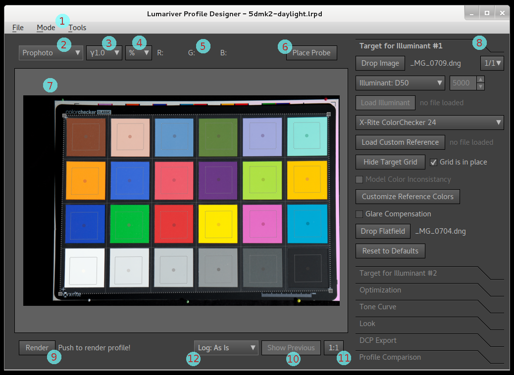
The main window contains the following elements:
- Menu bar — contains the menus. Note that in the MacOS version the menu bar is located at the top of the screen (the standard way on that platform) rather than in the main window.
- Color inspector color space selection — when the mouse pointer is moved around over an image, the color value under the pointer is shown above the image frame (5). You can select one of several color spaces, and if applicable select gamma (3) and if you want display in percent, 8 bit or 10 bit (4). This color space only affects the color inspector values, that is it doesn't change anything in the image or the profile.
- Gamma selection — for applicable color spaces you can choose the gamma separately.
- Percent, 8 bit and 10 bit selection — for applicable color spaces you can choose if the color value should be presented on a percent scale (0-100), an 8 bit scale (0-255) or a 10 bit scale (0-1023).
- Color inspector value — shows the color value in the image under the mouse pointer, using the selected color space. (In the screenshot no value is shown as the mouse pointer is not pointing inside the image.)
- Place Probe button — if want to look at the color value at
a specific point in the image when for example swapping between
images or profiles in the profile comparison tab, you place a
probe with the "Place Probe" button. When the probe is placed, the
color value is shown for that position regardless where the mouse
pointer is. To clear the probe press the button again (which have
changed text to "Clear Probe").
- When the probe is placed there's an additional line of numbers added below the main (fixed) color values, which is the relative difference to the color under the mouse pointer. This is used to compare colors. The difference is specified for each dimension, plus a forth value which is CIEDE2000 value if not specified otherwise (see the available color spaces for specifics).
- Image view — shows the target image or any image loaded in
the profile comparison tab. It has the following properties:
- The image view will show the images with the last rendered profile applied (unless otherwise specified in the profile comparison tab). If there is no rendered profile yet, the embedded profile is used.
- Toolbox panel — the toolbox groups the rich functionality into several tabs which you switch between by clicking them. Which tabs that are available depend on which file format that you are using (DNG or ICC) and which mode (General-purpose or Reproduction). The screenshot shows DNG and General-purpose combination which has the most tabs. There are two target tabs where images of the targets for the illuminant(s) are loaded, the optimization tab for tuning the colorimetric base profile, the tone curve tab to specify tone curve shape, the look tab to control various subjective aspects of the profile's look, the export tab to save the internal profile to DNG or ICC profile format, and finally the profile comparison tab used to test and compare profiles and settings with different type of images.
- Render button — press this to render the profile with the
current settings. The render button is only enabled if the current
profile can be rendered, if not the message beside the button
describes what needs to be done in order to make render possible.
- As it can take several seconds up to minutes (in special cases) to render a profile, the profile is not automatically re-rendered when you change settings, that is you need to press this manually to get an update.
- Show Previous button — make a switch to a cached image of
how it looked with the previous profile render. When previous is
activated a red line is drawn at the bottom of the frame.
- The purpose of this button is to make it easier to test if some change of settings lead to an improvement or not. That is 1) render with original settings, 2) change a setting, 3) render, 4) use Show Previous button to make A/B comparison with the original setting, 5) if happy with the result continue, if not restore the original setting and press render button again.
- The idea of the red line is that you can really concentrate your eyes at some detail in the image doing A/B swaps by clicking the button, and see the red line in the corner of your eye to know if you look at the previous or the current.
- Fit/1:1 button — zoom to fit or 1:1. Note that 1:1 is not pixel size as in a raw converter, but a little bit zoomed out; Lumariver Profile Designer doesn't make a full demosaicing of raw images and thus gets a lower resolution image, and for TIFF/JPEGs the size is limited to about 12 megapixels to maintain reasonable speed.
-
Log display mode selection — only available and
visible for Cube projects when output gamma is a reflectance
(log) gamma. The settings are as follows:
- As-is — display the output as is, that is mapped directly to display output without conversion, so you will get the low contrast washed out look that log gamma has.
- Linearize — linearize and convert to display to view the 0 - 100% reflectance. Highlights outside will be clipped, but the displayed range is mapped without distortion to the display.
- Linearized, with knee curve — keeps the full range, but compresses the highlights with a knee curve. This is how log output is typically recoded to normal display output.
- Linearized full range — the image is fully linearized without clipping and mapped to the display. This will typically yield a very dark image as video material normally has most range reserved to the highlight range.
Inspector color spaces
The color value inspector comes with a number of color spaces. There are many more alternatives to choose from than is necessary for profile making; the purpose of this is to be more flexible as a technical color value inspector when working with other image processing software.
RGB color spaces like AdobeRGB and sRGB are actually specified with an associated gamma. In this color value inspector the color spaces are defined just with the primaries and you choose gamma separately. The gamma normally associated to the color space (if any) is specified in the list of color spaces below.
- ProPhoto — ProPhotoRGB color space, use gamma 1.8 if you want its traditional gamma. ProPhoto is the limiting color space for DNG format, and also the limit for Lumariver Profile Designer's tone operators and look adjustments.
- ProPhoto (HSV) — the RGB HSV version of the ProPhoto space. This color space (with gamma 1.0) is used internally by the DNG Profile LUT, and it can also be used in parts in the look adjustments editor.
- ProPhoto (HSL) — the RGB HSL version of the ProPhoto space.
- ACES AP0 — ACES AP0 color space also known as ACES2065-1, an extremely large color space that engulfes the locus, used mainly for archiving in the cinema business. It's native gamma is 1.0.
- ACES AP1 — ACES AP1 color space, similar to Rec.2020, is a popular color space for grading in the cinema business. There are a few variants of it depending on gamma used, ACEScg uses gamma 1.0, while ACEScc and ACEScct uses a log gamma.
- Rec.2020 — Rec. 2020 color space. The gamma is similar to sRGB, so use that if you want to display gamma-encoded values. The color space is the same size as the related Rec. 2100.
- DCI-P3 — DCI-P3 color space, typically used with gamma 2.6, or sRGB gamma for the "Display P3" variant.
- AdobeRGB — AdobeRGB color space, use gamma 2.2 if you want its traditional gamma.
- sRGB / Rec.709 — sRGB color space, use gamma sRGB if you want its traditional gamma. Rec.709 is the same size, but that is typically used with gamma 2.4.
- Raw WB — the camera's raw RGB values before the profile is applied, but after white balancing.
- Raw — the camera's raw RGB values before both profile and white balance. In the case of a TIFF or JPEG image it's just the file's values before the profile, not related to any raw camera values.
- CAM02 JCh — CIECAM02 J (lightness), C (chroma) and h (hue, degrees). This is a perceptual uniform color space used for example by the look adjustments editor. It's a good space for making comparisons, especially the ΔE variant described next.
- CAM02 JCh ΔE — same as CAM02 JCh, with the difference that if the probe is active all delta numbers are shown as CIEDE2000 values, separate for lightness, chroma and hue, that is the same type of unit used in the manual matrix and LUT optimizers. The overall color difference value is CIEDE2000 as usual.
- CAM02-UCS — CAM02-UCS can be seen as a modernized CIE Lab which is more perceptually uniform. It's actually a fine-tuned CIECAM02 Jab (the cartesian form of JCh). It's the central color space used by Lumariver Profile Designer's native 3D LUT. The total color difference is here shown as the euclidean distance in the space, which is similar to CIEDE2000 values.
- CAM02-UCS J'C'h — the CAM02-UCS Jab converted to J' (lightness), C' (chroma) and h (hue in degrees). Easily confused with the much more commonly used CAM02 JCh, the lightness and chroma are not the same, but hue is. Considered to be more perceptually uniform than the original CAM02 JCh.
- CIE Lab — the traditional "perceptual uniform" CIE Lab color space which is popular in many imaging software programs. It is far from as uniform as more recent color spaces such as CAM02-UCS though. The total color difference is here shown the euclidean distance in the space, also known as the CIE76 ΔE.
- CIE Lch — the Lab color space in its cylindrical form. The more modern CIECAM02 JCh is more perceptually uniform and doesn't have the same hue skew issues in the purple region like Lch has.
- CIE XYZ — the standard observer response, see the CIE 1931 color space.
- CIE xyY — derived from XYZ to separate brightness (Y) and chromaticity (xy), see the CIE 1931 color space. It's the same color space as used in most chromaticity diagrams. The total color difference is here shown as chromaticity difference (that is Y is disregarded).
- CIE uvY — a more chromatically uniform version of the xyY space, see the CIELUV color space, the Y channel is kept the same as xyY though. The total color difference is here shown as chromaticity difference (that is Y is disregarded).
- Lutspace v2 — the color space used by the native 2.5D LUT (in version 2 and later). It's similar to uvY but it's uniformity is superior, based off the CAM02-UCS model while being lightness independent (unlike CAM02-UCS). The total color difference is here shown as chromaticity difference (that is L is disregarded). This unit of color difference is used in some advanced 2.5D LUT settings.
When working with camera profiles inside Lumariver Profile Designer the most versatile color space to view is CAM02 JCh ΔE.
Thanks to the many settings you can often find a matching setting between your raw converter and Lumariver Profile Designer. For example, to mirror what Adobe Lightroom is showing in its color value inspector, select ProPhoto with sRGB gamma and % unit.
Menus and tools
File menu
The file menu contains the following functions:
- New Project — create a new project. Only one project can be open at a time, so the current project will be closed first.
- Open Project — open a project. Only one project can be open at a time, so the current project will be closed first.
- Open Recent — a list of the most recent opened/saved projects for quick access open.
- Save Project — save project under its current file name.
- Save Project As — save project with a new file name.
- Revert Project — revert back to the project's last saved state.
- Archive Project — save the project file and all related
data files (images, target reference files etc) into a single ZIP
archive file. It's useful for archiving or when you need to send
projects to friends and colleagues, or to our support.
- To make the ZIP files portable between operating systems (Windows/Mac) the filenames are limited to 7 bit ASCII. Files in the archive will be automatically renamed if extended characters are used.
- About — show version and license information.
- Quit — exit the program.
Mode menu
When you create a new project you get to choose which profile type (DNG, ICC or Cube) and which type of defaults (general-purpose or reproduction) you want. Those settings can later be changed by changing them in the "Mode" menu, but if you do be sure to go through the tabs afterwards as some settings will be reset to default values.
Tools menu
The tools menu contains the following entries:
- Inspect/Edit Profile — lets you view a DNG or ICC profile in text format, and optionally hand-edit it. This tool is intended for advanced users only, and is not required in any normal workflow.
-
Add transfer function to TIFF — in the rare cases the raw
software or scan software doesn't embed a transfer function or an
ICC (or instead a misleading ICC), a transfer function can be
manually added to the file before use with this tool.
- A preset gamma, sRGB, custom gamma or a custom curve can be applied as transfer function. For the custom curves, see curve file formats.
- See the section on missing transfer functions for more details.
- Export Reference File — a tool to export a CGATS text file with the reference with various pre-processing settings. Documented separately.
- Check for Update — will check with the Lumariver server what the latest version of the software is. This is also done automatically when the software is launched (and the computer has access to the Internet).
Export reference file
This tool will take the currently selected reference and associated settings in the project and export it to a CGATS file, which then can be processed in third-party software, or imported back in as a custom reference depending on use case.
The export dialog has the following settings:
- Target index selection — only available for DNG projects, then to select if you want to export for Target 1 or 2.
- Flatfield selection — choose how to do flatfield correction, if any. You can choose to correct the RGB values (ie camera RAW), which will affect exported RGB values if included, or if RGB is used as source for XYZ/Lab values it will affect included XYZ/Lab values. The other flatfield correction alternative is to scale the XYZ/Lab values (and spectra if included) to match the unmodified camera raw RGB values.
- This will only have effect if the project and its settings support flatfield correction, otherwise it will do nothing.
-
Use RGB to make XYZ/Lab — if enabled, the reference
colors (XYZ and Lab values) will not be that of the
project's reference file, but instead be the colors in the
image, that is the camera raw RGB values converted with the
image's defined color space. This thus only works for images
which actually have an ICC color space embedded (ie not DNG
files), or in passthrough mode where the color space is
taken from the input gamut setting on the optimization tab.
- In this mode you probably want the source image to be perfectly white-balanced otherwise the neutral patches will be recorded as off-white which can make the resulting file less workable.
- Likewise it's advisable to have perfectly even light on the target, or enable flatfield correction.
- This feature could be used if you want to create a reference to match a specific existing look as in the image. Note however that Lumariver Profile Designer expects sources to behave largely linearly like real digital cameras and scanners, so matching a contrasty look will probably not work well.
-
Apply white balance to RGB — if enabled, the RGB
(Camera Raw) values will be white balanced based on the most
neutral and reasonably bright patch, looking at the RGB
values.
- This will only have effect if RGB values are included, or if XYZ/Lab are generated from RGB values. If the latter, the resulting reference file is typically only useful if there is at least one neutral patch, and this is either achieved with having a perfectly white balanced source image, or enabling this setting so the RGB values are white balanced before XYZ/Lab values are made.
- Apply target adjustments — if enabled, the reference colors will be modified according to the project's target adjustments if any.
-
Model color inconstancy — the reference file colors
are usually defined with D50 as illuminant (or full
spectrum), and the exported file XYZ and Lab values will
always be relative to D50. If the
project's calibration illuminant (ie light on the target) is
not D50 you may choose to enable color inconstancy modeling,
which modifies the colors such that they better represent
how colors appear in the calibration illuminant. For
example, in tungsten light red colors appear brighter and
more saturated relative other colors than in daylight.
- When making general-purpose realistic profiles one usually wants to model color inconstancy, while if one makes a reproduction profile the goal is usually to make colors appear as if shot in daylight even if not, and then color inconstancy should not be modeled.
- If the XYZ/Lab values comes from the image itself ("Use RGB to make XYZ/Lab" setting enabled) this setting is not enabled as it does not make sense in that use case.
- Include RGB (Camera Raw) — include raw RGB values from the image (no color space conversion applied).
- Include XYZ — include XYZ reference values in the exported file.
- Include Lab — include Lab reference values in the exported file.
- Include spectra — include full spectra in the exported file, only possible if the source has spectra.
Target tabs
For general-purpose DNG profile projects there are two tabs, one for each illuminant. If you make a single-illuminant profile you only configure the first. Reproduction, Cube or ICC profiles are always single illuminant and in that case there is only one target tab.
Input gamma selection (Cube only)
Purpose: specify the input gamma used in the the target still. Should always be set.
For Cube projects the input gamma used in the target cannot be derived from the image and instead needs to be specified separately. This is because Cube projects are generally made for video where input gamma is a log-to-linear reflectance curve rather than a classic gamma function, and there is no standard to embed it in the image.
It's very important to get this setting right, otherwise a correct profile cannot be made.
The input gamma drop-down list contains a number of common traditional gammas and video log functions. If the input gamma you need is not available in the list, you can provide a custom gamma through one of the many supported curve formats. (Advanced use: you can also permanently add a custom curve to the list by adding it to the static settings file.)
If the target photo is a still from log-encoded footage you should provide the log-to-linear reflectance curve. This usually starts slightly below zero and ends at a value much larger than 1.0, typically somewhere in the range 4 - 64. For professional cameras this curve is usually available from the manufacturer in the form of a 1D LUT that can be loaded directly as a custom input gamma. You can also use the online tool LUTCalc or similar tool to generate a curve you can use.
Note that sometimes the manufacturers, while providing one or more LUTs, may not provide one that actually converts to unclipped reflectance. This is common for consumer cameras. In that case you need to look for the LUT elsewhere, such as generating it using LUTCalc or other third-party tool.
Traditional gammas used in still photography does not specify reflectance, but instead just go from 0.0 to 1.0. Lumariver Profile Designer will work with both types, as long as the provided gamma matches the target still image.
If you make a Cube LUT for a "normal" still image just like for an ICC project, you can choose the "From Target Image" option, then the gamma is read from the target image just as for an ICC project (where the term is "transfer function" rather than "input gamma", but it is the same thing. Video and still photography has a few terminology differences).
(The reason log-to-linear reflectance curves starts below zero, ie negative reflectance which does not exist in the real world, is because cameras generally record with a black level offset to capture the full noise amplitude which may produce negative reflectance values. Recording the full noise amplitude avoids skewing the black level.)
Illuminant selection
Purpose: specify which light that was used in the target photo. Should always be set.
The illuminant drop-down list provides a number of standard illuminants, black-body and possibility to load an illuminant spectrum from a file (CGATS or CGATS-like format).
As cameras have similar response in similar lights it's not important that the illuminant specified exactly matches what's used in the target image. If you are uncertain of what to choose, here's a guide:
- Flash: D50.
- Midday sunny: D50.
- Midday cloudy: D65.
- Tungsten lamp or other lamp with known temperature: black-body with matching temperature.
- Warm indoor light tungsten/LED: StdA (same as 2850K black-body).
- Semi-warm indoor tungsten/LED: 3200K black-body.
Note that it's more important to be close in temperature for lights below 4000K than above as the change in behavior is non-linear. For example, a 100 degree change represents a much larger difference below 3000K than above 7000K.
If you have access to a spectrometer and use it to measure your illuminant spectrum (you must use other software for that) you can provide the exact spectrum if you like. It's more of a curiosity than providing any real benefit over a decent approximation though.
For the DCP format there is in the format's specification a preset list of illuminants (the EXIF LightSource tag). If any of those are matched exactly, that name is put into the resulting profile. Otherwise the illuminant is stored as "Other" with associated exact whitepoint, which is a DCP format version 1.6 feature. If you for compatibility reasons need your profile to not use this feature you must use an illuminant that matches. You can use StdA, D50, D55, D65, D75, and black body with 3200K which in the DCP context is the same as "ISOStudioTungsten" (note that actual ISO 7589 Studio Tungsten is defined slightly differently).
(If color correction version is set to version 1, the DCP format version 1.6 feature is not used, instead a closest match is attempted for naming the illuminant in the resulting profile, which was the Lumariver Profile Designer 1.x behavior.)
Multi-illuminant profiles (DNG only)
If you're making a general-purpose DNG profile there is a calibration illuminant drop-down at the top of the target tab where you can add and select illuminant. There can be single, dual or triple illuminant profiles. Dual-illuminant profiles are common, while triple-illuminant was not added until version 1.6 of the DNG specificiation, and is less in use.
A suitable combination of illuminants for a dual-illuminant profile is StdA and D50 - D65. That is one profile for daylight/flash and one for warm indoor light. The idea of a dual-illuminant profile is to make it more user-friendly, as you don't need to manually switch profiles for different lights. A common misconception is that multiple illuminants makes the profile more accurate, but it's not about that. In terms of accuracy it's always better to have a single-illuminant profile designed for the light used, than having a multi-illuminant profile interpolate an in-between light. A multi-illuminant profile can be very convenient for general-purpose use as it can be made to work well in a wide range of lights.
It doesn't matter how you order the illuminants in the project, when exported the resulting profile will have the illuminants ordered according to the DNG specification recommendations.
When a multi-illuminant profile is rendered, the resulting profile will be tested to see if its color matrices can convert white balance between RGB multipliers and temp/tint forward and backward. If illuminant settings do not match the actual light in the target images well enough or illuminants are too close, white balance may not be fully inversable. A warning message will then be displayed. The profile will still work, but it may yield unexpected results when white balance is set through temp/tint. This error is more likely to occur in triple-illuminant profiles than dual-illuminant as it's likely the third illuminant is quite close to one of the others.
Caution if you intend to make corrections along the neutral axis: the lookup tables embedded in the DNG profile format has the quirk that they cannot make changes to the neutral axis (grayscale). For general-purpose profiles where you typically disable lightness correction this is not an issue. However if you do enable lightness correction and/or 3D LUT with scaling the result can become poor with noise around neutral colors due to a rough transition between non-corrected and corrected lightness. For a single illuminant-profile lightness correction will still be applied as it can be done via the profile's tone curve, but as there is only one tone curve that workaround cannot be applied in a multi-illuminant profile.
In other words, if you apply lightness correction to your profile it's recommended to make multiple single-illuminant profiles rather than one multi-illuminant.
ICC and Cube profiles don't support multiple illuminants, and for reproduction photography it doesn't make sense so in those cases the calibration illuminant selection box is hidden.
Target selection
Purpose: select the target viewed in the target photo. Must be set.
Many popular targets are available as built-ins, and custom targets can be specified if needed. If you choose any of them the grid is configured to match so you can place it in the photo.
In addition to the patch layout the profiler must also know which color each patch has. With each built-in target there are pre-loaded spectral data so you don't need to provide any reference file with them. However, as targets vary a bit between manufacturing batches the precision cannot be fully guaranteed, so if you need the utmost accuracy you should measure your own target and load custom reference data. If possible that data should contain the full spectrum for each patch and not just the XYZ or Lab value.
We think that for general-purpose profiles it's overkill to measure your own target, while for reproduction work we recommended to do it. The file format supported is anything similar to CGATS text, as produced by the software listed in the related software section. Note that the patch naming in the reference file should be for a grid, like A1, A2, ... B1, B2, ... rather than descriptive names, so the software can figure out where the patches are located in the grid. This naming is indeed the default for most measurement software that generate these files, but there are exceptions. If you can't get the measurement software name the patches as desired, you can manually edit the resulting CGATS file as it's just a text file.
The following target types are available for selection:
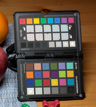
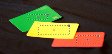
- X-Rite / Calibrite ColorChecker 24 — the most classic 24 patch target with a history from the 1970s. Still an excellent target for making general-purpose profiles in varied lighting conditions. The name of the target has changed a little over the years, and is now made by Calibrite.
- X-Rite ColorChecker 24 (pre Nov 2014) — the same target as above, but with the slightly different colors used for targets produced November 2014 or earlier. If you're not certain which version you have, use the later version. The color difference is not huge, so picking the wrong version will not lead to a large error.
- X-Rite ColorChecker Passport — the portable version of the classic color-checker target, with some extra patches.
- X-Rite ColorChecker Passport (CC24 part) — only the classic 24 patch page in the ColorChecker Passport, which may be more convenient to use, and there is not much gain in using both pages anyway as the other page has similar colors.
- X-Rite ColorChecker SG / Calibrite ColorChecker Digital SG — a glossy target with many white patches that allows for automatic flatfield correction. Note that glossy targets are difficult to shoot without glare issues, and thus we only recommended them for work indoors where you can control the lighting.
- X-Rite ColorChecker SG (pre Nov 2014) — version of this target produced November 2014 and earlier, which has (very) slightly different colors.
- DataColor SpyderCheckr 24 — a 24 patch color-checker very similar to X-Rite's classic version.
- DataColor SpyderCheckr 48 — a 48 patch color-checker, which adds 24 more patches to the classic 24 patch base.
- DataColor SpyderCheckr Photo — same patch set as SpyderCheckr 48, but in pocketable version with slightly different geometry.
- QP-Card 202 — legacy all-around matte color checker from QpCard.
- QP-Card 203 — legacy all-around matte color checker from QpCard.
-
IT 8.7 Reflective DIN A4 (Coloraid C1) — a standard
color-checker manufactured with a photographic process, typically
used for making scanner profiles (flatbeds or film scanners) when
copying work made with the same photographic process as the target
is made with. The embedded reference data for this target is for a
Coloraid C1 target,
and won't match your target very well, unless it's
manufactured in the exact same way. However, if you have purchased
one of these targets you almost certainly got a reference data
file together with it which you then can load separately (press
the "Load Custom Reference" button). You can of course use this
for IT8 translucent or other targets as well when you have a
matching reference file, as when loading a custom reference
only the layout is used, and the actual patch colors are
loaded from the custom reference.
- Due to the manufacturing process these targets have less varied spectral shapes than the X-Rite ColorChecker targets for example, and that's the reason they are best used when the goal is to copy work made with the same photographic process (such as in a film scanner). In other words the Digital SG is better as an all-around target than this one, however if you use multi-target feature you could use a ColorChecker 24 for the base colors, and use this for high saturation colors, that way you have good spectral variation in the normal range while still providing some extra accuracy in high saturation colors.
- CMP Digital Target 8 (Glossy) — a large glossy target from CMP-Color.
- CMP Digital Target 8 (Matte) — the matte version of the above.
- HutchColor HCT (Fuji RVP) — a scanner target from HutchColor, the built-in reference data is for Fuji RVP slide film, but as these targets are made on different media and delivered with corresponding reference data files you should load that.
- Calibrite ColorChecker Video — a "video-specific" target. Matte colors with much focus on skin tones, and one very deep black glossy color. In conditions where glare can be a problem it may be wise to disable the black glossy patch.
- Calibrite ColorChecker Passport Video — the 24 patch video subset of the small Passport Video target.
- Custom Target (Grid) — this setting requires a custom
reference file, and then the grid layout (must be rectangular) is
figured out from the provided CGATS (or CGATS-like) text file.
-
The
LGOROWLENGTHtag specifies the row count. If it's missing Lumariver Profile Designer tries to figure out the layout from patch naming. - If you have a file in CxF3 / .cxf format, you can use Argyll to convert CxF3 to CGATS.
- The patches are listed column by column left to right.
- This is the same arrangement BabelColor PatchTool uses.
- Custom layouts for targets can be defined by adding JSON configuration to the CGATS file, but this is only intended for advanced users.
-
The
- Custom Target (Free-Form) — this setting requires a custom reference file which specifies the patch colors. Each patch can then be moved around and placed freely (that is it doesn't have to be in grid form). This is typically used in a multi-target setup when you add some important spot colors (some specific samples of paint, logotype colors etc) as a separate target.
- Custom Target (Raw Values) — this setting requires a
custom reference file, which in addition to the patch reference
values also has the scanned raw RGB values. When this is selected
the target grid is disabled as it doesn't make sense to place the
grid when all data is ready.
- Normally you use Lumariver Profile Designer to place grid and scan target. This function is mainly intended for academic or research work, or if you have some third-party software that you already use to scan targets.
- You still need to load a target image, but it doesn't need to contain a target.
- This can for example be used to import files prepared in DCamProf or some other third-party software. It can be useful if you want to perform some custom pre-processing, or prepare targets from SSF (Spectral Sensitivity Functions) which DCamProf supports.
If you haven't bought any target yet and you consider to buy one to make general-purpose profiles, we recommend the X-Rite / Calibrite ColorChecker Passport Photo for the most all-around use both indoor and outdoor, and the larger format classic 24 if you are only going to use it indoor. Glossy targets with many patches are mainly for reproduction work, or if you have some special interest in precision of high saturation colors. Note that with glossy targets you then need to put considerable more effort into your target shooting setup to avoid glare issues.
Nowadays there are some targets that are sold as being specific to video. In the context of Lumariver Profile Designer there is no need for a video-specific target, as video sensors behave in the same ways as still image sensors in terms of colors. The video targets may still be excellent targets of course, both for video and still image profiles.
Model color inconstancy
Purpose: model the slight color appearance differences if the target illuminant is different from D50.
The reference illuminant used to define color is D50, a form of idealized daylight. Thanks to our eye-brain's capability to adapt to different lights (chromatic adaptation) most aspects of colors are kept constant, red is red, blue is blue, green is green regardless if the light is warm or cool, this is known as color constancy. However there are still some slight differences, formally known as "color inconstancy". For example under a tungsten light source reds appear relatively brighter than other colors, and skintones are a bit warmer than in daylight.
When "model color inconstancy" is enabled these effects are simulated, otherwise the profile will try to make colors look as if shot under daylight. For general-purpose profiles this should generally be enabled. However if you do reproduction work you probably want colors to look as if shot in D50 regardless of light used in the target setup, and then this setting should be disabled.
If you want to visually see the effect, first choose an illuminant much different from D50 (such as StdA), then open the "Customize Reference Colors" dialog and toggle the checkbox on/off there to see the difference on the target patches.
Note: for Cube projects this setting is not available directly in the target tab, but only in the Customize Reference Colors dialog (due to limited space in the tab). For the other projects the setting is available both directly in the tab and in the "Customize Reference Colors" dialog.
Customize reference colors dialog
Purpose: view and/or adjust target reference colors, possibly exclude patches, and in multi-target mode decide how targets are merged.
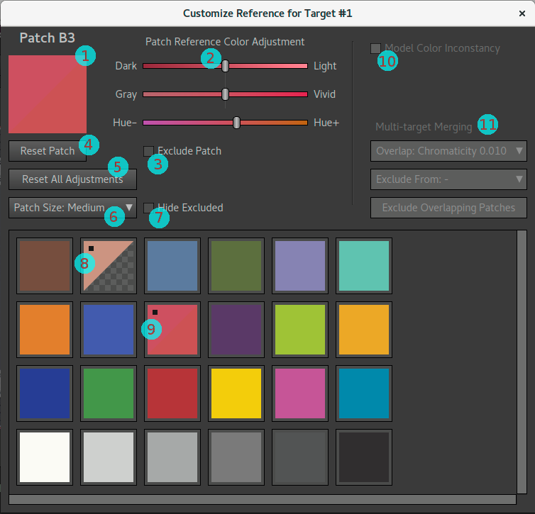
- Split patch icon — shows the currently selected patch, top left half is the reference color as read from the reference file, bottom right shows the result after adjustment (if any).
- Reference Color Adjustment sliders — adjust the color of the patch to taste, view the result in the split patch icon.
- Exclude Patch — exclude the patch from the target so it won't be considered when the profile is made. Note that patches can be excluded also in the later stages of matrix and LUT optimization. Excluding in this stage is usually only done for multi-target merging purposes, but may also be done if a patch is known to be bad.
- Reset Patch — reset any adjustments of the currently selected patch.
- Reset All Adjustments — reset all adjustments made to the target(s).
- Patch Size selection — select the size of the patch icons in the patch table. Note that the patch window can be resized. Large icons can be useful when visually evaluating the colors and comparing to the real target for example.
- Hide Excluded — hide all excluded patches, which can make large merged multi-targets easier to view.
- Patch icon for excluded patch — when a patch is excluded the bottom right half of the split icon is replaced with a gray checker pattern.
- Patch icon for adjusted patch — the small black square in the top left corner indicates that the patch has been adjusted. The color is split too of course, but may be hard to spot compared to the black square.
- Model Color Inconstancy — if the target illuminant was not D50 it's possible to toggle the color inconstancy setting here and directly see the result visually on the patch icons.
- Multi-target Merging — short-cut to manually exclude overlapping patches when multiple targets are used, documented separately in the multi-target merging section.
Note that you should generally not adjust the target colors here. If you're not pleased with the profile output color you should first check the optimizer if the matrix and LUT matches the colors well enough, and then think if you are using the appropriate tone curve and tone operator (which can modulate color), and then consider if you should make a subjective adjustment in the look adjustments editor. However if your actual target is not really matching the reference data so the reference data is actually wrong, or you don't agree with the result of the chromatic adaptation transform (model color inconstancy) you could make adjustments here. It should normally be a rare thing to do.
More common could be to exclude one or more patches from a target, for example if it's damaged in the real target or the target photo is suffering in some way with certain patches (excessive glare for example). Patches can be excluded in the optimizer step too though, doing it in this step will remove some clutter later on though.
If you are using the multi-target feature you may want to merge the targets, which means that overlapping patches are excluded to avoid metamerism issues.
Glare compensation
Purpose: compensate for glare in the target photos. Warning: experimental function that only works well in a narrow set of conditions.
The glare compensation function works best when the target is glossy, has some very dark patches and is evenly lit. Rather than subtracting glare from the target photo it actually adds in glare in the reference colors (which as a result will become lighter and less saturated), as it's a more stable approach.
This function should not be used as a casual compensation for not caring about glare when shooting your target. If you have control over the target photography you should strive to minimize glare as much as possible, and then you don't need to compensate. This function is intended to be used only when you cannot redo the target shot. It still requires even lighting and preferably glossy target with dark patches otherwise it may do more harm than good.
If you suspect that the target photo suffers from glare and the profile result looks overly saturated (which is a typical result of glare), you can try enabling glare compensation and see if the result improves.
Flatfield correction
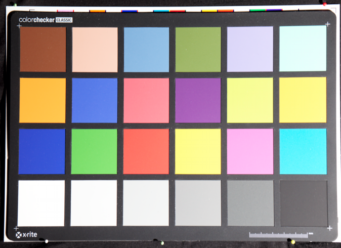
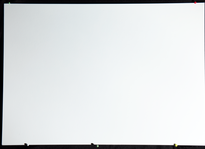
Purpose: compensate uneven lighting in target photos.
Uneven lighting is not a problem in professional grade reproduction setups with two (or more) lights, so if you have such a setup flatfield correction will be overkill. But if you use side-lighting with only one light there's most likely a quite large variation in brightness from side to side of the target. While the optimizer is robust for uneven light (when not correcting for lightness), you can get better results with flatfield correction in these situations. Using flatfield correction you can match or even improve on a professional grade setup concerning measurement error with a simple single light setup. This can be a big cost-saver if you're using expensive daylight simulator lights.
There are two ways to perform flatfield correction. One is to load a flatfield image and will work for any target. The other is to employ the "Auto Flatfield" feature (checkbox), in that case correction is done using the target's own white patches so you don't need to shoot an extra image. Some targets, like X-Rite's ColorChecker SG, has an outer border with neutral patches which is recommended for this case. However the white patches don't have to be along the border although it yields more robust results. For auto flatfield to have effect, the target must have at least three white patches.
The target-based "auto flatfield" correction function cannot be used at the same time as the image-based flatfield correction, so as soon you load a flatfield correction image the auto setting is disabled.
Note that the "auto flatfield" feature does not make a visible effect on the target image (unlike the image-based flatfield correction). The auto flatfield function will under the hood scale the scanned raw values to match but make no changes to the target image. The largest amount a value had to be scaled with is written beside the "auto flatfield" checkbox after the profile is rendered. If it says "none" it means flatfield didn't happen, usually because the target colorchecker doesn't have enough white patches.
To use Lumariver Profile Designer's image-based flatfield correction function you need to shoot a gray or white card in the same position as the target with the exact same light and camera setup. The white card needs to be large enough to cover the whole target. The typical workflow is as follows:
- Shoot the target, with fixed light setups and the camera fixed on a tripod.
- Place the white card precisely on top of the target, making sure that it's large enough to cover the whole target.
- Shoot the white card, the exact same light, the exact same framing. (Exposure and white balance settings doesn't matter, but are usually kept the same.)
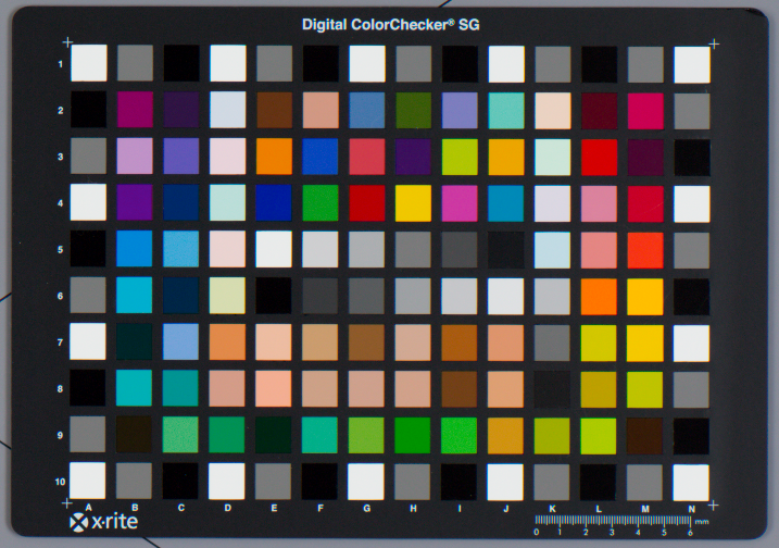
There are special white/gray cards on the market, but if you are only going to use it for flatfield correction you can do with a normal thick matte printer paper (thick enough to avoid any see-through!), as it doesn't matter if it's slightly off-white.
With both target and flatfield image made, you can start profiling. Load the target and place the grid as usual. The flatfield correction only works within the placed grid, so the "Load Flatfield" button does not become active until the grid is placed (if you later move the grid, the flatfield file will be dropped and you need to load it again, so be sure to be happy with grid placement before going further). Press the "Load Flatfield" button and load the flatfield image there. It will take some time to process, and after it has finished you will notice that the light has been evened out inside the grid. You can now continue with profiling knowing that the light is perfectly even.
Beware that while flatfield correction will correct for uneven light on the target and lens vignetting, it will not correct for glare or flare so you should still try to minimize those aspects as much as possible, as discussed in the shooting targets section. You can gain from using flatfield correction when battling glare though — glare can be easier to avoid with a minimal of lighting, and flatfield correction allows you to use as little as only one light source.
Special considerations if using multiple targets: flatfield correction may change the overall brightness of the image of the target, which means if you have multiple targets and multiple flatfield images their brightness may vary. While this is okay for the 2.5D LUT with disabled lightness correction (default for general-purpose profiles), you can't make reliable 3D LUTs or lightness correction. The solution to this is to make sure that you need only one flatfield shot, that is that the white card used is large enough to cover all targets. You don't necessarily need to fit all targets under it simultaneously (you could shoot one image per target), although it makes workflow even more effective of course.
Note that some raw converters have flatfield correction on their own. Capture One is one such raw converter, where flatfield correction is known as "LCC". If you want to you can apply flatfield correction there instead of in Lumariver Profile Designer.
Optimization tab
The optimization tab contains functions related to colorimetric matching, that is the profile's ability to as accurately as possible match colors. This is the base which the rest of the profile is built on.
For reproduction the result will be used as is, as the purpose of a reproduction profile is to accurately match colors to be able to copy artwork and similar. For a general-purpose profile the colorimetric result can later be transformed with a tone curve and a tone reproduction operator, and gamut compression can be added as well as individual subjective color adjustments.
Color correction mode
Purpose: select which generation of color correction algorithm that should be used, or none at all.
With Lumariver version 2 a new and improved color correction was introduced, simply called "Version 2". For backwards compatibility with older projects the old is retained as "Version 1". For new projects there is normally no reason to use the older version.
In most circumstances there will be a very small visual difference between color correction version 1 and 2. Version 2 uses a more uniform color space that will improve smoothness slightly and other smaller improvements here and there, such as more optimized input curve for ICC profiles, revised color clipping algorithm and more.
There is also a special mode "passthrough", which will disable the color correction stage alltogether. Instead you can load a third-party LUT with own color correction which is applied according to specified input gamma and input color space.
In the passthrough case the optional LUT is expected to work directly on the target input without any gamma or color space conversion, and the input gamma and gamut settings is to describe the result after the LUT, if any, has been applied. If there is no LUT the input gamma and gamut just describes the unmodified target image. In other words, if you apply a custom LUT the "Input Gamma" should actually be the output gamma of the LUT. Likewise the input gamut should be the output gamut of the LUT.
The passthrough mode is most likely to be used in video workflows (Cube profile projects), where you might already have color correction made in other software but would like to apply other functions that Lumariver Profile Designer provides, such as tone reproduction, gamut compression and look operators. Note that you can also apply additional LUTs via look operators through the Apply LUT adjustment operator. That way you can cascade multiple LUTs.
Passthrough mode will work for ICC and DNG profiles as well, however in the DNG case note that the plain result will generally be a green tinted image as it shows the raw sensor color channel balance which is heavy on green.
Neutral selection
Purpose: fine-tune what the profiler should consider as perfectly neutral.
The profiler must know what should be considered perfectly neutral, that is R=G=B, gray or white. There are the following settings:
- Neutral: From White Patch — the selected white patch on the target is considered perfectly neutral. In reality it's generally (very) slightly off though. This setting is used when you will be using the target for white balance color picking, so it's a good setting for general-purpose profiles.
- Neutral: From White Balance — if you have set the in-camera white balance from an exact gray card prior to shooting the target you can use that as reference by using this setting. Setting the white balance separately is popular in reproduction workflows and that is why this setting is here. Usually the main target contains a neutral enough patch though so using the "From White Patch" setting can be more effective and just as good.
- Neutral: From Reference — the target reference data contains the exact colors of the neutral patches, and if this is used as reference you get the most accurate result.
When the "From Reference" setting is used the optimal white balance is calculated, which you can retrieve from the "Profile comparison" tab after rendering the profile, as a temp/tint setting for a DCP profile and as RGB multipliers for ICC profiles. Most ICC raw converters don't allow for entering multipliers though, so transferring the white balance may not be feasible for your workflow. If so it's better to use "From White Patch" so you can pick the white balance, or set the white balance using a high quality gray card. As the white patch of the target usually is not too off-white it does not matter that much if you choose "From Reference" or "From White Patch".
White patch selection
Purpose: if the target is to be used for white-balance picking, manually point out which patch to consider to be the most neutral (or leave at "Auto").
When the neutral setting uses the white patch as reference neutral, this setting specifies which patch that is the "white patch". If it's set to "Auto" the profiler will pick the most neutral patch, which may or may not be the brightest white patch. For example, in the X-Rite CC24 target it's the second brightest patch is actually more neutral than the brightest. If you will be using the same target as used in profiling for white balance picking later on you may want to point out a specific patch.
If left at "Auto" the name of the patch chosen will show up beside the drop-down list after the profile is rendered.
This setting is only shown in the optimization tab when running in reproduction mode, otherwise it's tucked away in the manual matrix optimization dialog (which is not available in the reproduction mode).
Matrix optimization selection
Purpose: choose strategy for how the linear color correction (matrix correction) should be derived.
This setting is not available in reproduction mode as it's not contributing any value in that case. For general-purpose profiles you might want to control the matrix. There are the following settings:
- Matrix Optimization: Auto — the profiler will make a matrix that as good as possible matches all patches in the target, treating all patches as equally important (except from the white point preserving property). This setting is good for reproduction profiles or any other when maximum overall accuracy is important.
- Matrix Optimization: Auto, with Y Limit — while making an ordinary matrix optimization, the profiler will make sure that the matrix doesn't contain a negative factor larger than the specified Negative Y Range (default 0.20). This makes the matrix more robust for ultra-saturated colors and artificial lights, and typically makes deep blues a bit lighter (often considered a desirable subjective property). This setting is good for general-purpose profiles.
- Matrix Optimization: Manually Tuned — activates the manual matrix tuning dialog(s) where you can in detail hand-tune the optimization (documented in its own section). Manual tuning of the matrix is generally not required, but if you are extremely picky of the result especially if making a matrix-only profile (no LUT correction) you may want to consider it.
Activating manual tuning and opening the dialog is also the only way if you want to see the matching statistics visually and by numbers. You can still use one of the templates in the dialog (all alternatives in this drop-down are represented) if you don't want to make manual adjustments.
Negative Y Range
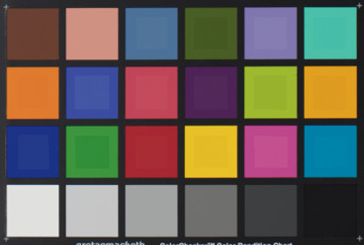
Purpose: minimize negative factors in the matrix to make it more robust when handling ultra-saturated colors, often affecting the deep blue range the most.
This setting is only enabled if the matrix optimizer is not set to "Auto".
Technically this value is the smallest value allowed in the matrix Y row, that is if set to 0.20 (default) the smallest Y value will be -0.20. A large value such as 5.00 makes it in practice unlimited as not too large negative values are required to make the best matrix match.
What does this actually mean? Camera color filters are usually over-sensitive in some ranges compared to the eye, to have better low light properties or work better in certain types of light. This means that to for example make a correct deep blue color in the normal range we actually may need to subtract one color channel. If the camera then registers an ultra-saturated color the matrix may actually end up with a negative result (clipped to black). For a reproduction profile where we know what we will shoot this is generally not a problem as we won't face that type of colors or strange artificial lights that can trigger the situation. To make a general-purpose profile maximally robust it's better to make the matrix match less well and limit the negative factors.
Having this value at the default 0.20 will generally make deep blues a bit lighter, but the result varies depending on the camera. Note that lighter deep blues while less accurate is often preferred as a subjective adjustment. If you think the effect is too strong you can try to gradually increase the value and re-render the profile for each increase to see the difference.
Note that the LUT can be made to counter-act the lightening effect. The default LUT setting is however to ignore lightness corrections and thus the lightening effect will then be kept.
LUT type selection
Purpose: choose if the profile's color corrections need to make different corrections based on how bright a color is or not (3D vs 2.5D corrections). Typically only reproduction profiles gain from having full 3D corrections.
The LUT (LookUp Table) applies corrections on top of the linear matrix result. This can either be done in 2.5D or 3D.
The 2.5D LUT is "exposure-independent" and is therefore well-suited for general-purpose profiles. A 2.5D LUT will apply the same correction for a dark color as a light color if they have the same hue and chroma, which is what makes it exposure-independent. In other words it doesn't use the lightness axis as input but only hue+chroma (2D), and based on that scales lightness+hue+chroma (3D) in the output.
The 3D LUT considers lightness also on input, that is a dark color may get a different correction than a light color even if the hue+chroma is the same. For this to be useful one or both of these conditions must be true: 1) the spectral reflectance varies for dark and light colors of the same chromaticity (hue+chroma), or 2) it's desirable to correct for non-linearities in the system (such as glare in the optics). If so you can get a better correction if the LUT makes different corrections depending on brightness. In order for that to work you need a target with many patches with varying brightness, such as an IT8.7 target, and if you are considering spectral properties the target must have the same properties as the objects that will be reproduced.
The typical use case for a 3D LUT is a scanner profile or reproduction with a fixed setup (that is camera set up to work similar to a scanner).
If the 3D LUT is used together with a sparse target, such as a 24 patch color checker, it will fill out the gamut by rendering darker/brighter versions of the patches. Those will then of course be linear and have the same spectral properties as the anchor patch so the LUT will effectively be 2.5D in those areas. This makes the 3D LUT more versatile and safe to use as you don't need to worry if the target has some gaps in the gamut.
Headroom
Headroom only applies to the 3D LUT, and specifies the range from the brightest target patch up to clipping.
The headroom drop-down list contains the following alternatives:
- Headroom: From Image — the target reference is scaled to match the
brightness of the image. This has the following effect:
- The resulting profile should only be used at the same exposure as the target was shot.
- The LUT correction will only cover the brightness range that the target covers in the image. That is if the target was under-exposed, there will be no correction of light colors.
- As the LUT range is adapted to the image, the corrections will match the target in the image, without changing the brightness of it.
- This setting disables the "Scale to Match" checkbox, as the reference is already scaled to match the image.
- After the first render the "Headroom" spinbox will for informational purpose be filled in with the actual headroom that is in the image.
- Headroom: From Reference — before profiling the image values are
scaled to match the brightness specified in the target
reference. This has the following effect:
- Regardless of exposure of the target image, the LUT correction will cover the same range.
- If "Scale to Match" is enabled, the resulting profile will brighten/darken the image to match the reference.
- After the first render the "Headroom" spinbox will for informational purpose be filled in with the actual headroom that is in the reference.
- Headroom: Custom — specify a headroom in stops from the white patch to clipping, with or without "Scale to Match".
If you're making a scanner profile, or have a reproduction setup with fixed exposure where you are satisfied with the resulting brightness you should use the "Headroom: From Image" setting.
If you're making an exposure-independent profile you should normally use the 2.5D LUT and then you don't need to set the headroom as it doesn't apply. If you still want to use the 3D LUT, the setting "Headroom: From Reference" makes good sense.
LUT optimization selection
Purpose: choose strategy for how the non-linear color correction (LUT correction) should be derived.
There are the following settings:
- LUT Optimization: Auto Relax, No L — automatically relax the non-linear stretch in the LUT to provide a suitable tradeoff between smoothness and accuracy, and "No L" means that no correction of lightness is made, that is the linear matrix result is kept in that regard. This is a good default setting for a general-purpose profile, where skipping lightness adds extra robustness and smoothness in the extreme ends of the gamut.
- LUT Optimization: Auto Relax, With L — automatically relax, and do consider lightness in the corrections. This is a good default setting for a reproduction profile.
- LUT Optimization: No Corrections — don't make any corrections at all, that is keep the linear matrix result as is. This setting is used if you want to make a matrix-only profile, or the target image is of poor quality (bad light etc) so fine-tuning with LUT correction doesn't make sense. The final profile may still employ a LUT if other features require it, such as gamut compression or the tone reproduction operator.
- LUT Optimization: Manually Tuned — activates the manual LUT tuning dialog(s) where you can in detail hand-tune the optimization (documented in its own section). Manual tuning of the LUT is generally not required, but if you are extremely picky about the result you may want to consider it.
Activating manual tuning and opening the dialog is also the only way if you want to see the matching statistics visually and by numbers. You can still use one of the templates in the dialog (all alternatives in this drop-down are represented) if you don't want to make manual adjustments.
Optimization report
The "View Report" button is enabled when the profile is rendered, and when pressed it will bring up the optimization report dialog, which is a read-only view of the profiling result. This can for example be used to visualize how well the colorimetric part of the profile matches the reference target colors.
It can be used as for quality evaluation of the profile, and also as a tool to gain better understanding of what the profile actually does.
Note that in a reproduction use case it's not a complete replacement for a Delta E report made on an end product, ie when the profile has been applied to an image in a raw converter. Such a report must be made in a third-party software. Here Lumariver Profile Designer presents what it sees in its own pipeline. It should be the same as what you get when you apply the profile in your raw converter, but if some setting is incorrect or some behavior of the raw converter cannot be replicated correctly the result may be slightly or vastly different in the raw converter. So for professional delivery in a reproduction use case we strongly recommend to make additional reporting on the final product using some other software.
Note: there is currently no support for showing the report for the previous render, that is the result of the last rendered profile is always shown even if "Show Previous" button is pressed. If you need to manually fine-tune correction interactively you should use the matrix and LUT tuning dialogs.
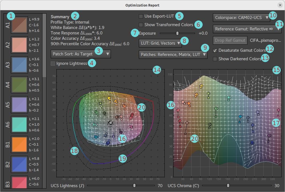
The optimization report dialog contains the following elements:
- Patch column — all the target's patches as split icons, the top left part contains the reference color and the bottom right the profile result. Beside each patch icon there are three values showing lightness (L), chroma (C) and hue (h) errors in signed DE values, ie the same as seen in the matrix and LUT tuning dialogs.
- Summary — display's the profile type viewed (will be "Internal" =
Lumariver Profile Designer's own format-agnostic profile, or if "Use
Export-LUT" is activated it will be the generated profile in the
given format (ICC, DNG, Cube) and some well-known statistical values
about the color errors that can be used to get a quick glance of
the profile's accuracy regarding the target colors.
- White Balance Delta E: of all target patches that are close to neutral (equal to or less than 2.0 LCh chroma), what is the largest CIEDE2000.
- Tone Response Delta L 2000: the maximum lightness error of all neutral patches (2.0 LCh chroma or less), in CIEDE2000 along the lightness axis only.
- Color Accuracy Delta E 2000: the statistical mean color error of all patches in CIEDE2000, that is "overall color accuracy" in daily speak.
- 90th Percentile Color Accuracy Delta E 2000: 90th percentile → the best accuracy of the worst 10 percent.
- Patch sort — choose sorting order for the patch column. The sorting function also exists in the LUT optimization dialog, and the documentation of the various patch sort orders can be found there.
- Ignore lightness — if you are only interested in chroma and hue corrections, you can enable this which will affect the statistics, patch icons and charts.
- Use Export-LUT — if enabled the statistics, patch icons and charts will show the result of the actual profile that will be exported rather than the internal representation. The exported profile may cause some further rounding and clipping.
- Show Transformed Colors — if enabled, the reference gamut is replaced with what colors the profile LUT will produce at each given input point. It's a way to visualize smoothness of the LUT. Normally, it should not be possible to see any smoothness issues, but if you work with large targets and full 3D LUT correction in a reproduction use case you might start to see smoothness artifacts in this view.
- Exposure — with the exposure slider you can visualize what happens if the image is exposed at light level different from what the profile was designed for. In principle, for 2.5D LUTs you will see very little difference in error regardless of exposure, while a full 3D LUT can be more accurate when used at the designed exposure (0.0), but will have larger errors when used at other exposures. There are many factors involved though so it's hard to predict how different exposure will affect the result, and this is a way to visualize that.
- LUT display modes — choose a combination of grid and vectors you
want to display in the charts. The grid and vectors both visualize
the LUT but in different ways.
- The grid shows how the LUT acts like stretching a rubber sheet (the grid) to make colors fit.
- The vectors are a grid of vectors that start in a perfectly square grid and then each vector end where the LUT will move the starting point.
- The vectors will better than the grid visualize how far in the color space the LUT moves a certain color. The grid on the other hand better visualizes how smooth the LUT is.
- Naturally, a uniform color space like CAM02-UCS or LutspaceV2 is best suited for this type of visualization.
- Patches display modes — choose a combination of Reference, Matrix and LUT to show in the charts. The target reference color is the square, the matrix correction is the small circle, and the LUT correction (final colorimetric profile result) is the large circle.
- Colorspace selection — choose which colorspace to use in the charts. The choices are limited to the ones typically used for chromaticity charts, plus LutspaceV2 which is a lightness/exposure independent version of CAM02-UCS, and these are the most uniform spaces.
- Reference gamut selection — the charts show a gamut
volume just for reference. Choose one which is
suitable for your use case. For example it may be interesting to
compare the target's reference color positions compared to all
real-world colors as approximated by ISO 12640-3 reference gamut,
to evaluate if you need more coverage or not.
- Reflective ∞ — the maximum theoretical gamut for all reflective colors with 0 to 100% reflectivity. This is a theoretical gamut as no real color can reach 0% reflectivity (infinite DMax), or 100% reflectivity (0 DMin). Thanks to the 0% reflectivity property this gamut reaches the locus, but as it does not emit light there is a limit to how bright colors can be, the more saturation the less bright.
- Emissive ∞ — like the reflective ∞ gamut but with the added feature that light emission is introduced so there is no limit on how bright a color can be, thus producing all colors that a human eye can register.
- ISO Refererence — the standardized reference gamut from ISO 12640-3 is a decent representation of the all real-world producable reflective colors. That is colors outside this gamut would have to be produced by means of emissive sources.
- Various RGB spaces — sRGB, AdobeRGB, Rec.2020, the gamuts of various popular RGB spaces. These will by nature appear as triangles in CIE xyY and and CIE uvY chromaticity charts. All RGB spaces are remapped to D50.
- Custom — load a custom gamut for display, by loading an ICC profile for which a gamut hull is built. This could for example be an ICC profile for a printer + paper combination if your use case is about reproduction.
- Desaturate gamut colors — no computer display of today can show color up to the locus, so either colors need to be clipped, or all colors have to be desaturated to fit into the available display gamut. If desaturate gamut colors is enabled a lower saturation is shown which means that there is no clipping, and the target patches will pop out more, so this is usually the best display mode. If you rather want to see the actual colors of the gamut volume you can disable this setting. There will then be a border drawn and a dotted pattern where clipping occurs.
- Show darkened colors — this setting only affects the chromaticity chart. Normally the chart will only show a razor-thin slice of the reference gamut exactly at the lightness value set by the slider below. If "show darkened colors" is enabled however, it will also show darker colors, you can think of it as slicing off the top of the 3D gamut volume and looking at the remaining part from above.
- Chromaticity chart. Described in more detail below.
- Hue-Lightness chart. Destribed in more detail below.
Both charts are interactive, with the following functions:
- Zoomable using the mouse scroll wheel. The mouse pointer position will be used as the center of the zooming operation.
- Pannable when zoomed in. Grab the chart by pointing and pressing the mouse buttom, move the pointer to the new position and release. Due to the way the charts are update the panning is not animated and will not update until the mouse button is released.
- Click on any target patch visible in the charts to highlight it. The patch column will also move the patch to the top, and the lightness and chroma sliders will be set to the lightness and chroma of the highlighted patch. This can be an effective way to inspect a single patch.
- Slider below the charts to select which lightness slice to view (chromaticity chart) or chroma (hue-lightness chart).
In addition to previously discussed, the charts has the following graphical elements:
- Light grey dashed line — this shows which slice the other chart displays. That is in the hue-lightness chart the dashed line is horizontal and shows which lightness slice the chromaticity chart displays. In the chromaticity chart there is a circular dashed line showing which chroma the hue-lightness chart is operating on.
- Grey elliptical outline around each reference patch — this shows where in the coordinate system the error exceeds 4.0 CIEDE2000. It's a quick visual feedback to see if the profile result is close or far from the reference, which can be otherwise be hard to see if using a less uniform color space such as xyY.
- Black dashed outline — (chromaticity chart only) shows the maximum chroma possible (locus). For lightness-independent coordinate systems like xyY, uvY, and Lutspace this line is not visible as the colored locus line always reaches the limit and is painted on top.
- Colored locus outline — (chromaticity chart only) shows the maximum achievable chroma with the current lightness setting. For lightness independent coordinate systems this line will always be at the same position regardness of lightness.
- Cyan outline — this shows the limit of what colors the
camera profile can output for the given lightness (chromaticity
chart) and chroma (hue-lightness chart). If "show darkened colors"
is enabled, the outline in the chromaticity chart will expand to
not only cover the slice at the given lightness value, but also
all colors at lower lightness levels. That is if you want to see
the total profile gamut, slide the lightness slider to max and
enable "show darkened colors".
- You will note that the profile's gamut is typically quite much smaller than the locus, which is normal. A camera will most likely still register colors outside the gamut but they will be mapped to inside the gamut.
Tone curve tab
The tone curve tab looks quite different depending on profile format modes. It's more complex for ICC and Cube profiles. ICC pipelines can include many curves in different variations, while for DNG profiles the use of curves is standardized. Cube profiles tone curve settings are quite many due to its support of reflectance (log) gammas.
The tone curve tab is not available for DNG and ICC when running in the "Reproduction" mode, as in that case a fully linear tone curve is assumed. It has to be present for Cube profiles though as output gamma must be specified also in that use case.
Input curve selection (ICC only)
Purpose: inform the profile maker which curve the raw converter's pipeline considers as linear.
Should almost never be set to anything else than the default "Auto".
ICC raw converters often have an integer pipeline, or at least had traditionally, which means that some sort of input curve is often used to give more precision to the shadow range and less to the highlights, to match our eyes' exponential response to lightness. The profiler must know what the raw converter is using. There are the following settings:
- Input Curve: Auto — the default setting which works in most cases. Only change if you experience problems or you really know what you are doing.
- Input Curve: From Target Image — extract the curve from the target image. This only works if it's guaranteed that the embedded curve (stored in TIFFTAG_TRANSFERFUNCTION tag) represents 100% linear, which may not be the case for example if the target was exported with a contrast curve (not recommended) or some sort of highlight control has been applied (may not be user-controllable).
- Input Curve: Linear — specify that there is no input curve in the raw converter's pipeline, which indeed is quite common.
- Input Curve: Capture One Gamma — the input curve used in Phase One's Capture One raw converter.
- Input Curve: Custom — load a custom input curve, using the separate "Load Input Curve" button below which becomes enabled when this setting is active. The curve can be loaded in several curve formats. This setting would be used if you are using some exotic raw converter has a non-linear input curve that cannot be extracted from the target image (and haven't got hard-coded automatic handling in the Auto mode like Capture One has got).
Lumariver Profile Designer has input curve (ICC only), input gamma (Cube only) and target transfer function. These may all be the same which can be a bit confusing. The target transfer function is derived from information embedded in the target image itself and describes how to convert the pixel values to linear. Typically this would be the same as the "input curve" that linearizes pixel values for the ICC profile, however some raw converters, for example Capture One, may have additional highlight compression or similar in the target transfer function causing them to differ slightly. This is the reason Lumariver Profile Designer handles these two curves separately.
For the Cube format there is however no difference between linearization of target pixel values and input to the profile, so in that case it's called input gamma, which also aligns with traditional video terminology.
Load base curve (ICC only)
Purpose: inform the profile maker which base curve the raw converter's pipeline will apply before the ICC profile is applied.
Some ICC raw converters (like Capture One) allow the user to select the tone curve separate from the ICC profile, while others let the ICC profile itself apply the curve. If it's the latter you should not load any base curve, otherwise you need to load the same curve that will be applied in the raw converter.
This can either be loaded as a tone curve specification directly, or as an exported TIFF file with the tone curve embedded (the case you will use with Capture One). If the TIFF file case is used the specified input curve is subtracted from the embedded tone curve to form the base curve.
Curve mode selection (ICC only)
Purpose: specify if the selected curve should be added to the base curve, or replace the base curve.
This setting is only enabled if a base curve has been loaded. If the raw converter allows the user to select a base curve, this may either be the final curve you want in the profile (if so choose "Add to Base Curve" and select a "Linear" curve below), or it's a softer curve that needs some additional contrast (the case with Capture One's general-purpose profiles). As a third alternative you may want to replace the curve with something different that may have more or less contrast than the base curve.
If you want to add additional contrast on top of the base curve, you choose "Add to Base Curve", and load or make a soft S-curve in the curve selection below. In the case of Capture One you can get this extra curve by loading an original bundled ICC camera profile.
If you want the curve selection below represent the final curve you choose "Replace Base Curve" here. Then the base curve will be automatically compensated for in the resulting ICC profile. There is a risk using this mode though — if the curve you replace with has lower contrast (or is just very differently shaped) than the base curve, the end result may show banding, typically close to the white point. To diagnose this you can open the tone curve dialog and look at the shape of the "Profile Curve" after rendering, if this has strange bends close to the white point it may mean that it can cause banding. If unsure, use the "Add to Base Curve" mode.
Curve selection
Purpose: select the profile's tone curve, either linear or some sort of contrast-enhancing S-shaped tone-curve.
For ICC profiles there is a special case when the above "Curve Mode" is set to "Add to Base Curve", then the curve selected here will not be the final curve, but just added to the specified base curve.
There are the following presets:
- ACR Default — Adobe's default curve, used in many of their profiles. A good all-around contrast S-curve with quite light shadows.
- ACR Black — same as ACR Default but with a stronger shadow dip that is similar to the effect of the default curve with automatic black subtraction enabled. In other words, this curve is an alternative to ACR Default if you don't want to enable automatic black subtraction but still want blacker shadows.
- C1 Film — another all-around S-curve variant.
- Linear — 100% linear, suitable for reproduction profiles.
- Custom Spline — design your own curve using the curve editor, or load from a file. See curve file formats.
- Custom — load a custom curve from file, not necessarily in spline format. See curve file formats.
Tone curve dialog
The tone curve dialog is used to view and optionally edit tone curves. It's documented separately in the tone curve design section.
Baseline exposure offset (DCP only)
Purpose: specify an exposure adjustment that will be applied together with the DNG profile.
If the overall result is too bright or too dark you can adjust this either by adjusting the tone curve, or specify a baseline exposure offset. Usually it's wise to compare to in-camera JPEGs to figure out what a suitable brightness is. Most often the value is left at zero.
You may also consider adjusting the exposure with the tone curve rather than using baseline exposure offset, as described in the tone curve design section.
Automatic black subtraction (DCP only)
Purpose: specify if the DNG profile should instruct the raw converter to perform automatic black subtraction (or not) before the profile is applied.
Adobe's raw conversion products supports automatic black subtraction, which means that depending on subject more or less of the blacks will be subtracted to create blacker shadows and slightly more contrast. Among third-party raw converters it varies if automatic black subtraction is supported, and if it is it's not necessarily the same as Adobe's as their algorithm is proprietary and not part of the DNG specification.
All(?) Adobe's own profiles have automatic black subtraction flag enabled, so if you are making a general-purpose profile for Adobe it's generally wise to enable it. If you want 100% predictable result as for a reproduction profile, or if you will be using the profile in several different raw converters and want the same result you should disable it. Making a stronger shadow dip in the contrast curve gives a similar effect.
Lumariver Profile Designer's image renderer has a basic automatic black subtraction algorithm, which yields a similar result to Adobe's products, but not exactly the same. That is you will see an effect of the flag in this software, but it may not be exactly the same as the result in other raw converters.
Output gamma type (Cube only)
Purpose: specify if the Cube LUT output should be reflectance (log format) or display.
If the Cube LUT will be used in a workflow where color grading is applied on top, it's often desirable to work with log encoded footage, and then a reflectance output gamma should be used.
If the Cube LUT is supposed to produce ready-to-display footage a display gamma should be used. This can also work in a color grading workflow if the grading will only need to make smaller adjustments.
Output gamma selection (Cube only)
Purpose: specify the gamma of the color space the Cube LUT will produce its output to. Should always be set.
The available options will depend on which output gamma type that has been selected, that is there will either be log gammas or display gammas in the list. There is also a possibility to load a custom gamma, and you advanced users can extend the list of gammas by adding additional entries in the static settings file.
Normally an output color space will be defined by a combination of gamma and gamut. In this software you select gamma and gamut separately so you can make any combination you like, but in normal use the gamma selection is tied to the output gamut selection which is on the export tab.
In a Cube profile workflow, the input and output gamma and output gamut must match the environment the Cube profile will be used in. This means that the values for these settings are normally found in the settings of the video editor project where the Cube profile will be used.
Scale input (Cube only)
Purpose: specify how to scale the input to match the range available in the output.
This setting is only available if the output gamma is reflectance (log format), in which case it is expected that also the input gamma is of reflectance type. Reflectance gammas have a defined range, and thus if input gamma has a different range than the output gamma Lumariver Profile Designer must know how to deal with that. There are the following settings:
- Keep — the absolute reflectance of the input is kept, just re-encoded to the output gamma. This means that if the input gamma has a larger range than the output gamma there will may be some clipping.
- Fit — the maximum value of the input is scaled so it matches the maximum of the output. The black point (value 0) is always aligned, so there may be clipping in the negative range (that is noise below black) if the input has more negative range than the output.
- Custom — first the input is scaled to match the output, then scaled with the given number of f-stops. That is if the scale is left at 0 stops, then it will be the same as the "Keep" setting.
Knee range (Cube only)
Purpose: specify which reflectance range that should be considered to be extended highlight range, which then can be compressed with a knee.
If the input gamma is a reflectance curve (ie log footage), there is usually an extended highlight range. On the knee range line the actual clip level of the input gamma is shown. If this is 1.0 it means that the input gamma is a normal still image transfer function and thus does not have any extended highlight range. For log footage the value is typically somewhere in the range 16 to 64, with the exception of very small video cameras with limited dynamic range (some drones, action cameras) which may not have more than 2.
The knee low range should be the reflectance that should be considered as the maximum normal range value, that is where a normally exposed stills image would clip. The normal tone curve is applied only up to this value, and the remaining range is handled by the knee compression settings.
The knee high range is the reflectance above which we choose to hard clip, that is everything above that value will be clipped away rather than compressed.
Normally exposed still images usually clip at about 2.0 reflectance (twice the brightness of 100% perfect white), so that is a good value for reflectance low range.
Some video footage have extreme highlight range, and if we cram it all in it may be either so strongly compressed that there is a significant loss of detail anyway, or we need to use such a low knee output level that we get very low global contrast. If you make a Cube LUT for some sort of pre-processing you way want to keep the full range in those cases, but normally putting more than 3 stops into the knee (range 2.0 to 16.0) is not advisable.
Should the specified knee range exceed the available range (the input gamma Clip level), the values are aoutmatically adapted in processing. Say if the range is 2.0 to 16.0 and the clip level is only 6.0, the result will be as if 2.0 to 6.0. If the clip level is below the low range, there will be no knee at all.
This automatic adaptation makes it possible to leave this setting at the default values for any camera, meaning that changing the values is not a common thing to do.
Knee output level (Cube only)
Purpose: specify at which output level the knee should be, that is where the compression of the extended highlight range (if any) starts.
If there is an available extended highlight range as specified with the knee range setting, this will be smoothly compressed in the output from the specified knee output level up to 1.0. That is if the knee output level is set to 0.9 the last 10% of the output (that is 920 - 1023 in case of 10 bit video output), will be used for compressing the extended highlight range.
If you want to just clip the extended highlight range rather than having a knee with compression, set this value to 1.0 (ie leave no space for compression), and specify the clip level with the knee range low setting.
If the knee range is so small that the highlight range would be expanded rather than compressed, the knee output level will automatically be adjusted such that a linear result is had (neither compression or expansion). If this actual value used differs from the specified, it will be displayed on beside the "Knee Output Level" label.
To guarantee a smooth transition the knee compression range will be limited to not have less slope than the ending slope of the tone curve. If the end slope of the tone curve is too flat in relation to the knee output level, it will be automatically raised to fit. So if you see the output level being raised despite wide knee range, make sure your tone curve doesn't have too flat ending.
The output level is mapped directly to the selected output gamma. If you have selected a HDR output gamma and want the knee be where the extended highlight range starts, you need to find out which code value that is and scale accordingly to a 0.0 to 1.0 range.
View curves
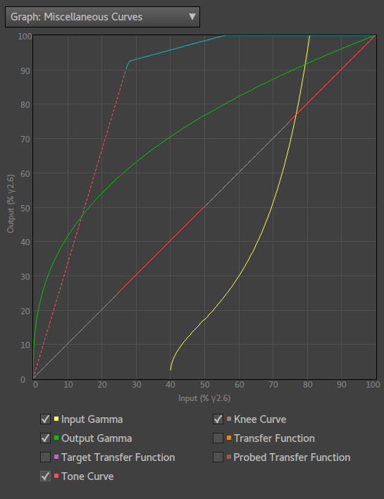
The "View Curves" button will bring up a dialog where you can for informational purposes view a number of curves related to the current project.
Depending on type of project there are different curves available to view. DNG projects has the least amount of curves, while ICC and Cube projects may have plenty. By hovering with the mouse over the checkbox labels you get a short explanation of the associated curve.
- Input Curve — only visible for ICC projects and represents what the intended raw converter consider as being linear.
- Input Gamma — only visible for Cube projects and represents the gamma encoding of the source material. Input Gamma for Cube projects and Input Curve for ICC projects are actually the same thing conceptually, but Input Gamma is more of a video terminology so different names are used for ICC and Cube. Input Gammas can also be reflectance gammas and in that case you will only see the section of the gamma that covers the 0-1 range in this view.
- Output Gamma — only visible for Cube projects and represents the gamma encoding of the output. It may be a display gamma, which then starts at 0,0 and ends at 1,1 (bottom left and top right corners in the diagram), or a reflectance gamma and then only the range covering 0-1 will be visible.
- Target Transfer Function — the transfer function as extracted from the target image. For ICC projects this is typically the same as the Input curve, but not always.
- Tone Curve — the tone curve selected for the profile, ie the one you choose separately and can also make a custom design for.
- Knee Curve — only available if input gamma is a reflectance gamma and output gamma is a display gamma, then this shows the tone curve modified with knee highlight compression. The tone curve sections is shown as red dashed lines, and the highlight compression section is shown as a cyan line. Note that this curve is applied on the linearized input scaled to fit 0-1 range, ie the x axis on the diagram does not represent the 0-1 reflectance range for this curve, but instead the full input reflectance range compressed to 0-1, except the negative range (if any).
- Base Curve — only available for ICC projects and shows the result of the base curve setting. The base curve represents the curve which the raw converter will pre-apply to an image before it applies the ICC profile.
- Probed Profile Curve — this curve is derived by probing the actualy rendered profile along the neutral axis. Depending on project configuration it should match up with one of the other curves, but may be a bit rounded off due to limits in profile resolution.
- Transfer Function — conversion from input pixel range to output pixel range along the neutral axis. This curve excludes any lightness correction that the profile may do.
- Probed Transfer Function — same as transfer function but probed from the actual rendered image. Due to limited precision in the profile format it may be a bit rounded off compared to the calculated transfer function curve. If the profile does lightness correction the probed transfer function may differ quite significantly from the calculated transfer function, especially if "Scale to Match" headroom setting is used. Also note that if the input curve (ICC profile) does not reach 100%, which might be the case in some reproduction projects, the probed transfer function may have a wierd shape near the clip point, this is also normal and not harmful as it is in very near the clipped range and beyond.
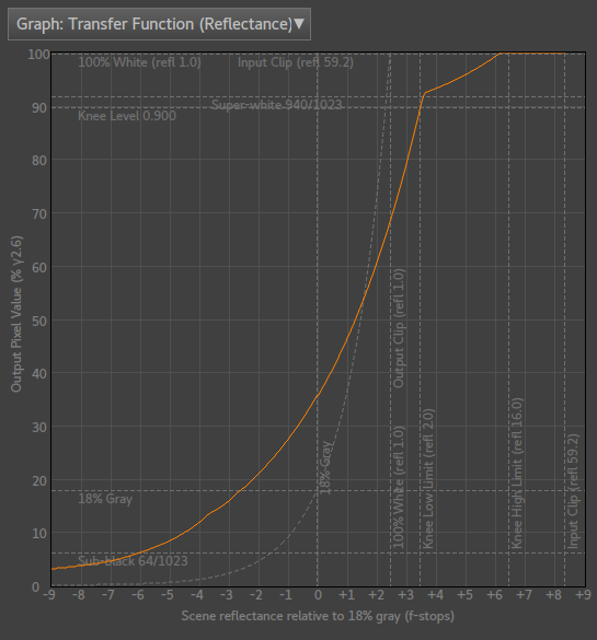
For Cube projects there will also be a drop-down where you can choose different diagrams to view.
- Miscellaneous Curves — this is the basic view also available for ICC and DNG projects, where the range is 0 to 100% displayed with the same gamma as selected in the tone curve editor (usually sRGB). This works well for all curves that are display-related, that is the range is from 0.0 to 1.0.
- I/O Gammas — display input and output gammas, and transfer function in a logarithmic diagram centered at 18% gray. These diagrams are common in video where you work with reflectance.
-
Transfer Function — view the profile's transfer
function from input to output image pixel values 0 to
100%. The diagram has also a number of informational help lines:
- 18% Gray — the standard middle gray, which perceptually is about halfway between black and white in printed material.
- 100% White (refl 1.0) — a perfect 100% reflecting white. Brighter reflectance than this requires an active light source. Note that if this actually represents a true 100% white in an image depends on how that image was exposed.
- Max reflectance — the maximum reflectance that the camera can reproduce. This is only available if the camera will not use the full range of the gamma curve, which is quite unusual. Arri has this behavior for some gammas.
- Input Clip — the output pixel value where the inputs clips, ie there will be no output values generated over this level as the input cannot produce it. This line is only shown if the output range is larger than the input range.
- Output Clip — the input pixel value where the output clips, ie all input values above this level will be clipped. This line is only shown if the inptu range is larger than the output range.
- Sub-black 64/1023 — the pixel level which in video is considered as sub-black. See "video levels" vs "full levels".
- Super-white 940/1023 — the pixel level which in video is considered as super-white. See "video levels" vs "full levels".
- Knee level — only visible if the output gamma is a display gamma, and then it shows the output pixel level where the knee highlight compression starts.
- Knee low/hi limit — only visible if the output gamma is a display gamma, and then it shows the low and high limits of the kneeknee highlight compression at the corresponding pixel input levels. Note that the resulting knee curve may not exactly match up with the knee limit due curve fitting in the knee compression algorithm. Input levels below the low limit is unaffected by compression, and levels above the high limit is clipped.
- Transfer Function (Reflectance) — an alternate view of the transfer function where input is shown on a logaritmic scale as scener reflectance relative to middle gray. Video workflows often use this scale to determine the available exposure range.
Curve file formats
Curves can be imported from several types of formats, exactly which ones available depends on context. Here's an overview of the formats:
- Extract curve from DNG Profile — in this case the embedded ProfileToneCurve tag is extracted if available, otherwise the curve becomes linear.
- Extract curve from ICC Profile — an ICC profile doesn't have an embedded tone curve in the same way as a DNG profile, so in this case an "effective curve" is extracted by probing the neutral axis.
- Extract curve from TIFF image — the curve is extracted from the TIFFTAG_TRANSFERFUNCTION tag if available, otherwise the curve becomes linear.
- Extract curve from Cube or Cube-like profile — if the software detects some sort of Cube-like format it will extract a curve from it. If the profile contains a 3D LUT it will probe the neutral axis to get the curve. It could also be a simple 1D LUT, that is just the plain curve. If you work in video workflows it's likely that you will get curves in these type of formats.
- Spline (and Linear) file formats — described separately below.
The spline file formats can be both imported and exported. Two formats are supported, one JSON based that looks like this for a spline:
	    {

	      "CurveType": "Spline",

	      "CurveHandles": [

	        [ 0, 0 ],

	        [ 0.199557, 0.185185 ],

	        [ 0.649667, 0.812169 ],

	        [ 1, 1 ]

	      ],

	      "CurveMax": 1.0,

	      "CurveGamma": "sRGB"

	    }
and the other is the RawTherapee spline format (.rtc) and looks like this:
	    Spline

	    0 0

	    0.199557 0.185185

	    0.649667 0.812169

	    1 1
The RawTherapee format doesn't specify gamma, the curve is
interpreted as being in sRGB, unless loaded as a custom spline when it
will be interpreted as in the currently selected viewing gamma. While
you can use the JSON format with the DCamProf command line tool and
the .rtc format with RawTherapee, the main purpose of
using these text formats is that the formats should be easy to
hand-edit if needed, or imported/exported to/from a spreadsheet or
some other technical software.
If you have a huge table in a spreadsheet or similar that you only
want to be linearly interpolated (there's a limit to how many spline
handles you can have), you can't load it as a spline, but you can load
it as a custom curve. Make a .rtc file with all the values (X, Y from
0 to 1) but set "Linear" in the first row instead of "Spline". If you
need to specify a different gamma than sRGB you must use the JSON
format, with "CurveType" set to "Linear" and "CurveGamma" to a desired
real number.
If you want to specify a pure gamma curve, the JSON format supports that too, like this (gamma 1.8 in this example):
	    {

	      "TRC": 1.8

	    }
Look tab
The look tab is hidden if the software runs in "Reproduction Mode" as it makes no sense to apply looks to a colorimetric profile made for copy work. It's purely intended for general-purpose profiles.
Tone reproduction operator
Purpose: select tone reproduction operator, which affects how colors are modulated to compensate for the tone-curve contrast changes, resulting in different "looks".
The tone reproduction operator is only relevant if the tone-curve is not linear, as otherwise there is no contrast change and thus nothing to compensate.
The following tone reproduction operators are available:
- Neutral — this is the signature tone operator of Lumariver Profile Designer and the DCamProf technology it's based upon. By advanced perceptual modeling it keeps color appearance neutral/unchanged when contrast is changed.
- Simple — use the plain tone operator natural with the current profile format, which is the ACR tone operator for DNG profiles and a pure RGB curve for ICC and Cube LUT profiles. If this is enabled no gamut compression or look adjustments can be applied as there is no look LUT generated.
- RGB — the traditional plain RGB curve, with its characteristic look of high saturation and some hue shifts.
- ACR — the tone curve used by Adobe Camera Raw and defacto standard for DNG profiles, which is a curve that copies the saturation increase of the RGB curve, but keeps the HSV-hue constant so perceptual hue shift is (almost) eliminated.
- RGB-Lum — a combination of a pure RGB curve and a pure luminance curve for the S-curve's shadow dip. This reduces the over-saturation and color shift issues of a regular RGB curve, while still keeping some of its traditional look.
The neutral tone reproduction operator is the one we strongly recommended, and is a key feature that sets Lumariver Profile Designer apart from other profile makers. The fundamental idea of it is to keep colors perceptually the same after the contrast has been applied. No hue shifts, no saturation increase or decrease. It's not possible to make such an operator 100% perfect as it's somewhat subject dependent, and can also vary a bit over the image surface, but we dare to claim that it is as close as it can get.
The classic RGB tone operator suffers from hue shifts by design, but by applying it in a carefully balanced colorspace those have been minimized. The hue shifts does cause an artificial hue separation effect which some may like. The mixed operator RGB-Lum is usually a better toned down choice if you like the look of the RGB tone operator.
TRO Variant
Purpose: select a variant of the currently selected tone reproduction operator for further fine-tuning of its look.
Currently only the "Neutral" tone reproduction operator supports different variants, and the alternatives are as follows:
- TRO Variant: Neutral — no adjustments made to the tone reproduction operator.
- TRO Variant: Skin&Sky — highlight rolloff optimized for skintones and sky, which means earlier desaturation in the skintone range (to make skintone highlights look "lighter" and "fresher"), and later desaturation in the sky blue range (to keep natural saturation in bright skies).
- TRO Variant: RGB-Lum Mix — 50/50 of "Skin&Sky" and "RGB-Lum", a bit less hue accurate but some may find it "lighter" and more "lively" while being more realistic than the "RGB-Lum" alone.
- TRO Variant: Lively — a subjectively tuned variant based on "Skin&Sky", mixing in some "RGB-Lum" in the Red-Brown-Skin range having a similar effect as the "RGB-Lum Mix" variant, but more targeted "where it counts", subjectively speaking. That is overall accurate color, with some compromise in the Red-Brown-Skin range to achieve a lighter more lively look.
- TRO Variant: From Base Look — copy the TRO variant parameters from the base look, if any. If you load a custom base look you can thus make your own TRO variant.
Curve saturation
Purpose: manually adjust the overall saturation of the neutral tone reproduction operator.
If the neutral tone reproduction operator is used you can adjust the overall saturation. This is generally not necessary (the automatic mode works well), but you may subjectively want higher or lower saturation as a look feature, and then you can manually adjust the value.
First render the profile once to get the automatic value displayed, and then you can adjust from there. The setting is very fine, it's hard to see any difference for the smallest steps.
Gamut compression
Purpose: select how much the saturation of ultra-saturated colors should be reduced to lower the amount of out-of-gamut clipping.
One might think that today raw converters would deal with gamut compression in real-time inside the software without involving the profile. While this probably is a good idea it's not how it's done today — raw converters still expect that the camera profile provides some static gamut compression to deal with high saturation colors.
With version Lumariver version 2 a new gamut compression algorithm is introduced, which can be configured in detail in its own adjustment dialog. This is now the default, but the old presets (with varying compression strength) is also availble for backwards compatibility. Gamut compression can also be completely disabled by using the "None" setting.
There's also the special choice "From Base Look" which means that the gamut compression parameters are loaded from the selected base look, if any. Note that this is an experimental setting, and exists now mostly for backwards compatibility. With version 2 of the gamut compression algorithm you can configure it in detail directly in the adjustment dialog so there is no need to resort to configuration files.
Regarding the old sRGB/AdobeRGB presets: The gamut compressor is not "exact", that is even if you set it to "sRGB" (the smallest gamut) it may produce colors outside of that gamut. The reason is that some clipping is desired otherwise scenes like sunsets will look flat and dull. The "Strong" variants applies a contrast compression in addition to a pure saturation compression, which further compresses the gamut.
How strong compression to use is a matter of taste, and it also depends on how well your raw converter can handle gamut compression in itself. The default setting works well in a variety of conditions and is about the same strength as found in typical bundled camera profiles. The gamut compression effect can be hard to see in "normal" images as it only affects high saturation colors — in other words you should use images with bright high saturation colors when comparing the effects of the various settings.
If version 2 compression is used, you can if you desire configure it in detail. Normally there's no need to do so, but for those that want precise control it is now available.
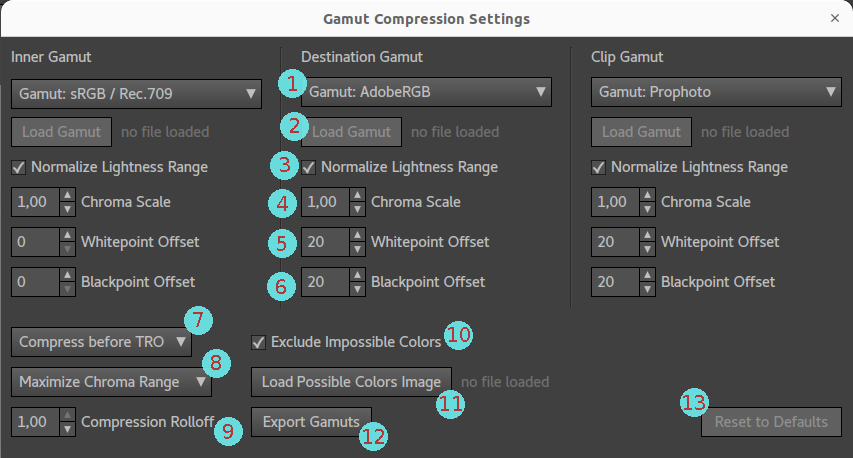
The gamut compression settings dialog contains the following elements (1-6 exists and is the same for all three gamuts, inner, destination and clip):
-
Gamut selection — choose from a predefined list of
gamuts, or select custom. In addition to the usual suspects
there are also a few special gamuts:
- ISO Reference — the ISO 12640-3 gamut which represents real-world reproducable reflective colors.
- ISO Reference 2D — a 2D version of the ISO Reference, that is lightness and thus exposure independent.
- Locus 2D — the human Locus, lightness / exposure independent.
- From Target Image — the same gamut as the target image is using.
- A "2D" gamut in this case means that if the gamut volume is sliced up in xyY space each slice will be equal, in other words the Y axis is the one that's not used.
- Load Gamut — activated when custom gamut is selected, and then you can load gamut as an ICC profile which supports complex gamut volumes (such as a print/paper profile), or JSON format for an RGB color space defined the same way as the gamuts for the output gamut setting.
- Normalize Lightness Range — if enabled, the gamut will be scaled such that the whitepoint hits 100% reflectance and blackpoint 0% reflectance. For simple RGB gamuts this is always the case and thus the setting has no effect. Gamuts loaded from an ICC profile, such as a printer gamut, normally has whitepoint lower than 100% and blackpoint higher than 0%.
- Chroma Scale — scale the chroma of the gamut such that it holds more or less saturated colors. A value of 1 means no change. The scale factor is applied in a linearly extended CAM02 space.
- Whitepoint Offset — how many CAM02 lightness units to raise the whitepoint. The whitepoint is raised with the indicated amount (ie if the original whitepoint is at lightness 100, the offset is 20, the new whitepoint is 120), and then the offset is faded out towards the maximum chroma waist of the gamut. The offset is applied after normalize lightness has been applied.
- Blackpoint Offset — same as whitepoint offset, but for the blackpoint. The blackpoint is lowered with the indicated amount, and may end up at negative. That is if the original blackpoint is 0 and the offset is 20, the new blackpoint ends up at -20, and the offset is faded out towards the maximum chroma waist of the gamut.
- Compress before or after TRO — specify if the gamut compression should be applied before or after the tone reproduction operator (and look adjustments). If applied before, it means that it's applied in the linear colorimetric stage so the compression will work on scene-referred colorimetric colors. When contrast and saturation increase is applied by the TRO afterwards it may pull some colors out of gamut again, which then is clipped using the smart clipping algorithm. In practice this means that the compression will have a softer effect, and the result is a bit harder to predict. If you want to have the full effect of the compression, you can apply it after the TRO is applied and then it will also affect the color changes introduced by that. This gives a more predictable result, but may not be as visually pleasing. Please, do experiment.
- "Maximize Chroma Range" or "Preserve Lightness" — instructs the compressor if it may manipulate lightness to reduce chroma compression, or if it should keep lightness intact which will cause more chroma compression. Gamuts will have their maximum chromas at a medium lightness. This means that if we want to maximize chroma of a light color we can do so by darken it a bit, and for a dark color we achieve the same by lightening it a bit. As lightness is a less sensitive aspect in terms of accuracy, it may be worthwhile to use the maximize chroma range, which will maintain a wider chroma range after compression.
- Compression Rolloff — smooth control between the compression being more evenly distributed in the range between inner and destination gamuts, or if most compression takes place close to the destination gamut border. The default, 1.0 (actually max value) makes more compression close to the destination gamut, and lower values distributes it more evenly, ie desaturation occurs earlier. The range is controlled such that the shape of the compression Bezier curve is always smooth, so the effect of different settings is rather subtle.
- Exclude Impossible Colors — the range of possible colors that the profile matrix and LUT can produce may in some ranges be smaller than the clip gamut. If "Exclude Impossible Colors" is enabled, the clip gamut is reduced so it does not extend beyond the colors the profile can produce. This way unnecessery compression is avoided, but will also lead to slightly different compression depending on the camera profile as the clip gamut depends on that.
- Load Possible Colors Image — specify which colors that can occur by loading a single image which defines all possible colors. This is generally only applicable if you intend to make a profile specifically for one image only. To have effect, the "Exclude Impossible Colors" setting must be enabled, and then the gamut defined by the image colors (with profile applied) is used instead of the profile gamut as the defined gamut limit.
- Export Gamuts — choose a directory where 3D obj files will be saved with the inner, destination and clip gamuts, in Lumariver's linearly extended CAM02 space which is the color space the gamut algorithm is working in. Note that if "Exclude Impossible Colors" is active the clip gamut may be affected and to be sure to get the current clip gamut you need to render the profile first.
- Reset to Defaults — reset to a default setting which will yield a good all-around gamut compression with a subtle effect.
As you see the gamut compression algorithm works with three gamuts, inner, destination and clip. Normally the inner is smallest, destination a bit larger and clip the largest.
The gamuts works as follows: all colors inside the inner gamut will be unaffected, ie not compressed at all. Anything outside the clip gamut will be clipped rather than compressed. The range between the inner and clip gamut will be compressed such that it fits between inner and destination gamut.
In the version 2 algorithm, the gamuts are true 3D volumes defined in Lumariver's unique linear-extended CAM02 technical color space. This means that the algoritm can work with colors in a hue-constant way and that it won't break apart even for colors that are outside the human locus (such theoretical colors do occur quite frequently in profile making).
A typical gamut volume will become narrower when nearing the whitepoint or blackpoint, or in other words for very light or very dark colors high saturation cannot be achieved. To avoid making too strong compression it is often worthwhile to enlarge the destination and clip gamuts, using the whitepoint and blackpoint offset settings. This will lead to more clipping near whitepoint and blackpoint, which while not hue accurate will keep more saturation.
Currently it's not possible to visualize the gamuts in the user interface, which indeed would be helpful. You can export the gamuts and open them in a third party app to view them though. Configuring gamut compression is a highly technical task and at this time intended for advanced users.
Note that the software also performs clipping in a smart way, so even with gamut compression disabled or with only weak compression, colors are clipped wisely:
- Colors outside the available RGB gamut triangle in xy plane (ie at least one channel value is negative) will be mapped to the gamut edge in a hue-stable color space which can deal with out-of-locus colors.
- Overexposed colors, ie at least on channel above max value, will be clipped keeping as much chroma as possible at the cost of hue stability, while keeping hue shift aesthetically pleasing. Red turning yellow, blue turning cyan, and green turning yellow or cyan is accepted as ok. The reason being that for example red turning yellow is traditionally associated to over-exposure. Blue or red turning into magenta is undesired as that is not associated to over-exposure, so in this range more desaturation is applied to maintain hue stability.
Base look
Purpose: select a (subtle) look to apply on top of the generated profile.
The currently available looks are:
- Neutral+ — makes subtle changes intended to not
significantly hurt accuracy but add some subjective changes that can
make a neutral profile look even "more neutral than neutral". It
does the following (the ones marked with NTRO has effect only when
the recommended Neutral tone reproduction operator is being used):
- slight warm-up of midtones and highs in greens and yellows for making sunlit areas stand out more in landscapes
- slight saturation increase, skin-tones excluded as well as already highly saturated colors
- slight reduction of green component in oranges to get better separation between greens and reds (for landscapes)
- make neutrals more neutral (increases color "purity" and helps noise reduction)
- None — no change.
- Custom — load a DCamProf look specification in JSON format. With it you can enable the live reload checkbox if you want to edit the text file and have an automatic reload each time the file is saved. This is an advanced feature not intended for mainstream use.
Note that the changes are so subtle that they may be difficult to see depending on subject material. This is intended. While you can design strong looks if you want to, we think that highly subjective looks are better left to the post-processing tools in the raw converter, and profiles should just concentrate on giving a good realistic result that can be used as is, or as a well-defined starting point for creative post-processing.
Look adjustment workspace (Cube only)
Purpose: when log output is enabled make it possible to apply look adjustments in a more practical gamma.
This setting is only applicable and visible for Cube profiles with a log output gamma selected.
When the output gamma of a Cube profile is a display gamma, the look adjustments are conveniently applied after the tone operator to make final adjustments in a range that is suitable for display. With a log gamma however, the linear full range is available to the look adjustments, which for video cameras can be a huge highlight range, meaning that the normal range appears very dark. While it is possible to make adjustments in this space, it can be a bit unpractical. Therefore you can in the case of log output adjust the workspace for the look adjustments:
- Log — instead of working on the linearized data, apply adjustments in the log gamma instead. While it may seem like a backwards way of working as contrast is low and colors appear desaturated, many video colorists are by tradition used to apply adjustments directly to log output.
- Linearized full range — the most "correct" space to work in, all data linearized and the full range available. This is the default, but it's not very user-friendly as the output image normally appears very dark due to that video cameras dedicate most range to highlights.
- Linearized, with knee curve — keep the full range, but compress the highlights with a knee curve. The image will still be significantly darker than normal display output, in order to minimize highlight compression and make the full range available for adjustments.
- Linearized, with clipping — this workspace is fully linearized, and clips everything over 100% reflectance. It's the most user-friendly mode to work in, but you lose access to the highlight range, and if you make strong adjustments close to the clip point, the transition into the highlight range may not look good.
Edit look adjustments
Purpose: add subjective look adjustments that are applied last, after tone reproduction operator, gamut compression and base look.
Manually tuning the look with look adjustments is intended for advanced users that have very specific ideas of how the colors out of camera should look. It's documented in the separate section about look adjustments.
Export tab
In the export tab you convert the internal Lumariver Profile Designer profile to a DNG, ICC or Cube LUT profile and save it to disk. The export tab is named according to the project's export format.
Profile Name
Purpose: set a descriptive name of the profile to identify it in the raw converters.
This is usually the string that shows up inside your raw converter, so choose the name wisely so you can differ profiles from each-other. (Some raw converters use the file name instead though, so it's good having the habit to choose a descriptive file name too.)
Profile Copyright
Purpose: set the copyright string.
A typical copyright string would be "Copyright your name". This string is usually not shown in the raw converter.
Embed policy (DCP only)
Purpose: restrict how the profile is allowed to be used.
This DNG profile-specific field specifies how you as the profile creator wants the profile to be used. Not all raw converters care about this flag, and it's not by any means a copy protection, but it provides an opportunity to display your intentions. The alternatives are the following, and the explanations for each value comes from Adobe's DNG specification document:
- Allow copying — the camera profile can be used to process, or be embedded in, any DNG file. It can be copied from DNG files to other DNG files, or copied from DNG files and stored on the user’s system for use in processing or embedding in any DNG file. The camera profile may not be used to process non-DNG files.
- Embed if used — this value applies the same rules as "allow copying", except it does not allow copying the camera profile from a DNG file for use in processing any image other than the image in which it is embedded, unless the profile is already stored on the user's system.
- Embed never — this value only applies to profiles stored on a user's system but not already embedded in DNG files. These stored profiles can be used to process images but cannot be embedded in files. If a camera profile is already embedded in a DNG file, then this value has the same restrictions as "embed if used".
- No restrictions — the camera profile creator has not placed any restrictions on the use of the camera profile.
Use ACR color matrices (DCP only)
Purpose: embed Adobe's standard color matrices instead of using Lumariver Profile Designer's calculated color matrices, in order to avoid a white balance shift for custom white balances in Adobe's software.
Due to a design choice made by Adobe, their software doesn't store custom white balance settings as true RGB multipliers but as temperature/tint and thus the actual result becomes dependent on which color matrices the profile has.
When calculating a profile in different software with different targets the color matrices don't become exactly the same if the camera is the same. That is Lumariver Profile Designer's color matrices won't exactly match Adobe's own, and this means that if you have set a custom white balance in Adobe's software and change from an Adobe Standard profile to your custom profile the white balance will shift slightly.
To avoid this you can instead copy the color matrices from Adobe's standard profile into your custom profile. This will only affect the white balance handling, not the color as such as there is a different matrix for that (the "Forward Matrix").
Note that if you're not using Adobe's software this may not apply, as different raw converters handle white balance in different ways. There's no harm to copy the matrices even if you don't need to though, so if unsure how the profile will be used leave the setting checked.
Naturally, the color matrices can only be copied if you have the Adobe profile installed. If not uncheck this setting otherwise the export will fail.
Avoid forward matrix clipping (DCP only)
Purpose: specify if the forward matrix should be the real one, or a compressed one expanded by the LUT to avoid clipping issues for ultra-saturated colors.
This technical setting should be left at its default unless you have a special need that requires the embedded forward matrix to be the real one rather than a compressed version that is expanded by the LUT. The key reason for disabling this setting would be if you want to make a compact matrix-only profile.
In the normal case this should be enabled to make sure that ultra-saturated colors are not clipped prematurely.
Output gamut selection (Cube only)
Purpose: specify the gamut of the color space the Cube LUT will produce its output to. Should always be set.
The gamut should match the environment where the Cube LUT will be used, which typically is in a project in a video editor.
If you do not find your desired gamut in the list of options, you can choose the custom option and load a gamut from an ICC profile or JSON file, where the format is the same as in the static settings file, and a self-explanatory example is given below. Advanced users may also choose to permanently extend the list of gamuts by adding new gamuts to the static settings file.
	    {

	      "Name": "Aces AP0",

	      "RGBPrimariesXY": [ [ 0.7347, 0.2653 ], [ 0.0000, 1.0000 ], [ 0.0001, -0.0770 ] ],

	      "WhitePointXY": [ 0.32168, 0.33767 ]

	    }
Correct white balance (ICC and Cube only)
Purpose: make the profile alter the white balance in the target photo to the calculated optimal white balance, useful in some reproduction workflows.
There are many workflows regarding reproduction photography, one is where you set the white balance in-camera before shooting the target, another is to have a fixed white balance in-camera (say Flash setting), and then let the profile itself correct the residual white balance offset based on the white calculated from target. This setting is intended for the latter. That is it's probably only useful for fixed reproduction photography setups.
The setting is suitably combined with the "Neutral: From Reference" setting in the optimization tab, which then means that the white is entirely controlled by the target reference values.
High resolution LUT (ICC and Cube only)
Purpose: make a denser LUT (higher resolution) to support sharper bends in the color correction, useful in some reproduction cases.
While the DNG profile LUT is always made quite high resolution by necessity (due to how curves and LUTs interact in the format), ICC and Cube profiles can normally be made more compact and this is the default for general-purpose profiles.
However, if you desire a denser LUT table, for example to make it better follow strong corrections, you can enable a high resolution LUT. It's never harmful to have a high resolution LUT except that the profile becomes larger and takes longer time to render. This is the default for reproduction profiles. Do note that if you actually need a high resolution LUT to get better matching, there is a risk that the profile has too strong bends to produce smooth gradients.
Export profile
The export profile button (named differently depending of the project's file format) will open a dialog where you can choose where to save your exported profile, and choose filename. If the profile hasn't been rendered yet it will be rendered before the dialog opens. If the profile can't be rendered (for example if the target grid is not placed yet), this button is disabled.
Consult the documentation of your raw converter to find out where it wants its custom profiles stored.
For DNG Profile projects there's a text below the export profile button that displays the camera's make and model, which will be embedded in the resulting profile. The make and model is retrieved from the primary target image. Many raw converters, including Adobe's, require that the make and model exactly matches what they expect to make it show up in the raw converter's profile selection. As long as the target raw image is actually shot with the camera model that the profile is made for it will work out fine.
If you by some reason would require the make and model be different than it is in the target (for example to test a profile made for camera A on camera B which is different but has the same sensor), you will have to use the Inspect/Edit Profile tool to manually change it after you have exported the profile.
Profile comparison tab
The purpose of the profile comparison tab is to provide efficient means to compare the often subtle rendering differences between different profiles on a number of test images of your choice. When making active design of the tone curve and look, using real scenes rather than the target images to evaluate different settings is very useful.
You can also load generic TIFF or JPEG images, such as an in-camera JPEG, for comparison.
Comparison strategy
The comparison tab does not allow for side-by-side comparison (view two images simultaneously side-by-side) but is instead designed for swapping back and forth between images you compare. There is a good reason for this — side-by-side comparison doesn't really work when the differences are relatively small, or very large. One reason is that viewing angle is often suffering. A display, even one with good viewing angle, is usually only fully accurate when viewed exactly perpendicular. With side-by-side viewing the viewing angles become different and sub-optimal.
Another more critical problem with side-by-side viewing is that of eye-brain adaptation. For example, the eye-brain will adapt to the contrast in the image, and then modulate how saturation is perceived. If you view two images side-by-side with different contrast the adaptation will be somewhat in-between, and the lower contrast image may look over-saturated while the higher contrast image looks under-saturated.
The proper way to compare images is to view image A, straight on to avoid viewing angle issues, and then swap to image B, wait a couple of seconds for the eye-brain to adapt and then evaluate differences. In other words, layered on top much smaller differences can be detected than if viewed side-by-side, and it's also feasible to compare images with different contrast.
One typical and very useful comparison when designing general-purpose profiles is as follows: make a profile without any tone curve or look (that is a reproduction style profile) which then can be used for reference for colorimetric accurate colors. When starting to work with tone curve, look and subjective adjustments you can in the profile comparison tab duplicate test images and load the colorimetric profile on one of them, and use the current project profile on the other. This way you can make A/B swaps with a known reference. As the colorimetric profile has no tone curve it will render much darker. Use the exposure setting to push exposure so midtones became about equally bright (about 1 stop), then it becomes easier to compare.
Why is comparing to the colorimetric base profile useful? When you design a general-purpose profile with subjective adjustments you may find that you'd like to adjust some color because it seems to be "off". Why is it "off"? Is it because there is something wrong in the colorimetric matching, or is the look or tone operator introducing some color distortion, or is it just your taste on how certain colors should be rendered? If there actually is a problem in the colorimetric base profile it's better to correct that first by adjusting the matrix and/or LUT optimization, rather than post-correcting in the look adjustment editor. If you correct colorimetric errors in the look adjustment editor that look cannot be re-used on other profiles as they may not have the same colorimetric errors.
In other words, as the profiles are layered from colorimetric base profile and up it's desirable to know in which layer a color problem is introduced so you can make appropriate design decisions.
Image selection
The target image(s) is always available in the image selection drop-down list, and those cannot be removed or re-ordered. Below the list there are buttons to add, drop, duplicate or move an image up in the list (to reorder).
To change the viewed image you use the mouse to pick the image from the drop-down list, or you use Shift+Up keys or Shift+Down keys. The keyboard control works also if there a different tab in view, except for the target tabs which only show the target images.
For most effective A/B swapping you can re-order the list (using the "Up" button) so the key images are next to each-other.
Note that the image selected in the Profile Comparison tab will stay visible when you change tabs, except for the target tabs. This can be useful if you want to view a specific image when adjusting the tone curve, making manual look adjustments or make other changes to the profile. For that to make sense the viewed image must of course have the "Current Project's Profile" as the selected profile.
Profile selection
You can change the profile of the current selected image. The available choices are context sensitive. For DNG images you can choose the embedded DNG profile, and any profiles found associated to the Adobe DNG converter (if installed), plus the project's current profile and any extra profiles you choose to load with the "Add Profile" button.
For JPEG and TIFF images you can only use the embedded profile. If the image lacks a profile, sRGB is used as default. However if you're making an ICC profile, the TIFF images are seen as "raw" images and you can in addition to the embedded profile use the current project's profile or any extra profiles you load.
Any loaded profiles can later be dropped by selecting the profile for some image and press the "Drop Profile" button.
Exposure
You can adjust the currently viewed image's exposure. This can for example be used to make a linear curve image easier to compare to the same image with a contrast curve applied. Then you would push the exposure of the linear image to make midtones match in brightness with the other image.
You can apply negative exposure, but note that there is no highlight reconstruction in this software so if you have a clipped highlight it will be rendered flat gray.
For DNG profile projects the exposure is followed by two informational numbers in gray text. Those are 1) the DNG baseline exposure embedded in the currently selected DNG file, and 2) the DNG profile baseline exposure offset in the currently selected profile. The exposure is added to these two values and form the final effective exposure displayed last.
Baseline exposure offset of the own profile is specified in the tone-curve tab. Baseline exposure in the DNG file is a constant that is generated by the DNG converter when the DNG was generated, and may differ depending on ISO or other camera shooting settings.
Note that some of Adobe's bundled camera profiles actually have negative exposure offset, and thus to some extent rely on the raw converter's highlight reconstruction to produce a good result in images with clipped highlights (such as a sunset). The look of those highlights cannot be correctly rendered in Lumariver Profile Designer, and as highlight reconstruction is not standardized results may also vary between raw converters.
White balance selection
Purpose: change white balance of the currently viewed image, using a list of presets.
The reason to change white balance is usually to be able to better compare test images with each-other. Note that copying another image's white balance doesn't guarantee that the tint becomes the same, as it requires the light to be the same in both images too.
For ICC profile projects when TIFF files are loaded as "raw" images rather than real images there are no illuminant presets, there's just the Target's white balance (available after the profile has been rendered), the "As Shot" (which means the original white balance of the provided TIFF image), and "Custom" where you can set your own white balance via the multipliers or by using the white balance picker.
You can also copy a white balance preset from another image in the comparison list, just choose the entry with the image's name.
For DNG profile projects when real raws are being used there are more presets to choose from based on various illuminants. When TIFFs or JPEGs are loaded in a DNG profile project those have limited white balance presets as they are not true raw files. Matching white balance of a JPEG with a DNG raw is thus something that you need to do by eye or by having some common white balance color picking target.
Here's a list of the illuminant presets available for DNG images:
- Daylight — Adobe's traditional daylight, which is defined as temp/tint 5500/10. Almost exactly the same as D55.
- Cloudy — Adobe's traditional cloudy, which is defined as temp/tint 6500/10. Almost exactly the same as D65.
- Shade — Adobe's traditional shade, which is defined as temp/tint 7500/10. Almost exactly the same as D75.
- Tungsten — Adobe's specification of tungsten, calculated from temp/tint 2850/0. Almost exactly the same as StdA.
- Fluorescent — Adobe's traditional specification of fluorescent, calculated from temp/tint 3800/21.
- Flash — Adobe's traditional specification of flash, calculated from temp/tint 5500/0.
- StdA, D50, D55, D65, D75, StdE — various standard illuminants, which many are very close to the Adobe counterparts.
Adobe's illuminant names (daylight, cloudy etc) corresponds to what you find as white balance presets in Adobe Lightroom. Note that other raw converters may have other presets, as there is no standard on how presets should be derived.
Pick white balance
Purpose: change the white balance of the currently viewed image by picking any color in the image.
By pressing the "Pick WB" button the image view will wait for a click inside and the re-balance the image so that the color under the pointer becomes neutral (R=G=B). In other words, this works as the white balance color picker found in any raw converter.
When clicked it the "Pick WB" button becomes active and gets a double outline. If you change your mind and don't want to pick a new white balance click the button again to deactivate.
RGB multipliers
Purpose: manually set a custom white balance of the currently viewed image.
Internally in raw converters the white balance is decided by multipliers (weights) on the red green and blue raw channels. This is generally considered too technical to show in raw converter user interfaces which instead use some sort of conversion to a temperature/tint number. With DNG profiles this conversion is documented in the DNG specification and thus "standardized", but few except Adobe themselves actually use that model. With ICC profiles all raw converters have their own proprietary ways to convert RGB multipliers to some sort of temperature and tint.
In Lumariver Profile Designer the RGB multipliers are shown, and you can manipulate the white balance using these numbers. However its main purpose is informational, and it's generally easier to set the white balance using the white balance picker button ("Pick WB"), or using presets.
For DNG profiles and DNG raw files these multipliers are on the actual raw values which are the same regardless of the camera's white balance setting.
For TIFF files the white balance is already set in the file, so these multipliers then only becomes an alteration of the already set white balance, so multipliers 1,1,1 means that there is no change.
Temp/tint (DCP only)
Purpose: set a custom white balance via temperature and tint.
The temperature and tint settings are directly translated to RGB multipliers, which are the actual values stored. They are translated using the white balance model specified in the DNG specification and used by Adobe's software. Other raw converters using DNG profiles may or may not use the same way to convert the multipliers to and from temp/tint so these settings may or may not be directly transferable to your favorite raw converter.
Use ACR color matrices for temp/tint (DCP only)
Purpose: if enabled the temp/tint numbers will be the same as with Adobe's profiles, which may be useful if you will use the profile in Adobe's software.
Typically you should also have "Use ACR Color Matrices" checked in the "DCP Export" tab, which means when you export the profile it will also use Adobe's color matrices. See the documentation for Use ACR Color Matrices for the reasons why you may want to do this.
Export TIFF image
Purpose: export a TIFF image of the rendering shown in the image view.
The exported image will be 16 bit and have the ProPhotoRGB ICC profile embedded.
Advanced topics
Matrix optimization
Optimizing the matrix manually is perhaps the most difficult aspect and at the same time the least important, so it shouldn't be the first thing you do with this software. If you run the software in reproduction mode the matrix optimization dialog is actually not available as it doesn't make sense to hand-optimize in that context.
The reason it's a bit difficult to work with is because a matrix is linearly matching the target patches, which means that if you improve matching on one patch, some other patch(es) must become worse, and this interconnection is not easy to predict, so it's a trial-and-error process.
Therefore if you do intend to optimize the matrix manually it's wise to not have too many patches. A 24 patch color-checker is fine, but it doesn't make much sense to play with a 288 patch IT8 target as it's very difficult to overview, and since you're making a linear match anyway having lots of patches doesn't contribute to better precision. If you do have a large number of patches in your target, you can deactivate most of them and leave a smaller number for the matrix optimization part, and use the remaining for the LUT optimization.
It's harder for cameras to linearly match ultra-saturated colors, so if your target contains that it can lead to that normal saturation colors will suffer. Therefore we recommend using patches within the "matte" range when it comes to manual matrix optimization.
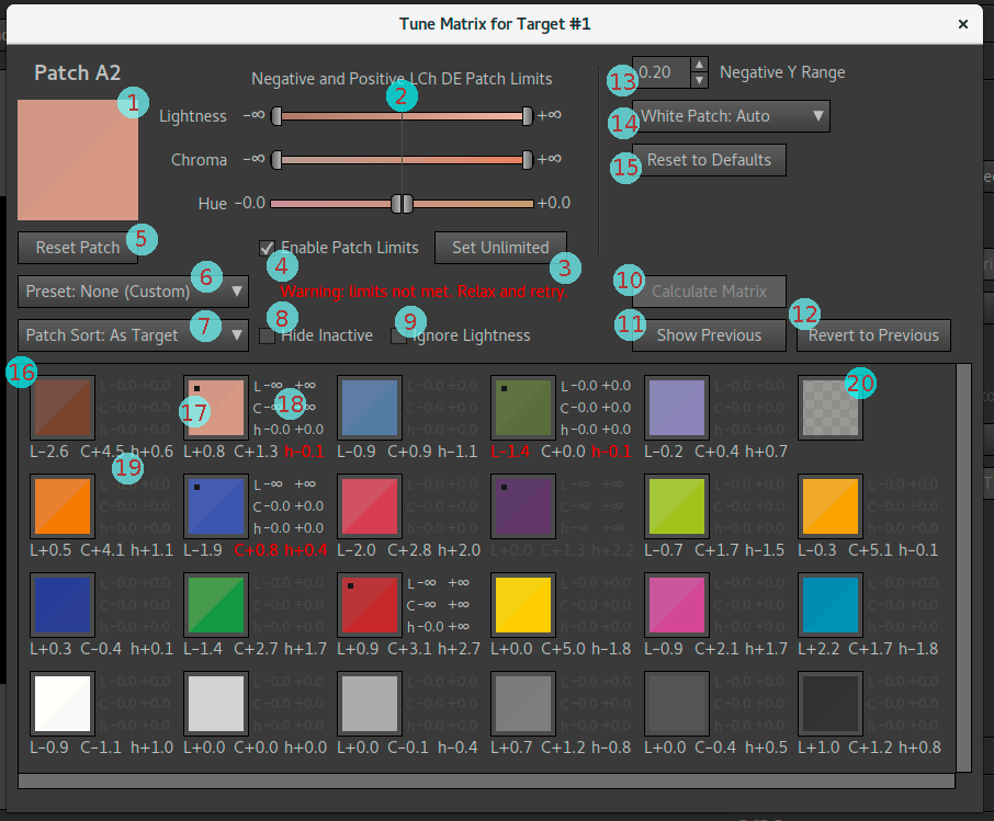
The matrix optimization dialog contains the following elements:
- Split patch icon — shows the currently selected patch, top left half is the target's reference color, bottom right shows result of the matrix.
- Patch error limits — sliders to specify maximum accepted error for the refinement pass. The patch error limits sliders are documented separately.
- Set Unlimited — shortcut to set all patch error limit sliders to unlimited for the currently selected patch.
- Enable Patch Limits — only if enabled the currently selected patch will be refined according to the patch error limit settings.
- Reset Patch — reset the currently selected patch to defaults (=no refinement).
- Preset — shortcuts to set all patches at the same time to a certain state. The presets are documented separately.
- Patch Sort — alternatives to sort the patches shown in the patch table in various orders to give easier overview of certain aspects, such as largest matching errors. Most useful for large targets.
- Hide Inactive — if enabled all patches that are not active in matrix optimization are hidden and thus make it easier to overview.
- Ignore Lightness — to get a better visual on only chroma and hue errors in the split patch icons you can enable this.
- Calculate Matrix — calculate the matrix with the current settings. If the button is disabled as in the screenshot the matrix is either already calculated or cannot be calculated (for example due to no target image is loaded yet).
- Show Previous — show the result of the previously rendered matrix (if any). Used to make a visual A/B comparison to see if the result improved.
- Revert to Previous — revert back to the previously rendered matrix (if any).
- Negative Y Range — global setting to limit the negative Y range of the matrix.
- White Patch — select which patch in the in the target that should be considered to be the most neutral patch, the white patch.
- Reset to Defaults — reset matrix optimization back to defaults.
- Patch table — a table with the target's patches. If the target is too large to fit, scale up the dialog window and/or use the scroll bars.
- Patch table: patch icon — split icon, top left shows the target reference color, bottom right the matrix result. If the icon has a black square in top left corner it means it has patch error limits enabled.
- Patch table: patch error limits — the same patch error limits as set with the sliders. If the limits are enabled they are shown in bright gray (like here), otherwise dark gray (like for most patches in the screenshot).
- Patch table: patch matching error — patch matching error in signed DE for lightness, chroma and hue respectively. If a value is colored red it means that it's outside the specified error limit.
- Patch table: excluded patch — icon for a patch that has been excluded from the target, in the customize reference colors dialog.
Workflow
The matrix optimization dialog is designed for a specific workflow, follow it and the optimization process will go smoother. The optimizer always starts with a standard best fitting of all active patches, and then it runs a refinement pass on top based on manually specified refinements. The refinement pass is a best effort fitting of all active refinements, meaning that if it's not possible to meet all refinements at the same time it makes a compromise. Here is where trial and error comes into play — it's next to impossible to know in advance if the refinements will be possible to meet or not, and how much it hurts the matching of the other patches (those not included in refinement), so one makes a test run, adjust, run again, over and over until satisfied.
Each patch can have one of four states:
- Excluded — if the patch was excluded globally in the target tab it's always inactive and not included in the matrix optimization or in patch sorts.
- Deactivated — deactivated in this dialog, which has the same effect as the patch being excluded, that is it's not used at all in the optimization, you can still see the matching error statistics for the patch though.
- Active, no refinement — the patch is considered in the automatic first optimization pass, but will not be considered in the refinement pass (if any).
- Active, with refinement limits — the patch will be included in a refinement optimization pass, where the goal is to meet the manually defined error range for the patch.
To deactivate a patch you increase the error limits to unlimited, there's a shortcut button ("Set Unlimited") to do so on individual patches, and a shortcut preset ("Preset: All Unlimited") to deactivate all.
When a patch is active, it's either active without any manual refinements specified, or with it. To enable manual refinement error limits, check the "Enable Patch Limits" checkbox for the selected patch.
- Choose global settings (top right of the dialog). There is
usually little reason to not use default values.
- Negative Y range, typically left at default 0.20. Note that this default often limits the ability to match patches, dark patches becomes a bit lighter. If you want exact matches to be possible also for dark patches, increase the value to a large one, say 5.00.
- White patch selection, typically left at default "White Patch: Auto".
- Select preset.
- Leave at "Preset: No Refinement" if you just want to look at the result of the automatic optimization.
- Set to "Preset: All Unlimited" if you want to disable all patches and then manually enable one by one. To make optimization work you must have at least three patches active, one which must be a neutral patch.
- The two presets "Preset: Set Unlimited Fwd" and "Preset: Set Unlimited Rev" sets all patches to unlimited from the currently selected patch and forward or reverse respectively. The purpose of these settings is to be efficient shortcuts when you want to deactivate many but not all patches of a large target; then you first use the "Patch Sort" drop-down to sort in a desired order (for example normalized chroma) and choose to deactivate a portion of the head or the end of the list.
- Activate additional patches, if desired/needed.
- The preset is usually used as a coarse setting to make it quicker to specify which patches that should be active rather than having to select each individual patch and activate/deactivate. The preset usually requires that you manually activate/deactivate some additional patches though.
- Make a first optimization run (press the "Calculate Matrix" button), without any patch refinements set.
- Inspect the matching result to see what you are happy with and
not.
- You can check the "Hide Inactive" checkbox to hide all patches that are not active in matrix optimization and thus make it easier to overview.
- If the target is large you can choose a patch sort that makes it easier to get an overview, for example sort on matching error ("Patch Sort: DE").
- Lightness errors are often the easiest to spot in a split patch, but typically the error we are least interested in correcting, especially for general-purpose profiles. To get a better visual on only chroma and hue errors you can check the "Ignore Lightness" checkbox.
- If you want to refine some patches, enable refinement on them.
- Note that it's common to be happy with the result without any refinements applied. If so leave it as is and you're ready.
- Select the patch, check "Enable Patch Limits" and drag the error sliders to specify acceptable error range (or leave at zero to strive for a perfect match).
- Usually it's wise to only refine two or three patches, especially if the specified max error range is small. With too many patches it becomes impossible for the optimizer to meet the target.
- It is often better to refine two or three than just one though, refining only one may hurt the unrefined patches too much, especially if you try to get an exact match.
- Note that for exact matching only the neutral patch plus two more can be matched, as described in the patch table section.
- Often one is only interested in correcting the hue, but think lightness and chroma errors are acceptable. Then a good starting point is to set lightness and chroma range to unlimited which for the matrix optimizer means "don't refine these".
- Optimize again (press "Calculate Matrix") with the set
refinements.
- The optimizer going unstable and yielding crazy results is normal for certain refinements settings. It often happens when setting an exact match on just one patch for example. Don't worry, then just retry with some other setting.
- "Illogical" results can also happen occasionally, for example if you had a match within the limits and increase error range then you can sometimes end up with a new matrix that doesn't fit, despite the increased tolerance — this is just the nature of optimizing a forced linear system for which there exists no exact solution.
- Use the "Show Previous" button to make A/B switches with the
previous result to visually detect what became better and what
became worse. The patch table
highlights refinement limits that couldn't be met with red.
- With the show previous active there's a red line showing in the bottom of the dialog, the idea is that you can concentrate your eyes on the patches and see in the corner of your eye if you look at the current or previous result.
- If not happy with the result, you can press the "Revert to Previous" button to revert to the previous, or you just continue to change the refinement ranges for the current setting.
- Repeat with trial-and-error until satisfied. You may change the global settings at any time.
Note that the renders inside the matrix optimization dialog is for the matrix only (for speed), so when you exit the dialog and render the full profile, the main window "Show Previous" button will show what was previous before doing matrix optimization.
If refinement limits could not be met the exceeded limits are shown in red. If you still are satisfied with the result you can just accept it as is, that is there is no problem leaving the optimizer with exceeded limits.
Also check out the advanced tutorial which contains a couple of matrix optimization examples.
Starting with few patches
The typical way to manually optimize a matrix is to start with "No Refinement" but let all patches be active, and then add refinement to two-three patches. You may then notice that the matrix is quite stable, it just wants to be in a certain way and it can be hard to make large things happen (with results still being sane). Then there is an alternative approach: start off with as few active patches as possible, that is generate a matrix from only 3-6 patches and go from there:
- Deactivate all patches by setting to "Preset: All Unlimited".
- If you try to calculate the matrix now it will fail, as it needs at least three active patches.
- Activate one neutral patch (select it and press "Reset Patch").
- Activate two or three colored patches (select and press "Reset
Patch"). Either choose them at random, or colors that you think is
particularly important.
- Choosing largely different colors makes it more likely that the optimizer calculates a reasonable matrix than if you select similar colors.
- Press "Calculate Matrix".
- If the result is reasonably good, work with the normal workflow from here, try adding in additional patches, and/or start adjusting limits. If not happy with the result, start over and try with new groups of patches, or add another (one with the largest errors perhaps) to the current set.
Using this workflow with only 3-6 patches and trial-and-error you can start to see trends, which colors that work against each-other. What you see is the native camera behavior. To get some colors in a certain direction, you may need to accept large errors for others. In the end it's likely that you will end up with a result very similar to the automatic optimization, and that is natural. A matrix is just a mix of the camera's native raw channels, so the native response will shine through in one way or another.
Patch sort selection
With the patch sort drop-down you can choose to sort the patches in many different orders. Sorting becomes most in handy for large targets, say IT8 targets which has more than 200 patches, while being less important for small targets where you can see all patches at once.
One reason to sort patches is when you want to select only a sub-set of patches to be used in matrix optimization. Than you can sort in a desired order to get the most interesting patches in the start (or end) of the list and use the presets "Preset: Set Unlimited Fwd" and "Preset: Set Unlimited Rev" to in one sweep deactivate all patches you don't want included.
Another reason to sort is to get a quick overview of how the errors are distributed.
The sorting function also exists in the similar LUT optimization dialog, and the documentation of the various patch sort orders can be found there.
Preset selection
The preset drop-down provides a few alternatives to quickly set up various refinement configurations. There are the following alternatives:
- Preset: No Refinement — activate all patches, without refinement ranges. This is the default, no manual refinement is being made.
- Preset: All Unlimited — set all patches to unlimited (that is deactivate them). You can't make a matrix with this setting, it's just intended as a starting point to then manually include a (smaller) set of patches to be used for the optimization.
- Preset: Set Unlimited Fwd — set all patches from the currently selected to the last in the list to unlimited (that is deactivate them). You usually do this after you have sorted the patches in a desired order, so you can include say only the most saturated patches in the target.
- Preset: Set Unlimited Rev — as the previous, but from the currently selected patch to the first.
- Preset: None (Custom) — a dummy entry where the preset list ends up when you have made custom changes, that is when the configuration doesn't match "No Refinement" nor "All Unlimited".
Patch table
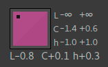
The lower part of the dialog contains a scrollable area with all the patches from the target. When clicking on a patch you select it and can make per-patch settings.
Below each patch there are matching statistics, split on lightness (L), chroma (C) and hue (h). The numbers shown are CIEDE2000 split on each axis. If those numbers are grayed out, the whole patch has been disabled (its error limits set to "unlimited").
Each patch is diagonally split, the top left shows the target reference color, and the bottom right shows the resulting color of the matrix optimization. The colors shown are the actual colors (make sure to use a calibrated screen for most accurate result), meaning that you can judge the errors "by eye" too as a complement to the CIEDE2000 error numbers which you should know is not that perceptually accurate, that is sometimes the visual error is larger than the CIEDE2000 numbers indicate, and sometimes less.
To the right of each patch there are three ranges, split on L, C, h. These are the configurable error ranges for the manual refinements. If grayed out they're not active (default).
After rendering the matrix (by pressing the "Calculate Matrix" button) the table may show some errors in red. Those are specified refinement limits that could not be met. As the matrix matching is a linear equation its rather limited in how it can match profiles. Concerning an exact match it can match the neutral patch plus two, but add one more and an exact match is highly unlikely to be possible (like a three legged stool, add a fourth one and if the legs doesn't match one will hang in the air). If you increase the error limits or refine fewer patches it becomes more likely that a solution can be found.
Patch error limits
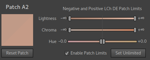
To refine a patch from the basic optimization you specify maximum accepted errors using the sliders, which work separately on lightness, chroma and hue, both in positive and negative direction.
The sliders contain gradients which visualize what the actual range setting means in terms of color error. For lightness negative means darker, positive lighter, for chroma negative means less saturated, positive more saturated, while for hue negative means smaller hue angle and positive larger hue angle. What larger/smaller hue angle actual means you can see as either warmer or cooler hue, look at the hue gradients on the slider to see which change the positive or negative change leads to.
The patch error limit unit is CIEDE2000 on the axis adjusted.
If you want to strive for an exact match you leave all sliders at zero, otherwise you increase the tolerance range by moving the slider handles. It's common to move the tolerance for lightness all the way to the end of the slider which turns the values to unlimited (=ignore that axis), shown with the infinity symbol (∞).
For the hue axis it's common to leave one slider on zero and just increase the other, to avoid that a color becomes cooler (or warmer) but care less about an error in the other hue direction.
For chroma it's common to accept higher under-saturations than over-saturations, as an overly saturated profile is less stable and makes it more difficult to make a good overall match.
The "Set Unlimited" button is a shortcut to set all axes to unlimited, and thus deactivating the patch. The "Reset Patch" button removes any refinement settings. With the "Enable Patch Limits" checkbox you toggle the use of the patch limits. It's automatically checked when you move a slider.
When deciding to refine a patch, it's a good idea to first press "Set Unlimited" and keep the axes that you think is okay unrefined at unlimited, and only limit where you want improvement. Setting a small range on an axis that really don't need improvement may throw the matrix off balance and produce a worse result.
Refinement advice
Uneven light and glare in the target photo hurts the lightness axis and dark colors the most. Know that before you consider fine-tuned manual refinement. You should always start with target shot of as good quality as possible, this is more important than having a custom-measured reference file for your target (although that too is good to have).
Concerning matrix refinement strategy, here are a few guidelines:
- Dark colors that are rendered too light is better than dark colors
rendered too dark.
- This counts especially in the blue range which in actuality is very dark making it hard to appreciate fine tonality in the final image.
- A Negative Y range at the default setting usually makes sure that deep blue doesn't get too dark.
- Under-saturation is better than over-saturation.
- It leads to a less aggressive and therefore more robust matrix (less color separation).
- Most will subjectively increase saturation in post-processing anyway.
- Most prefer hue errors that are too warm rather than too cool, especially in the blue range (rather turn to cyan than to purple)
- Skintone hue is generally the most important, as our eyes are very good at detecting small differences in that range.
- A profile made for difficult light (most indoor light) will most likely have the camera struggling much more than in daylight. In those situations manually tuning the tradeoffs necessary may be quite difficult but also extra rewarding as you get to lay out the tradeoffs according to your taste.
Let's transfer this broad advice to a popular real target, the X-Rite ColorChecker 24:
- A1 — represents dark skin, similar chromaticity as light skin patch A2. It doesn't hurt if it's a bit too light, as otherwise dark skin can end up a bit too dark when contrast is applied.
- A2 — represents light skin. A good hue and saturation match is recommended. It's probably better if it's a bit too light than too dark.
- A3, B2 — blue sky and purplish blue. It's better if the hues deviate towards cyan (=smaller hue angle) than purple (=larger hue angle).
- B3, C3 — pink and red. Reds turn orange with traditional tone operators, so that's how many are used to see them. When using the neutral tone reproduction operator it's often desirable to avoid these become too cool, it's better if they have a warm tint.
- B4 — deep purple, doesn't hurt if it's rendered a bit lighter.
- A4, B5, C2 — greens are rarely problematic on a global scale, as they are in the center of the spectrum. While it's preferable that deep blue and deep purple is rendered a bit lighter than their reference, you can afford the greens to be a bit darker. Hue shift towards warm or cool matters less with greens than with reds and blues.
If you have a large target with glossy high saturation patches, don't worry too much about the precision of the most saturated patches. They're hard to match with a matrix, and taking them too much into account may lead to a worse match of normal range colors.
LUT optimization
The LUT optimization dialog comes in two slightly different versions, one for 2.5D LUTs and one for 3D LUTs. They work the same, with a few settings that differ.
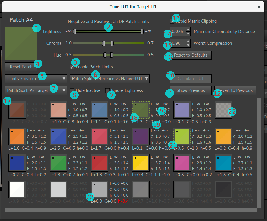
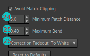
The LUT optimization dialog contains the following elements:
- Split patch icon — shows the currently selected patch, the top half and bottom half shows colors according to the current Patch Split setting.
- Patch error limits — sliders to specify maximum accepted error. The patch error limits sliders are documented separately.
- Enable Patch Limits — only if enabled the currently selected patch will be considered by the LUT.
- Reset Patch — reset the currently selected patch to no limits enabled.
- Limits — shortcuts to set all patches at the same time to a certain state. The presets are documented in the workflow section.
- Patch Split — choose what colors the split patch icons should show to investigate various matching properties.
- Patch Sort — alternatives to sort the patches shown in the patch table in various orders to give easier overview of certain aspects, such as largest matching errors. Most useful for large targets.
- Hide Inactive — if enabled all patches that are not active in LUT optimization are hidden and thus make it easier to overview.
- Ignore Lightness — to get a better visual on only chroma and hue errors in the split patch icons you can enable this.
- Calculate LUT — calculate the LUT with the current settings. If the button is disabled, like in the screenshot, the LUT is either already calculated or cannot be calculated (for example due to no target image is loaded yet).
- Show Previous — show the result of the previously rendered LUT (if any). Used to make a visual A/B comparison to see if the result improved.
- Revert to Previous — revert back to the previously rendered LUT (if any).
- Avoid Matrix Clipping — global setting to avoid clipping of extremely saturated colors before the LUT correction is applied.
- Minimum Chromaticity Distance — global setting to merge nearby colors together to one point for correction, to improve smoothness.
- Worst Compression — global setting to avoid too strong bends in the LUT that could cause poor smoothness.
- Reset to Defaults — reset LUT optimization back to defaults.
- Patch table — a table with the target's patches. If the target is too large to fit, scale up the dialog window and/or use the scroll bars.
- Patch table: patch icon — split icon, the top and bottom halves show colors according to the current Patch Split setting. If the icon has a black square in top left corner it means it has patch error limits enabled.
- Patch table: patch matching error — patch matching error in signed DE for lightness, chroma and hue respectively. If a value is colored red it means that it's outside the specified error limit.
- Patch table: patch error limits — the same patch error limits as set with the sliders. If the limits are enabled they are shown in bright gray (like here), otherwise dark gray (like for most neutral patches in the screenshot).
- Patch table: patch group outline — if the patches are close enough in color, according to the minimum chromaticity distance setting, they will be grouped together to one correction point. If this happen the patch icons get a colored outline with the same color as the group. The outline is solid, except when one of the patches is selected then it's dashed (as shown in the screenshot).
- Patch table: excluded patch — icon for a patch that has been excluded from the target, in the customize reference colors dialog.
- Patch table: neutral exclusion outline — in the screenshot all white patches are disabled, except one for show. It has however been excluded from (2.5D) LUT optimization anyway since it's too close to the neutral axis, which is indicated with the long white dashed outline.
- Minimum Patch Distance — 3D LUT global setting to merge nearby colors together to one point for correction, to improve smoothness.
- Maximum Bend — 3D LUT global setting to avoid too strong bends in the LUT that could cause poor smoothness.
- Correction Fadeout — 3D LUT global setting to make the correction fade out towards the white point, black point or both to make smoothest possible transition to them.
Workflow
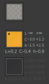
The LUT optimization dialog is designed for a specific workflow, follow it and the optimization process will go smoother.
When the LUT is optimized it's first made for a 100% match of all active patches (which may have been grouped together a bit based on the minimum patch/chromaticity distance setting), then it's relaxed according to the global relax parameters ("Worst compression" / "Maximum Bend"), and finally it's relaxed further towards the maximum accepted error limits specified for each patch.
The final destination for the relax is the linear matrix, that is full relaxation means that the result is the same as with only the matrix.
Each patch can have one of three states:
- Excluded — if the patch was excluded globally in the target tab it's always inactive and not included in the LUT optimization or in patch sorts.
- Patch limits enabled — active patch with a specified "max acceptable error range" which is considered during the LUT optimization.
- Patch limits disabled — just as the excluded patches it won't be considered in the LUT optimization, that is the result is left at what the matrix produces, possibly slightly moved by neighboring patches that may cause a slight stretch in the LUT.
Here's how you work this process:
- Choose global settings (top right of the dialog). The settings differ between the 2.5D and 3D LUTs, described in separate sections. There is usually little reason to not use default values.
- Select "Limits" preset.
- Limits: No Correction — disable all patch limits, meaning that there will be no LUT correction.
- Limits: Full Correction — enable patch limits on all patches and set sliders to zero (full correction). Note that the grouping and relax global settings can still force relaxation to take place so that full correction cannot be reached.
- Limits: Auto No Lightness — enable patch limits on all patches with automatic ranges, and lightness set to unlimited. The default for a 2.5D LUT.
- Limits: Auto with Lightness — same as the previous, but with lightness axis taken into account too.
- Limits: Exclude Forward — disable patch limits for the selected patch and all after it in the list. Usually used for large targets after a suitable patch sorting has been selected so you in one sweep can choose to exclude a certain range of colors to only work on a smaller set.
- Limits: Exclude Reverse — same as above but excluding the selected and those before in the list.
- Limits: Custom — dummy entry to which the list automatically changes to when the patch limits don't match any of the other limit presets.
- Refine the preset by selecting patches and change range limits
individually.
- Disable the limits of a patch if you are satisfied with the matrix result (note though that the color may move slightly anyway if a nearby color stretches the LUT). Use the "Enable Patch Limits" checkbox.
- Make a first optimization run (press the "Calculate LUT" button).
- Inspect the matching result to see if you want to improve
matching, or if you can relax even more (to make the profile
smoother).
- The patch table window highlights various aspects of the matching, see the separate documentation on how to interpret that.
- You can check the "Hide Inactive" checkbox to hide all patches that don't have active patch limits and thus make it easier to overview.
- If the target is large you can choose a patch sort that makes it easier to get an overview, for example sort on matching error ("Patch Sort: DE").
- Lightness errors are often the easiest to spot in a split patch, but typically the error least import to correct, at least concerning general-purpose profiles. To get a better visual on only chroma and hue errors you can check the "Ignore Lightness" checkbox.
- The Patch Split drop-down lets you choose between different types of patch splits to inspect the result from different aspects.
- If you want further improvements, apply your changes and optimize again (press "Calculate LUT").
- Use the "Show Previous" button to make A/B switches with the
previous result to visually detect what became better and what
became worse.
- With the show previous active there's a red line showing in the bottom of the dialog, the idea is that you can concentrate your eyes on the patches and see in the corner of your eye if you look at the current or previous result.
- If not happy with the result, you can press the "Revert to Previous" button to revert to the previous, or you just continue by changing the settings from the current state.
- Repeat until satisfied. You may change the global settings at any time (to force more or less relaxation for example).
Note that the renders inside the LUT optimization dialog is made for the LUT only (for speed), so when you exit the dialog and render the full profile, the main window "Show Previous" button will not show the previous render inside that dialog but what was before doing LUT optimization.
Also check out the advanced tutorial which contains a couple of LUT optimization examples.
Patch split selection
The split patches shown in the patch table will per default show the target reference color in the top right half, and the result of the native LUT in the bottom right. However, there are other options too, which you select by choosing one of the options in the Patch Split drop-down.
First you need to understand the difference between the "Native-LUT" and the "Export-LUT": Lumariver Profile Designer has its own internal LUT format, which actually isn't a plain lookup table, but a mathematical model based on the target measurements and optimization parameters. This is the native LUT. When the profile is exported as an DNG or ICC profile this native LUT is sampled to create a real LUT in the format supported by the profile, this is the Export-LUT. As the exported LUT's resolution is limited it will not exactly match the native LUT, but it should be very close. If not, there's probably smoothness issues with the LUT, that is too sharp bends (which should not be the case with default parameter settings).
The Export-LUT result is mainly relevant when you make reproduction profile, as if you apply a tone curve and tone reproduction operator and gamut compression there will be additional conversions made in the final LUT.
- Patch Split: Reference vs Native-LUT — the default setting comparing the target reference and the result of the native LUT.
- Patch Split: Reference vs Matrix — comparing the target reference with the matrix. Swap between this and "Reference vs Native-LUT" to see which improvements the LUT makes.
- Patch Split: Matrix vs Native-LUT — compares the linear matrix result directly with the LUT. Ideally the difference should be quite small as that means the LUT is smooth.
- Patch Split: Reference vs Export-LUT — compares the target reference with the actual exported LUT, which may not match the native LUT a 100% due to limited resolution. If you make a reproduction profile (linear curve, no gamut compression) this presents the actual performance of the exported profile.
- Patch Split: Matrix vs Export-LUT — compares the linear matrix result with the exported LUT, can be used as a final sanity check if you really need a LUT at all or if the adjustments are so small that you can go ahead with only a matrix.
Patch sort selection
With the patch sort drop-down you can choose to sort the patches in many different orders. Sorting becomes most in handy for large targets, say IT8 targets which has more than 200 patches, while being less important for small targets where you can see all patches at once.
One reason to sort patches is when you want to select only a sub-set of patches to be used in LUT optimization. Then you can sort in a desired order to get the most interesting patches in the start (or end) of the list and use the presets "Limits: Exclude Forward" and "Limits: Exclude Reverse" to in one sweep exclude all patches you don't want included.
Another reason to sort is to get a quick overview of how the errors are distributed.
The same type of sorting is available in the matrix optimization dialog. The following sorts are available:
- Patch Sort: As Target — this is the default and presents the patches in the same layout as on the target chart.
- Patch Sort: Norm Chroma — normalized chroma, sorted from most saturated to least saturated, lightness disregarded. When lightness is included a dark color is seen as less saturated, but if you are making a 2.5D LUT or matrix only profile it doesn't make sense to differ as any color can be exposed at any level. In other words this is a good sort order if you want to sort from most to least saturated.
- Patch Sort: Chromaticity — order with chromaticity (chroma+hue, lightness disregarded) as close as possible to each-other, that is similar colors are grouped together. Note that this sort is not unique as it depends on which color you start with how the order ends up. Here we always start with the patch closest to black and build backwards from there. This sort order groups colors together that are close in a 2.5D LUT.
- Patch Sort: Color — same type of sort as the "Chromaticity", but with lightness included in the equation. This sort order groups colors together that are close in a 3D LUT.
- Patch Sort: Groups (LUT only) — this sort order is only available in the LUT optimization dialog, and puts patches that have been merged into a group together.
- Patch Sort: Lightness — from lightest to darkest color.
- Patch Sort: Chroma — from highest to lowest chroma. Often normalized chroma ("Norm Chroma") is a better alternative.
- Patch Sort: Hue — hue from highest hue angle (360°) to lowest (0°). Note as hue wraps around the sort starts and ends at about the same hues.
- Patch Sort: DE — from largest to smallest CIEDE2000 matching error.
- Patch Sort: DE Hue — from largest to smallest CIEDE2000 matching error, only hue considered.
- Patch Sort: DE Chroma — from largest to smallest CIEDE2000 matching error, only chroma considered.
- Patch Sort: DE Chromaticity — from largest to smallest CIEDE2000 matching error, only hue+chroma considered. If you are not that concerned about lightness matching, this is the matching error sort order to look at.
- Patch Sort: DE Lightness — from largest to smallest CIEDE2000 matching error, only lightness considered.
Patch table
The lower part of the dialog contains a scrollable area with all the patches from the target. When clicking on a patch you select it and can make per-patch settings.
Below each patch there are matching statistics, split on lightness (L), chroma (C) and hue (h). The numbers shown are CIEDE2000 split on each axis. If those numbers are grayed out, the patch limits are not enabled, that is the LUT will not try to improve matching for them. The statistics are still valid though (assuming the LUT has been rendered).
Each patch is diagonally split, showing colors according to the patch split setting. The colors shown are the actual colors (make sure to use a calibrated screen for most accurate result), meaning that you can judge the errors "by eye" too as a complement to the CIEDE2000 error numbers which you should know is not that perceptually accurate, that is sometimes the visual error is larger than the CIEDE2000 numbers indicate, and sometimes less.
To the right of each patch there are three ranges, split on L, C, h. These are the patch error limits, which can be set automatically with a preset or be adjusted manually.
When the LUT is rendered (by pressing the "Calculate LUT" button), the patches in the table will get some informational highlighting:
- Nearby patches that have been merged (grouped) to a single one due to the minimum patch distance will get a colored outline of the same color as the merged group. When one of the patches is selected (by clicking on it) the outline becomes dashed making it easier to spot all patches that have been merged together. You can use "Patch Sort: Groups" to sort the patches one group after another.
- Patches that have been excluded from correction due to being too
near the neutral axis get a white long dashed outline. This can only
happen with the 2.5D LUT.
- If the 3D LUT is being used with the "Neutral: White Balance" setting and a non-zero minimum patch distance, patches close to the neutral axis (as defined by the white balance) will only get lightness correction (but aren't completely removed), and those are also marked with the same long dashed outline, but only if not already marked with a group short dashed outline.
- Matching errors that exceed specified patch limits with more
than 0.1 DE are marked red, to make it easier to spot where the LUT
did not succeed matching. Reasons for not being able to match are:
- The worst bend/compression global setting has forced the LUT to relax so matching cannot be fully met.
- A patch group has been formed and the average is corrected rather than the individual patch.
- The patch is close to the neutral axis hand has been excluded from matching (2.5D LUT) or only lightness correction has been made (3D LUT with "Neutral: White Balance" setting).
Patch error limits
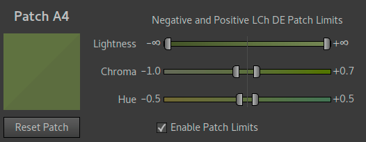
When a patch has its error limits enabled (check "Enable Patch Limits"), the LUT optimizer will strive to meet the target range, as specified with the lightness, chroma and hue sliders, both in positive and negative direction.
The sliders contain gradients which visualize what the actual range setting means in terms of color error. For lightness negative means darker, positive lighter, for chroma negative means less saturated, positive more saturated, while for hue negative means smaller hue angle and positive larger hue angle. What larger/smaller hue angle actual means you can see as either warmer or cooler hue, look at the hue gradients on the slider to see which change the positive or negative change leads to.
The patch error limit unit is CIEDE2000 on the axis adjusted.
If you want to strive for an exact match you leave all sliders at zero, otherwise you increase the tolerance range by moving the slider handles. For example, it's common to move the tolerance for lightness all the way to the end of the slider which turns the values to unlimited (=ignore that axis), shown with the infinity symbol (∞).
The tolerance sliders works the same as for the matrix optimization dialog, but unlike the matrix optimizer the LUT has much better ability to match a target as it can do non-linear corrections. While the global relaxation and grouping parameters usually make a 100% exact match for all patches impossible, you can often come pretty close. However, this is a tradeoff between smoothness and accuracy. The idea is that you should not correct more than you need, and this is what the tolerance sliders are for.
The LUT optimizer starts off with an as accurate match as possible, and will then start relaxing towards the linear (matrix) result, while keeping within the specified tolerances. When it has reached the tolerance limits for all patches (or the linear matrix result) it stops. In other words, the LUT optimizer will make an as poor matching as allowed by the tolerances in order to make the LUT as smooth as possible.
Avoid matrix clipping
Purpose: avoid clipping of extremely saturated colors before the LUT correction is applied.
The linear matrix alone will most likely push some extreme values out of gamut and clip them. If you want to make sure no values will be clipped before the LUT is applied, this setting should be enabled. The only drawback is that for a relaxed LUT the same precision cannot be had with colors very close to clipping.
Note that the setting has effect even if the LUT makes no corrections, so if you want the color to be the result of the matrix alone disable this.
It's enabled per default for general-purpose profiles, and disabled for reproduction profiles.
Minimum patch distance
Purpose: merge nearby colors together to one point for correction, to improve smoothness.
The "Minimum Patch Distance" of the 3D LUT and "Minimum Chromaticity Distance" of the 2.5D LUT do the same thing, which is merging nearby patches to form single correction handles in the LUT, and thus avoid sharp bends that otherwise could occur.
For the 3D LUT the distance is in Delta E (roughly equivalent to CIEDE20000), for the 2.5D LUT the distance is in chromaticity using the "DCamProf LUT" space, meaning that lightness is disregarded. Use the default values and modify from there to experiment. It's generally best to stay at the default values though.
If you don't want any grouping to take place, reduce the value to zero.
Worst bend/compression
Purpose: avoid too strong bends in the LUT that could cause poor smoothness.
The "Maximum Bend" of the 3D LUT and "Worst Compression" of the 2.5D LUT do the same thing, which is setting a limit for how sharp non-linear bends there can be in the LUT corrections. The value goes directly into the underlying LUT relax algorithm, which is different for the 2.5D and 3D LUT so you cannot use the same value for both, see below:
- 2.5D LUT "Worst Compression" — 0.90 is default, smaller value means more compression is allowed, that is less smoothness. Set to zero if you don't want any limit.
- 3D LUT "Maximum Bend" — 0.40 is default, larger value means larger bends are allowed, that is less smoothness. Set to a large value like 9.00 if you don't want any limit.
When changing these values it's best to start with the default value and work from there with trial-and-error. It's generally best to stay at the default values though.
Correction fadeout selection (3D LUT only)
Purpose: make the 3D LUT correction fade out towards the white point, black point or both to make smoothest possible transition to them.
The 3D LUT allows for correcting colors very close to the white point and black point. As a result of that the transition into clipping may not be optimally smooth. By fading out the correction close to the white point or black point or both any smoothness issues are avoided, with the drawback of less precise correction.
For a profile made for reproduction work where you can guarantee that no clipping will occur, you can set this to "None" which assures that the correction is not disturbed by any fadeout.
Optimization advice
If you are making a reproduction profile it rarely makes any sense to do anything else than use the automatic default settings. The LUT optimizer has been carefully tuned to produce robust trusty profiles.
A reason to play with LUT optimization even for reproduction work could be that you want to experiment to make a profile with a 100% exact match and see how much it differs. Another reason would be if you have some particular colors that are more important than others, say a set of company logotype colors, then you can make the LUT match those exactly.
Most of the time you would use it at the default settings though, but you can still open up the dialog to get matching statistics and diagnose problem colors.
When it comes to general-purpose profiles there may be some more interest to tune the LUT. The first question to ask is if you really need any LUT correction at all. You may be surprised of how well a matrix can match normal-range colors in a modern camera. Even if you disable the LUT ("No Corrections"), the final profile is likely to have a LUT due to the gamut compression and the tone reproduction operator and any subjective color adjustments you apply, and actually it's in these aspects a profile's LUT is doing most work. The color correcting part is generally only minor, which it should be to avoid any smoothness issues.
If you want to hand-tune the LUT for your general-purpose profile, you may consider to start by hand-tuning the matrix. The closer to the desired result the matrix is, the less work the LUT needs to do. In the matrix refinement advice section for the matrix optimization there are advice concerning specific color properties, and you can apply the same to the LUT optimization.
When you optimize the matrix you should focus mainly on normal range colors (that is not too high saturation), and you can then use the LUT to correct the high saturation colors.
When matching doesn't meet the target due to patches have been grouped together or the worst bend/compression setting is limiting how sharp turns the LUT can make, think more than once before actually changing those parameters to allow more aggressive correction. There's always a smoothness vs accuracy tradeoff, and bad gradients can really hurt an image. If you let the LUT make an aggressive correction be sure to thoroughly test your profile with various images to make sure that it doesn't introduce visible artifacts.
Tone curve design
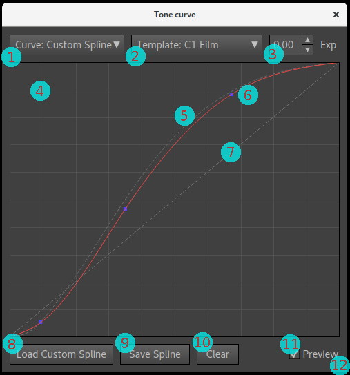
By pressing the "View/Edit" button beside the curve selection you open up a curve dialog where you can view the tone curve, and optionally edit it as a (cubic) Spline, that is a smoothly interpolated curve between custom handles.
Tone curve dialog functions
Here are the elements in the tone curve dialog and their functions:
- Curve selection — same as the curve selection in the tone-curve tab, that is selecting the main curve.
- Template selection — a context-sensitive list of template
curves which will show up as a dashed curve in the curve window. The
main purpose of this is to have a guide when designing a spline
curve. For example if you want a curve similar to "C1 Film" but with
a little less shadow dip, you select "C1 Film" as template and you
chose "Custom Spline" as curve and move handles around to match but
make the shadow dip a bit softer. The template curve list may also
contain additional curves for informational purposes, when
available. Here's a list:
- All the standard curves (except "Linear") from the curve selection, that is "ACR Default", "ACR Black", "C1 Film".
- Custom Curve — only available if a custom curve has been loaded. Even if you don't want to use a specific custom curve in the end, you can load one and use it as a guiding template when designing a Custom Spline curve.
- Profile Curve — the actual curve embedded in the profile (available only after render).
- Result Curve — the resulting curve when profile curve is applied on top of the base curve (if any), that is the final curve of the output. As only ICC projects allow for a base curve, this curve is the same as the Profile Curve for DCP and Cube projects.
- Render Curve — what the Result Curve was the last time the profile was rendered.
- Input Curve (ICC only) — the selected Input Curve.
- Base Curve (ICC only) — the Base Curve, only available if a Base Curve has been loaded.
- Target TF (ICC and Cube only) — the transfer function embedded in the target image.
- Input Gamma (Cube only) — the selected Input Gamma.
- Template curve exposure — this setting simply scales the currently selected template curve with the given exposure. It doesn't change any profile setting. The purpose of this is to scale a template so you can manually trace it with a spline and decide where to bend off to the whitepoint.
- Curve window — this shows the main curve in red in a 10x10 grid,
with a linear dashed curve, and a selectable template curve also
dashed. The curve is displayed with sRGB gamma per default, but can
since version 1.0.6 be changed via a dropdown (not shown in the
image which is from an older version).
- If you move the mouse pointer over the main image window, a cross-hair will show up indicating where on the curve the color under the mouse pointer is.
- Dashed template curve — shows the curve of the currently selected template (2).
- The tone curve — the current tone curve as selected in (1) is shown in red, and in this screenshot it's a custom spline with three handles (blue).
- Dashed diagonal — the curve window always shows a linear (diagonal) dashed curve as reference.
- Load Custom Curve/Spline — when curve selection is at "Custom Spline" (like in the screenshot) you can load a spline in JSON or RawTherapee RTC format. When curve selection is at "Custom Curve" the load button will allow loading custom curves in various formats (not only splines), see curve file formats.
- Save Spline — only available for "Custom Spline", allows saving the current spline in JSON or RawTherapee RTC format for later retrieval or use in other software.
- Clear — clear all spline handles, only available for "Custom Spline".
- Preview checkbox — when activated the image view will in real-time
update with the current curve. Note that it's not as fast as a
typical raw converter so depending on how fast computer you have you
may only want to enable preview briefly to check, and perhaps
disable it when moving around Spline handles.
- As the current curve will apply on the last rendered profile, the preview result is not 100% exactly the same as it will be when the profile is re-rendered with the new curve.
- You may press the "Render" button in the main window to refresh with the current curve. The smaller change from the last render, the more accurate the preview is.
- Window corner — don't forget that the dialog is re-sizable, making it large is very useful when you want to make precise edits.
Editing a custom spline
If the selected curve is "Custom Spline" you edit the curve by adding handles and dragging them around. It works like this:
- Add handles by either clicking on the curve itself, or move to
the image window and click there, then a handle will be added at the
cross-hair position.
- Note that while the tone curve dialog is open you can still change to the "Profile Comparison" tab and there load and change the image, which is useful if you want to see the curve effect on some specific image (be sure to activate the "Preview" checkbox). If you have test images already loaded you can change them with the Shift+Up and Shift+Down keys too.
- The preview curve is only applied on DNG images for DNG profile projects (that is not TIFFs and JPEGs), and for ICC profile projects it's applied on all images which have the project's profile selected.
- Move handles by clicking and holding the mouse button on the handle and drag it around.
- If you hold down the Shift key on the keyboard, the handle
movement is locked so it can only move vertically.
- The typical use case for this feature is to enable preview, go to "Profile Comparison" and load some reference image, note that some area in that image is too dark or too bright, point at that with the mouse pointer so the curve cross hair shows up, click to add a handle there, and then hold the Shift key to only darken/brighten that specific range.
- Delete a single handle by dragging it outside the window frame.
- Delete all handles by pressing the "Clear" button.
- Note that you can change the size of the tone curve window, making it large makes it simpler to fine tune the shadow end.
- If you change the viewing gamma the custom spline will still have the same grid coordinates (that is not move with the gamma as the other curves), meaning that changing the gamma will effectively change the effective shape of the curve. The reason for this is to keep the spline editing linear.
Curve design workflows
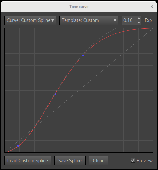
The tone curve dialog feature set has been specifically tuned to make it as easy/powerful as possible when it comes to designing the tone curve you want. There are a number of ways you can design a tone curve, for example:
- Tracing a template curve with the custom spline — select the curve
closest to what you want as the template, and then make a spline
that traces the template, and fine-tune from there.
- You may also load a custom curve by selecting "Curve: Custom Curve" and then changing to "Curve: Custom Spline" and use the custom curve just as a tracing template.
- You can even save your own spline, and then load it as a custom curve (rather than as a spline) and use your own spline as a template by selecting "Template: Custom".
- Capture One-specific tip (and others like it): if you have copied the bundled camera profile's curve using a combination of "Base curve" and "Custom Curve", the "Result Curve" template will show what the final curve actually is like. If you want to manually trace and tune that with a spline, you end up with the delicate problem that the "Result Curve" now moves with your spline (as the spline is the new curve). The solution is to use "Render Curve" (the curve used in the last render) as template instead.
- Match curve/contrast of in-camera JPEGs — load a representative in-camera JPEG in the "Profile Comparison" tab and also the DNG version (which is rendered with the project's profile), with goal to match contrast. By using the "Place Probe" button you can compare brightness between the two images in key areas and enable preview and drag spline handles around to match.
- Tune to taste using reference images — load representative images in the "Profile Comparison" tab to see if the current spline curve matches your desired contrast. Point in the image where it's too bright or dark and watch the cross-hair show up in the curve window, place a handle and drag. Use the "Place Probe" button in the main window if you want the cross-hair to stay in a particular area, and enable preview to make it update real-time.
If you are using Capture One or any other ICC raw converter that uses a combination of a user-selectable curve and an embedded curve, be sure to check out the section on Capture One curve handling as it can be a bit confusing in the beginning.
The reason any custom curve or preset isn't editable directly is that they are not defined as spline curves, but rather as thousands of linear segments. Thus you need to use your human judgment to make an approximate match using a spline. Don't overdo it — a spline tone curve rarely needs more than 5 to 7 handles.
If probing is used, the CIECAM02 JCh color space and the J (lightness) option is a good measurement to use as reference when making curve adjustments. Note that depending on tone operator used it varies a bit how the curve is exactly translated, and in the preview mode always the simplest tone operator is used. Low saturation colors are those that behave most similar to the final render. If your current curve differs much from the last render, you can press the main window's "Render" button again to refresh, making the preview more precise.
The tone curve dialog is re-sizable, making it large is useful when fine-tuning a custom spline.
Template curve exposure
Sometimes the images render a bit too dark or too bright, so you may want to adjust exposure. That can be achieved by adjusting the spline curve, and if you're experienced with that you can probably do it on free hand. If not, the template curve exposure setting is there to help. With that you can scale the currently selected template with the given positive or negative exposure, which you then can manually trace.
Increased exposure will cause bright parts of the image to clip, and reduced exposure causes the camera to never reach the whitepoint. This is seen when the template curve is scaled. This means that you should not trace the clipping curve all the way, but at some point your spline should bend off to the whitepoint. Where you start the bend is a matter of taste, and that's why the software doesn't do this type of exposure adjustment automatically for you. A broad guide is to make the transition long rather than short so the curve doesn't get too sharp bends.
If you are making a DNG profile there is a setting called baseline exposure offset which is an exposure offset built-in to the DNG profile format. You can make exposure adjustment with that rather than with the curve, but then clipping behavior is up to the raw converter rather than the profile. Most likely it will clip straight off, so making a curve which bends off to the whitepoint can be a more elegant solution with finer highlight rendering.
If you want to play around with exposure adjustments before actually adjusting the curve, you can use the baseline exposure offset (DNG profile only), or the exposure setting in the profile comparison tab. That way you can first decide how much you want to adjust the curve, and then make the design towards a set exposure value.
Black subtraction
When matching in-camera JPEGs or other finished renders, be aware that many rendering engines apply some sort of automatic black subtraction. With DNG profiles it's a setting in the profile itself (not all raw converters honor it though). For ICC profiles there is no such setting, but the raw converter might do automatic black subtraction anyway.
If deep shadows end up blacker in your raw converter than in the Lumariver Profile Designer preview, there's likely automatic black subtraction applied in that raw converter, and then you may want to compensate by making shadows a bit lighter, that is reduce the shadow dip in your tone curve.
Curve design tips
Try to (roughly) match overall brightness with the in-camera JPEGs, as the camera's auto exposure function is tuned for that.
Just like the audio system with louder volume sounds "better" when two are compared, the profile with stronger contrast and deeper shadows tend to look "better", more "punch" and "pop". However, a strong contrast profile is not as practical for post-processing (it's easier increase contrast than to reduce it). In other words, a profile made to impress out-of-the-box should probably have quite high contrast and a deep shadow dip (be careful if it is to be used with portraits though), while one intended to be used when further post-processing is made most of the time should have a bit softer contrast and open shadows.
Some cameras or raw converters provide profiles for different subjects, for example one for "Portrait" and one for "Product", and you could do that too. In terms of tone curve it's common that a portrait profile has a bit softer contrast, and a product profile a bit stronger.
Edit look adjustments
The "Edit Look Adjustments" dialog is opened by pressing the button available in the "Look" tab. It's used for manually applying subjective changes to color in the final stage, that is after the matrix and LUT, after the tone curve and tone reproduction operator, the gamut compression and any look preset.
The dialog may look overwhelming at first, but if you are used to color editors in raw converters like Capture One you'll notice that it works in a similar way, just with more detailed control and more modes.
It works according to the following principles:
- "Adjustments Patches" are created and applied in order one after another. They can be re-ordered with the "Move Up" and "Move Down" buttons.
- To each adjustment an anchor color ("patch color" for the adjustment patch) is selected using sliders or picked from the currently viewed image.
- Relative to the anchor color a span is specified where the adjustment should take effect, adjusted in lightness, chroma and hue axes separately, with fade out zones.
The colorspace used for the adjustments is CIECAM02 JCh which is a perceptual uniform space, meaning that if you for example change hue angle but keep lightness and chroma the same the new color will indeed have the same lightness and chroma as the old as seen by our eyes. For profile design working in a perceptually uniform space is an advantage, but one drawback is that different hues go out of gamut at different levels which may take some time to get used to in the user interface. For example, to our eyes there exists much brighter and more saturated reds than blues, so while chroma can reach 200+ for red, it goes to only 90+ for blue. The sliders will only show valid colors, out of gamut is clipped to black and if a slider is pulled into that area it jumps to the next valid color.
DNG profile limitations
The DNG profile format does not allow the LUT to change the neutral axis. This is due to how the format is designed and is nothing Lumariver Profile Designer can do anything about. This means that you cannot tint the neutral axis (that is make Sepia toning for example), and you cannot change lightness either (make grays darker or lighter) other than by changing the tone curve.
The ICC and Cube formats do not have this limitation and neither does the look adjustments editor, which means that you can make adjustments that will not have any effect if you work on a DNG profile project.
Functions
- Add Patch — add a new adjustment patch after the current.
- Drop Patch — drop (remove) the currently selected adjustment patch.
- Duplicate — make a copy of the currently selected adjustment patch and add it next in the list.
- Move Up — move the currently selected adjustment patch up in the list. Adjustments are applied one after another in order according to the list, which means if some adjustments have overlapping spans it matters in which order they are applied.
- Move Down — move the currently selected adjustment patch down in the list.
- Adjustment patch list — the first element is at the top. Each adjustment patch is illustrated with a split patch, top left its anchor color, and bottom right color after adjustment. Note that some types of adjustments cannot be visualized as a single color and in those cases the bottom right color is the same as the anchor color.
- Adjustment type selection — the type of adjustment, here a plain JCh adjustment.
- Anchor color sliders — the anchor color for the adjustment patch set by Lightness, Chroma and Hue, in the CIECAM02 JCh color space. The available range is visualized in the sliders. Out of gamut range (outside the human spectral locus or outside ProPhotoRGB) is shown as black and the slider cannot move into that space.
- Adjustment sliders — these adjustment sliders will vary depending on the currently selected adjustment type. In the example screenshot the plain adjustment is selected (the most common) where you can choose to modify the anchor color by scaling lightness and chroma and shifting hue.
- Split patch icon — the split patch of the currently selected adjustment patch, showing the anchor color top left, and the adjusted color (if applicable) bottom right.
- Pick Color — click to activate a color picker so you can fetch and set the anchor color from the currently viewed image. To deactivate the color picker without picking a color, click the button again.
- Disable Patch — disable (de-activate) the currently selected patch. This is often used temporarily to make an A/B comparison when the preview is active.
- Separator line for the span controls — all controls below this line specifies the span of the adjustment patch, and those are the same regardless of adjustment type. When a new patch is created the span is small, so the adjustment only affects the anchor color with a small surrounding. You can however make the span as large as you want, effectively including all colors (making the actual color of the anchor unimportant).
- Invert Span — check this if you want the adjustment to apply to all colors outside the specified span rather than the other way around.
- Relative/Absolute span — if the span is relative (default), the center of the JCh span sliders will be the anchor color, if absolute their span is in the fixed range 0-max. Which one to choose depends on the situation. A span that should cover a very large part of the gamut is often more practical to specify in absolute mode.
- Chroma span sliders — all the span sliders work in the same way: there are four adjustments per dimension. Upper and lower limit, and fadeout range for the upper and lower limit.
- Chroma activation checkbox — all span dimensions can be enabled or disabled. When a dimension is disabled it means that the whole range is covered. In the screenshot the J (lightness) axis is disabled (default) which means that the span covers all colors in the specified chroma and hue range from the darkest to the brightest colors.
- RGB-HSV Saturation and Value span sliders — these two special dimensions are not enabled per default. They can however be useful when you want to fade in or fade out an adjustment close to black or clipping. While the JCh colorspace follows human vision to be perceptually uniform, the HSV range clips exactly when the camera (profile) clips. One example use is to fade out a chroma increase close to the blackpoint to avoid noise increase, or fade out a lightness decrease close to the whitepoint to make sure colors still reach clipping. While you can fade out in JCh too, using these dimensions make sure that regardless of hue the same numeric distance is given to the fadeout before clipping, which is safer and can be smoother.
- Gamut window — this shows a 2D slice out of the 3D gamut volume that the span covers. The colorspace is CIECAM02 JCh. Colors outside gamut is clipped to black, that is the same as colors that are outside the span. The white crosshair points out the anchor color.
- Gamut slice slider — selects which 2D slice the gamut window should show.
- Hue/Chroma vs Hue/Lightness selector — specifies if the 2D gamut window should plot Hue/Chroma on X/Y or Hue/Lightness instead.
- Preview — if enabled the image view will refresh in a semi-realtime fashion to show the result of the current adjustments. If you have a fast computer you can probably have it enabled at all times. If the GUI becomes too unresponsive, just enable it when you need to view the result. Note that if you change some setting outside the dialog you may need to press "Render" again to make the preview render correctly.
- Show Span — if enabled the span coverage will be shown rather than the effect of the adjustments. This is generally the most useful visual feedback on span coverage. The span is shown by making all colors outside the span monochrome. The fadeout zones will thus be gradually desaturated.
Adjustment types
The following adjustment types are available:
- Type: Adjust (JCh) — the default plain adjustment and the most commonly used, simply scale chroma and lightness and shift hue of the anchor color.
- Type: Adjust (Jab) — same as above with the difference that chromaticity (hue+chroma) is modified by shifting along the A (green-red) and B (blue-yellow) axes, which in some situations gives better possibitilies to modify hue, especially when close to the neutral axis. Note that DNG profiles can't apply hue changes close to neutral axis anyway, while ICC profiles can.
- Type: Stretch Lightness — stretch/compress the gamut in along the lightness axis.
- Type: Stretch Chroma — stretch/compress the gamut in along the chroma axis.
- Type: Stretch Hue — stretch/compress the gamut in along the hue axis.
- Type: Temp/Tint — change temperature and tint, where 5000K/tint 0 is considered the neutral anchor point. This is usually used to warm up or cool down a larger range of the gamut.
- Type: Apply Lut — apply a Cube LUT. It's applied in the specified span.
The plain adjust and temp/tint types are straight-forward. The stretch variants may be a bit more difficult to grasp, and the effect when used is generally very subtle, so you may need to use the outer range of the sliders to really see what happens.
Let's discuss the "Stretch Hue" type. You select a span of hues around the anchor color that should be affected (the "Stretch Span"), select a large one to see the effect. Then you can choose to concentrate all hues towards the anchor hue, or push them out to the sides, the strength and direction controlled by the "Stretch Hue" slider. You can also shift the center of the stretch using the "Shift Center". Above the sliders there's a split color bar that illustrates the effect. The upper half shows the hues before stretching, and below after.
So what is this adjustment used for? Used over a smaller range and with more sane settings it can be used to even out skin tones for example, or the opposite increase color separation in some range. The hue stretch adjustment is generally the most easy axis to stretch, it can be a bit more difficult to work with the lightness and chroma axes.
(Stretching the lightness axis corresponds to changing the contrast, and if you want to do that you may want to use modifier curves in the tone reproduction operator as an alternative, available through making a custom base look.)
Apply LUT adjustment
The Apply Lut adjustment was introduced in version 2 and allows for applying a Cube LUT as an adjustment. As adjustments can be chained you can thus apply several LUTs one after another.
Video workflows have popularized applying looks via LUTs and this look adjustment feature brings this over to Lumariver Profile Designer. Note that if you want the LUT to be applied over the whole image you need to disable the span.
It's also important to specify which gammas and gamuts the LUT is designed for which you can do in the settings. Ideally the gamuts are the same as used in the project. If not, any gap will be interpolated.
The look adjustments are for the most part designed to make small subtle changes to the look as Lumariver Profile Designer is primarily intended for making profiles that are anchored in realism. Usually when LUTs are involved however the change in look are often quite drastic so this function introduces an easy way to apply strong looks. However, the software is still not intended to do the job of a pure LUT designer, it may introduce more such functions in the future, but as of now you are better off using a third-party LUT designer software if you want to make a creative look that departs far from realism.
Adjustment tips
Here are a few tips when working with the look adjustment editor
- Apply these adjustments last, first select tone curve, tone reproduction operator and variant, gamut compression and base look which all have large impacts on the look.
- Strive to make subjective adjustments here, that is make colors different from reality to make it more pleasing, and not for correcting actual hue matching errors. If there are hue errors, first look at the matrix and LUT optimizations and make possible manual adjustments there to make more accurate colors. If you don't get it 100% right with that anyway, you can correct residual errors here, but those adjustments will then as such be specific for the profile and cannot be reused on other profiles.
- If you work with multi-illuminant profiles be prepared that some adjustments that look good in daylight, may not suit equally well in tungsten light. The solution to this is to prioritize one, usually the daylight, or make two separate profiles.
- Make small adjustments, if they're barely noticeable you're in the right range. You could say that the difference between a good profile and a great one can be less than 2 DE. It is possible to make large adjustments though, but it's much harder and much larger risk that the profile gets subject-dependent, that is looks good just for some specific type of subject material (which of course is okay if that's your goal).
- Use real test images to evaluate and design (loading them in the "Profile Comparison" tab), rather than just a color-checker. Color-checkers are flat subjects with just a few colors and it's next to impossible to judge a look based on that other than just very coarse trends. To really evaluate the look you need a three-dimensional subject with finely graded colors.
- Dialog operation tips:
- Duplicating a patch and directly disable the new patch is a way to create a "backup" so you can freely edit and later revert to the backup, or toggle between the old an new patch using the "Disable Patch" checkbox.
- Disabling all axes in the span makes the adjustment patch cover all colors. Note that for DNG profiles the neutral axis cannot be affected though, due to a DNG profile format limitation.
- Make use of the preview mode and the "Show Span" checkbox, it becomes much easier to tune your span to a suitable range and fadeout range if visualizing it on real images.
If you want to make some special type of adjustment and you don't find a way to do it with the look editor or any other way, please let us know. You may convince us to add a new feature or a new adjustment type.
Copying adjustments between projects
At the time of writing there is no function to copy just the look adjustments from one project to another, but you can work around it. The obvious solution is to simply save the project with a different name and then load new target images and change other settings you need.
You can make a more direct copy though: as the
project .lrpd files are just text files in JSON format,
you can use a text editor and copy the LookOperators
array from one file to another.
Multi-target
Workflow
The reproduction edition supports multi-target, that is instead of using just one color-checker target you can complement it by adding an extra target, or individual color patches. The typical use case is in reproduction where you use some standard color-checker target as base, and complement with important colors, for example from a company logotype, paint samples or similar (which don't need to be in a grid target, you can use the free-form target). You could also use it to say combine a glossy target to cover high saturation colors with a matte target for normal saturation colors. Up to five targets can be used.
Here's how you add an extra target:
Add a target using the small drop-down in the top-right corner of the target tab.
Removing the current sub-target is also made from the drop-down. Note that the first sub-target (1/2 in this screenshot) cannot be removed.
- Click the small drop-down with "1/1" text in the top right
corner of the target tab, and select "Add Target".
- The text changes to "2/2" in the drop down indicating that you look at sub-target two out of two, a separate "page". Using the drop-down you can switch between the different sub-target pages, or drop the current sub-target or add another one.
- Per default the target image is copied to the new sub-target, as in many cases you have photographed all targets in one target image. If you need to load a different image for the second target, press the "Drop Image" button and then load a new.
- When viewing an other than the first (sub) target there are less settings in the target tab, as we only need to specify the settings specific for the sub target. Things like the illuminant is set globally for all sub-targets in the first page.
- Choose target type. In the case of having individual color patches you may be using the "Custom Target: Free-Form" target where you get to place and scale each patch individually.
- Load custom reference (if needed/applicable).
- Place the grid.
- Optionally load flatfield image.
- If enabling flatfield correction see the flatfield documentation as there are special things to consider in a multi-target scenario.
- Go back to the first target page (now marked as "1/2" in the
drop-down list), and click the "Customize Reference Colors" button
which brings up the corresponding dialog.
- Here you see that both sub-targets with their patches are listed one after another. If you're happy to include all patches when doing optimization, you don't need to do anything here. However, the targets are often overlapping, and one target is generally considered more important than the other. If so, use the Multi-target Merging buttons.
Multi-target merging
If you have multiple targets loaded it's likely that some patches overlap, that is they have the same or similar colors. Either you choose to include all patches anyway (and get an average correction for the overlapping patches), or you can use the multi-target merging functionality in the customize reference colors dialog to exclude overlapping patches.
In a reproduction use case it's typical to use one large standard base target, and then complement with important spot colors. In that case it's wise to exclude patches in the base target that are close to the spot colors to avoid any issues with metamerism, that is when a base target color similar to the spot color has a significantly different spectral distribution and may cause a somewhat contradicting camera response, and would thus reduce the accuracy of the spot color matching if included.
The multi-target merging is operated the following way:
- Choose overlap, either as a "Chromaticity" number (0.010 -
0.040) suitable for 2.5D LUTs or if you want to make an
exposure-independent profile, or as a plain "DE" number (5 - 20)
if you also want to consider lightness in color difference (may make
sense for 3D LUTs). The overlap specifies the minimum distance
colors can be from each-other before considered "overlapping" and
thus should be excluded.
- Even if using a 3D LUT (default for reproduction) it's often desirable to exclude based on chromaticity, as you may want the key colors to work for any exposure, not just the one used in the target.
- Chromaticity is measured in the "DCamProf LUT" coordinate system, and thus the values (0.010 - 0.040) are different than from the 3D CIEDE2000 values (5 - 20), but they are similar in range, that is 0.010 roughly corresponds to 5 DE.
- Choose which sub-target to exclude patches from in the "Exclude From" drop-down list.
- Press the "Exclude Overlapping Patches" button.
- All overlapping patches (if any) in the selected sub-target will then get their "Exclude Patch" checkbox checked. To restore, you just press the "Reset All Adjustments" button. For large targets it may be visually easier to see which patches that got excluded by checking the "Hide Excluded" checkbox.
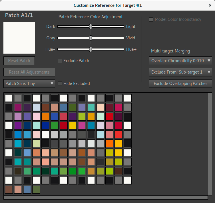
|
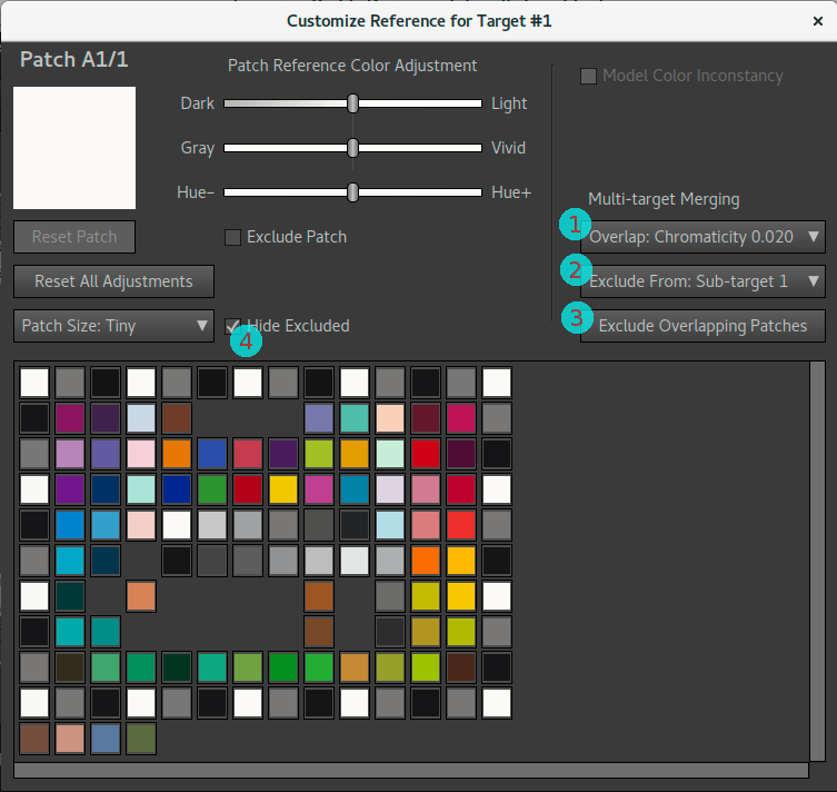
|
Multi-target example. The first target is a 14x10 ColorChecker SG, and the second target is four free-form spot color patches, seen as the bottom row with four patches. In the left screenshot all patches are included.
In the right screenshot the Multi-target Merging buttons have been used to exclude overlapping patches from the ColorChecker SG, like this: select Overlap range (1), choose to exclude from the first target, Sub-target 1 (2), and press the "Exclude Overlapping Patches" button (3). To make it easier to spot which patches that are still left the excluded ones have been hidden (4).
Custom layout for targets
Normally when loading a custom grid target (requires Repro edition) the layout is figured out from the CGATS file itself. However for that to work, it is required that the target is a plain rectangular grid.
Some targets have complex layouts which do not match a plain grid, and in that case one will have to specify the layout manually. This is a complex task and is not expected to be something regular users do, but instead keep to the pre-defined targets or regular grid targets. However, if you really want to, it is possible by adding a JSON configuration section to the CGATS file within a BEGIN_JSON / END_JSON clause.
There's no detailed documentation for this, instead we provide an example CGATS file with JSON configuration so you can see how it is done. The most common problem when making these file is syntax error in the JSON configuration. If the software complains about bad JSON, paste your JSON into an online JSON linter to make sure your syntax is correct.
Advanced tutorial
Here's a tutorial with files to make a dual-illuminant DNG profile. As the files are downloadable you can follow this tutorial exactly and come to the same result. To give a broad and deep insight into the software the tutorial uses many functions and is thus more advanced than it needs to be if the only purpose is to quickly make a great profile.
Target photos
We have four target photos, all which you can download if you want to follow the tutorial step-by-step:
- "Daylight" CC24 shot _MG_0709.dng.
- Corresponding daylight flatfield shot _MG_0704.dng.
- Tungsten CC24 shot _MG_0199.dng.
- Corresponding tungsten flatfield shot _MG_0191.dng.
It's for an old camera, a Canon 5D Mark II. While much have happened since in terms of dynamic range and other sensor aspects, not that much has happened concerning color response.
The setup used for shooting the targets is a very simple, but still yields excellent results together with the flatfield correction feature. Flatfield correction is a must, because there is only one light source and thus uneven light. This is what makes the setup good:
- Voltage tuned halogen light, very good simulation of Standard Illuminant A and Daylight D50 - D55 achievable with excellent spectral properties. A standard halogen was used for StdA, and a Solux halogen on voltage overdrive to reach D55.
- Very low light angle (around 30 degrees) to minimize glare.
- The light source has got an extra shade to avoid spreading the
light outside the target area more than necessary.
- When using shades and spotlights etc make sure that the light that hits the target is of even light temperature (same color). Some spotlights have an outer ring of warmer light, and the light shade can also tint the light.
- Before shooting the room becomes pitch black except the light on the target, further minimizing glare.
- All surfaces where the light hits directly outside the target have been minimized and covered with black cloth to minimize light bouncing around in the room (which can cause glare).
- A high contrast (= low flare) semi-long lens is used (85mm).
- As we shoot at a smaller aperture (f/8) the lens shade can be elongated to minimize flare.
- Before shooting the viewfinder is covered to avoid light leaks and flare that way. The LCD of the voltage supply is taped and any rear light leaks from the halogen is shielded.
- Using flatfield we don't need to worry about vignetting so we can let the target fill the whole image, thus reducing unwanted light pickup from the sides.
Even if you spend a lot of money on a professional reproduction rig it's hard to get any better result than the budget setup presented here. For matte targets as we shoot here it's a bit overkill, a regular outdoor shot is fine too. In less-than-perfect target shots there will likely be quite large lightness errors, which is generally not a problem when you make general-purpose profiles as you don't correct lightness. However if you work with manual matrix and LUT tuning like we do in this tutorial it can become a bit confusing if the target shots have significant measurement errors.
Using voltage tuned halogen is old-school but relatively inexpensive and still the best performers in terms of even spectrum. Using flash is a good secondary choice for simulating daylight.
See the shooting targets section for further advice on how to shoot targets.
Step 1: Loading the targets
- Start a new project (File→New Project), choose "General-purpose DNG Profile".
- Do the following in the "Target for Illuminant #1" tab:
- Load the daylight shot _MG_0709.dng.
- As the light used simulates D55, change the illuminant to D55.
- The target is X-Rite ColorChecker 24, but we have a custom reference, load that: cc24-own.cie.
- Place the target grid (show grid and drag corners into place), and check "Grid is in place".
- Load the flatfield image _MG_0704.dng
- Repeat the same with "Target for Illuminant #2" tab, but for the
tungsten images:
- Load tungsten shot _MG_0199.dng.
- Change illuminant to StdA (= Tungsten 2850K).
- Load the same custom reference cc24-own.cie.
- Place the grid, and check "Grid is in place".
- Load the flatfield image _MG_0191.dng.
- Just for fun: open the "Customize Reference Colors" dialog
to have a look at the "Color Inconstancy" effect:
- With the dialog open, look at the patch table as you press the "Model Color Inconstancy" on and off.
- You'll notice that with it active reds becomes brighter and skintones warmer, among other things. This is how these colors appear to our eyes in the warmer Tungsten light.
- Make sure you leave the "Model Color Inconstancy" checked, as we want the profile to make colors in tungsten light look as our eyes experience them.
Step 2: Manual matrix optimization
Move to the "Optimization" tab. We're going to make some manual optimization, that is specify which tradeoffs to make in color matching. It's not really necessary to make a good profile (you can skip this section if you want), but here we just want to show how it can be done.
Let's get started: change to "Matrix Optimization: Manually Tuned", and press the "Tune Matrix #1" button to open the matrix optimization dialog for illuminant #1. That is we start with the daylight matrix. In the dialog, press "Calculate Matrix" to get a starting point. Result in image below:
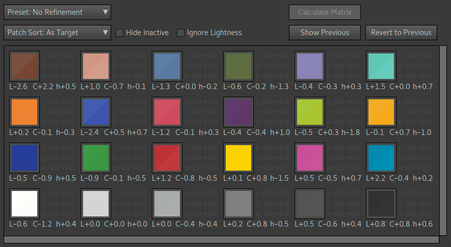
The split patches show the correct reference color in the top left half, and what the matrix result is on the bottom right. (In case you have forgot, the matrix makes color matching in a 100% linear way, which is later fine-tuned with a non-linear LUT. Check out the profile-making theory section for more information on that.)
Let's evaluate this unrefined automatic result, with our taste tuned to the matrix refinement advice section. Here are some observations:
- Lightness errors are overall okay, although it wouldn't hurt if dark skin (A1) and B2 blue was a bit lighter.
- The opposite results of dark skin A1 and light skin A2
is conspicuous. Those colors have similar chromaticity
(hue+saturation combination) in the reference, but the
camera makes one over-saturated and dark, and the other
(slightly) under-saturated and light.
- Why is it like this? Ask the manufacturer, it's probably a subjective choice built-in to the camera's color filters. Interestingly enough, newer Canon 5D models doesn't have this behavior, so the design has been changed since then.
- It's common that cameras have some "problem colors", don't try too hard to match them with the matrix as you'll end up with an impossible equation and get an overall poor match.
- Blues turn slightly to red (warmer) and reds slightly to blue (cooler). Not a big deal, but we'd rather see the opposite.
- The only big problem here is the dark skin patch, and especially its over-saturation.
As the matrix is 100% linear, that is just a combination of the camera's native raw channels, this is where the camera's "native color" shines through the most. The resulting color response can still be varied extensively by the matrix, but certain relative relationships are hard to change without severely hurting overall color accuracy.
You'll notice quite clear lightness difference on a few patches. Lightness, while being the easiest detectable error in a split patch, is the least important error to correct in a general-purpose profile. Why? In a real scene lightness errors don't look "strange" to our eyes, as it could just be some difference in lighting. As hue and saturation remain fairly constant regardless of light or eyes react much stronger to such errors even when not having a reference to compare to. Still we don't really want colors become too dark, such as deep blue (the Negative Y range limiter at the default value usually avoids that though).
Lightness is also typically the largest measurement error in target shots. In this tutorial we have minimized it with flatfield correction, but without that and just slightly uneven light on the target the lightness "errors" in the matrix matching would be much larger, when in fact they're just measurement errors due to an unevenly lit target. To see what the error is without lightness, press the "Ignore Lightness" checkbox. Then we see that the errors are actually quite small. They're still there but we need to look more carefully.
Now let's make a some manual refinements. This is a trial-and-error process as described in the matrix optimization section, and thus not really feasible to document step by step here in this tutorial, but we'll outline it briefly. First take a look at the end result:
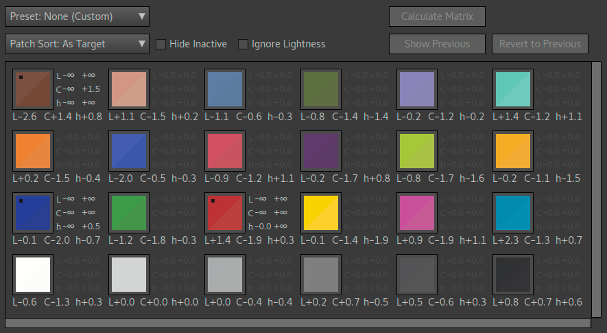
|
||
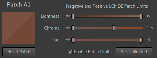
|
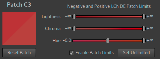
|
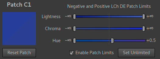
|
Note how all sliders for each refined patch except one has been left at infinity (∞) which is typical for matrix refinement. Values we are already satisfied with we don't provide any refinement for, that is leave them at infinity/unlimited.
Here's how we came to this conclusion:
- First we reduced the over-saturation error on the A1 patch and see
what happened. The most conspicuous result was that a lot of extra
red was added into the blues, which is exactly opposite to what we
want.
- Reducing the error all the way down to zero generally leads to an unstable result. Experimenting with values in between the original (+2.2) and 0 is recommended.
- To compensate, we added in C1 and set a limit of the red content (hue+ error). A balance between the now two limiters where tried with trial and error until a fairly stable result was found.
- Then the most conspicuous error left was a strong blue content in the reds, so a limiter on that was introduced. Pulling that all the way to zero and bingo — we got a result we are satisfied with.
- Already at a good position we tried adjusting each of the
limiters just slightly (say +/- 0.3 DE) and see if results
improved, and got to a final result.
- All the time we kept an eye at light skin patch (A2) and wanted to keep a low hue error on that, while we were okay with a bit larger hue errors on green and yellow, especially in the warm direction.
It may seem like the C1 hue limiter is no longer active, as it limits to +0.5 hue but the resulting hue is at -0.7 hue. However, this is not the case which you can see if you disable it and render again. With a matrix all colors are interconnected so it's unavoidable that you get somewhat unpredictable behavior, hence some trial-and-error.
A key to not get stuck in infinite trial-and-error is to only use about three limiters like here, focusing at the worst offenders. You can consider more colors, but if they're fine as they are without limiters, don't add one unless they get disturbed by the other refinements. And if something seems impossible to solve, it's probably because it is impossible.
As it's just a linear match, you can't get a perfect match on all patches. The automatic optimization is already as good as it gets, the "refinement" step is actually just about moving tradeoffs according to your taste. If we compare with the automatic result we can see that some colors did get worse, such as the greens, but we accept that in order to achieve our other goals, which was to get warmer blues and reds and balance the skin tone over-saturation problem.
You may have other goals and come to another conclusion, that's why the possibility exists to tune this manually.
Step 3: LUT optimization
After we've done matrix optimization for illuminant #1, we go directly to LUT optimization for the same illuminant: close the dialog to return to the main window, choose "LUT Optimization: Manually Tuned", and press "Tune LUT #1" to open the LUT tuning dialog. Press "Calculate LUT" if necessary to get a starting point, as shown in the image below:

While the LUT tuning dialog looks almost exactly the same as the matrix counterpart, the specified error limits has a much more direct effect and you work with them a bit differently. The operating principle of the (2.5D) LUT optimizer is this:
- Merge patches that are too similar in terms of color based on the minimum chromaticity distance setting (A1 and A2 has been merged here, as seen with the dashed outline).
- Remove patches too close to neutral axis (note: already deactivated here by the "Limits: Auto No Lightness" preset).
- Make an exact match of all remaining patches.
- Relax (=make more similar to matrix result) until the Worst Compression target is met (limiter to avoid issues with smoothness).
- Relax further to improve smoothness, but not further than the
specified patch error limits, or reaching the matrix result (as it
per definition is being fully relaxed).
- Note that maximum relax does not necessarily mean that the matrix result is reached, it depends on the position of nearby patches. Smoothness is always number one priority, and sometimes due to the position of surrounding patches it's better to have some adjustment left than relaxing to 0.
This means that we should always have error limits set, unless we want to end up at the matrix result — which by the way is not necessarily bad. A quite common design choice is to actually skip LUT correction completely. Here we make one though.
The "Limits: Auto No Lightness" sets up the error limits with unlimited lightness (no lightness correction), and small chroma and hue errors, with a bit larger margin on higher saturation colors. From the matching stats we see that it succeeded meeting all limits except for dark skin patch A1. This is not surprising considering the issues we had with the A1 patch in the matrix optimization. We also see that it has been merged with A2 to a single group (dashed outline).
When patches are merged the LUT optimizer will only have a single handle for those groups. The patch error limits are still shown per patch, and the merge handle will use the smallest value found in the group for each axis. Merged patches are as such are a bit difficult to control. Usually it's not a problem as the default average correction is generally a good one. However here we have a challenge, the A1 and A2 patch have as we have seen contradicting errors, they strive in opposite directions. Do we want an average correction anyway, causing both being off, or do we want to prioritize one over the other?
Another radical solution is to reduce the minimum chromaticity distance setting so that they are no longer in the same group and correct each patch individually. This is generally not a good idea though, making different corrections of nearby patches will likely cause smoothness issues, and the skintone range is arguably the most sensitive range for that.
We can also see this in a positive way: it's the camera color filters that makes this separation, an example of when a camera provides more color separation than our eyes do, and that can be seen as a subjective advantage. Having it in the skintone range is a bit odd though, but it's not much we can do about it in order to retain smoothness.
Let's have a look how we ended up after our subjective adjustments:
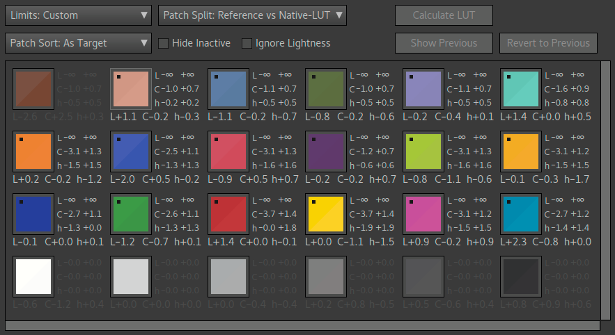
We adjusted the standard preset slightly, like this:
- Dark skin A1 was deactivated.
- Light skin A2 hue limit was reduced to +/-0.2 DE.
- Blue C1 positive hue limit was reduced to 0.
- Red C3 negative hue limit was reduced to 0.
An important aspect of the LUT optimizer to understand is that even if a patch is deactivated or within the error limits with the pure matrix result the patch may be moved rather than kept at the original matrix position. The reason for this is that when one patch is moved, surrounding patches will most likely be moved slightly too to maintain maximum smoothness (the least possible amount of stretch in the LUT's "rubber sheet"). This means that we should keep our eyes on all patches to see that their new positions doesn't contradict our priorities in the matrix optimization. (To compare the LUT result with the matrix result the Patch Split setting is used.)
In this case exactly that happened, blue and red became cooler although we preferred warmer, so that's why we set the limits on Blue C1 and Red C3. Then we had the skin tone issue. For smoothness reasons it was not a good idea to modify parameters to correct A1 and A2 individually, and then we either had to correct just one or be satisfied with the average correction. As it's clear that the A1 error would be quite large regardless, we decided to deactivate that patch and instead improve the precision of one of the light skin, A2.
Another aspect of the 2.5D LUT optimizer to be aware of is that chroma and hue is tightly connected as the "rubber sheet" works on chromaticity (hue+chroma combined). This means that if you improve/reduce error limit only on hue or chroma, the other axis will most likely move a bit too. So while the control certainly is more direct that for matrix optimization, it's still affected by the inner workings of the LUT optimizer and its top priority to maximize smoothness.
Step 4: Matrix and LUT optimization for tungsten
Now let's do the same procedure again for tungsten (illuminant #2). As you do it in exactly the same we describe it more briefly. There's one difference though — the camera has a much harder time to match colors in this light. This is common and not unique to this camera model. Daylight 5000K - 6500K is generally much easier for cameras to match than (warm) Tungsten 2700K-3000K.
Due to the larger errors we get to make much more radical optimization decisions, as we will see below. First let's have a look on the automatic matrix optimization:
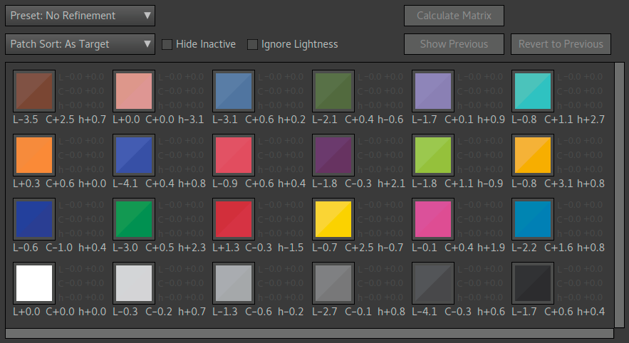
As we can see the errors are much more significant here than for daylight, even if we ignore lightness errors. Subjectively, the largest problem is the huge -3.1 DE hue error on the light skin.
Here's how we chose to manually optimize it:
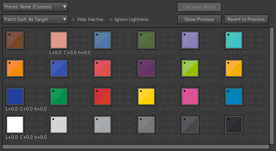
Here we have done something radical — we have deactivated all patches except white, blue and light skin. Why? The goal was to improve the light skin (A2). We already knew that A1 wouldn't be easy to manage, so we have sort of ignored that for now (which ended up with a huge +4.4 hue error, but at least in the warm direction which we think is subjectively better than the opposite). When a matrix contains quite large hue errors already in the automatic optimization this generally means that in order to improve hue matching on some patch there must be large compromises on other colors.
The automatic optimizer treats all colors equally and can't make too large compromises, so the only way is to exclude patches from the optimization. As we knew we wanted to get a good match on light skin, we started by excluding all ("Preset: All Unlimited"), added in a neutral patch, the skin tone, and then with trial and error added in one other patch. Trying red or blue are good starting points as they are located on the sides of the spectrum, but there's no real guide here, just try and see what happens. Quite quickly we ended up with this result which still has large errors, but in the right directions, and obviously very good match on skin.
All three patches have an exact match. This is often (but not always) the case when there are just three patches in the optimization, one can think about it as a three-legged stool which will stand flat on all three legs even if they are of different length. This is overkill, and arguably we could have included a fourth patch such as the magenta C5 to balance out a bit, that reduced the red patch error a bit.
Actually, when you got a feel for how this works you can to some extent predict what will happen when you add one more patch. The red C3 has a +6.4 hue error. If we add that in it's error will be strongly reduced, but at the cost of pushing skintone into magenta again. To reduce the red C3 error more gently we thus include a color a bit farther away from the skin tone but still quite close to red, and voila we get magenta C5. For reference this is how it looks:
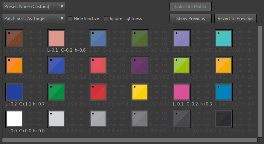
With a target with more patch colors to choose from you can make finer adjustments this way (as you get more "handles" to manipulate), but the CC24 is generally adequate and it's easier to work with small targets than large ones.
If the first or second alternative is better is a matter of taste. In this tutorial we went with the first, and then got into LUT optimization. Let's have a look on the automatic result:
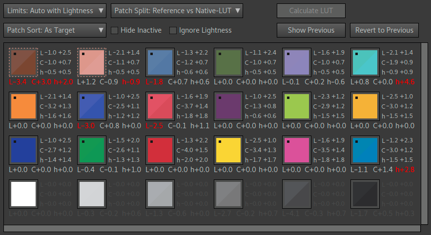
Again the grouping of the skin tone becomes a problem due to the camera's property that natively separates them strongly. Here and there the LUT optimizer can't reach the default matching goals, and the reason is that the matrix match is too poor and thus too strong stretches would be required to make a fit (which the Worst Compression setting makes sure doesn't happen).
Let's look at how we chose to optimize this manually:

Again, with the difficult matching situation we have chosen to simply ignore most patches and concentrate on keeping skin at a good match, and reduce the red error. As discussed earlier moving one patch does affect surrounding patches so we've had our eyes on them too. The C5 chroma limitation was added just to limit over-saturation, which actually moved red C3 to a better match than we actually thought necessary.
There's still quite large errors here and there, but that's generally unavoidable for this type of light. When having large errors choosing tradeoffs becomes more important. Making sure the final look has a "warm" tone to it is a good strategy especially for tungsten as our eyes are often partially chromatically adapted in those situations anyway (making colors have a warmer tone). Not all colors became warmer though, cyan for example got cooler. But to get a warm feel it's more important that a color with warm associations like red, is not cooled down rather than a color with more cool associations, like cyan.
Note that there is no "right" way to do these tradeoffs, it comes down to taste in the end and that's a reason why different raw converter's bundled camera profiles look so different even for the same camera. This tutorial is just one example of how to make these tradeoffs, you may choose other ones.
While working with these optimizations you may have looked at the target images once in a while and see how the patches there are rendered, and noticed that some of them look rather desaturated and not really like the colors in the optimization dialogs. This is normal. As the targets in this case have been "exposed to the right" (ETTR) and the profile uses a tone curve, the patches will be rendered in the highlight rolloff range and thus be a bit desaturated. Target photos are rarely good for evaluating profiles.
Step 5: designing the tone curve
When making a DNG profile it's typical to stay with the "ACR Default" tone curve and automatic black subtraction, like most of Adobe's own profiles. However, as this is an advanced tutorial we're going to design our own tone curve. There are a number of ways to do so, as described in the tone curve design section. Here we chose a (mostly) free-hand approach using a reference image.
When designing our own curve it's wise to try replicate the brightness of the in-camera JPEGs, as the automatic exposure control in the camera is tuned for that. Any mundane pretty high contrast shot is good as a reference.
Go to the profile comparison tab and press "Add Image" to first add the raw file _MG_0715.dng, and then again to add the in-camera JPEG _MG_0715_preview.jpg. The JPEG was shot with the camera's "Neutral" setting which for this model makes a quite under-saturated image. After loading:
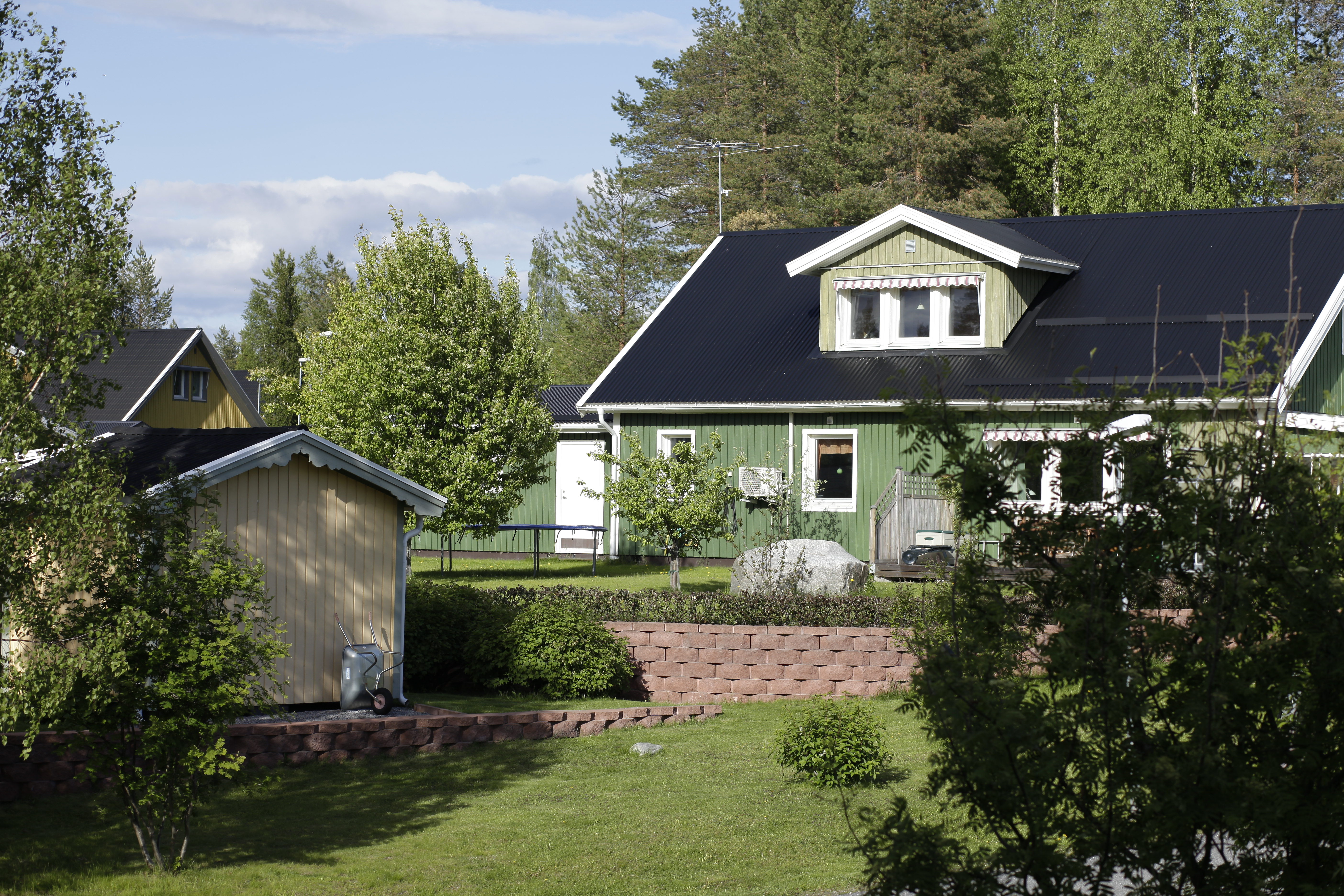
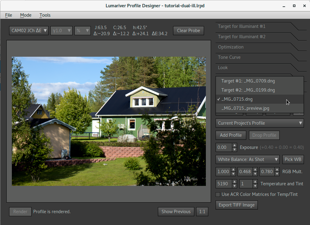
Note that we can change the image viewed in the profile comparison tab from the keyboard using Shift + Arrow Up or Down, which can be quite convenient in this case. Now we go to the tone curve tab and open the tone curve dialog. Our design approach is as follows:
- First have a look at the in-camera JPEG shadows closest to
black, and figure out if it uses some sort of black subtraction or
not (it does, easy to see in the bush in the bottom right
corner). Decide if you want black subtraction or not.
- Here we choose to use black subtraction, which is typical for DNG profiles at least those intended to be used in Adobe's products.
- If you don't choose black subtraction, make sure that option is disabled.
- Render the profile and enable the preview mode in tone curve dialog.
- Flip through the preset curves and pick one that is closest in
overall brightness to the in-camera JPEG. Using shift+arrow keys
makes it easy to A/B swap between the DNG and the JPEG while
changing settings.
- Here we notice that the ACR Default is the closest, but still a bit brighter.
- Now choose the ACR Default as template, and Custom Spline as curve. Trace the ACR default roughly as shown in the figure below. This is our starting point.
- As we know the in-camera JPEG is slightly darker the curve
should be lowered a bit. We can also use the color value inspector
(we suggest using the CAM02 JCh color space for this) when comparing
the two images.
- This is an artistic rather than mechanical process. Don't try to make an exact copy, it won't really be possible unless you shoot a neutral step wedge or similar, but there's little point in doing that. Use your own judgment.
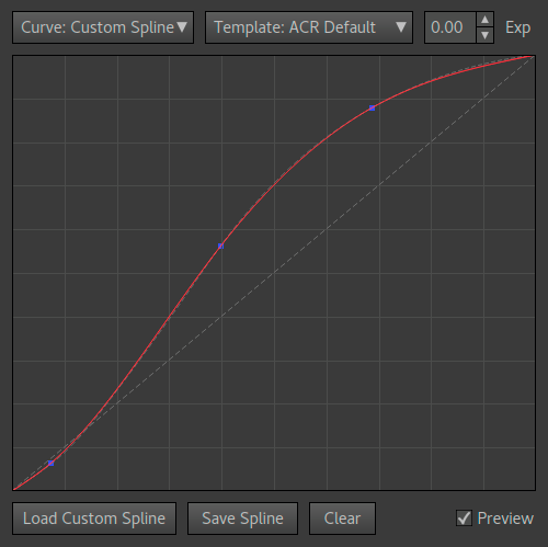
|
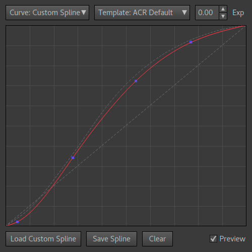
|
|
The first curve (leftmost) is the spline trace of the ACR default curve we use as starting point. Note how close it can be traced with just three handles.
The middle curve shows our end result. We added an extra spline handle for additional control of the highlight slope. The midtone contrast and highlight rolloff is a bit softer than the ACR Default, and the shadow dip a bit stronger.
The third curve shows the curve embedded in Adobe's bundled "Neutral" profile for this camera (which can be loaded as a custom curve). That profile is intended to be a fair copy of the in-camera Neutral mode. Our observations show that indeed the softer rolloff is mirrored quite well, but the shadow range is much lighter and has a strange shape. While you could load it and use it directly, it would be better to use it as an alternative template and design a softer spline tone curve inspired by it.
The final design we ended up with here has quite strong shadow dip, inspired by the in-camera JPEGs. For a more post-processing friendly profile it's wise to use less shadow dip and thus leave more open shadows. You can download the exact curve used in his tutorial, tutorial.rtc, which then can be loaded in the tone curve dialog.
Of course you could or even should use more reference images to get a good feel for if the curve has suitable contrast, highlight rolloff and shadow openness, for example adding a portrait image. It depends on what you will be using the profile for. If you actually load those images into the profile comparison tab, or just use one image to design the curve and then later test the image in the raw converter is your choice. Our recommendation is to only use one or two reference images at first, test the profile, and if there are problems add more, or adjust on free-hand. Having lots of reference images to look at easily leads to fatigue when designing, and usually you end up with a good result with just one when it comes to the tone curve.
Step 6: choosing look settings
Now let's go to the Look tab. The defaults are very effective here, and we think there's little reason to change them, and actually we will only change one thing for this tutorial. However, first we will go through the other settings too and say a few words about them:
Consider each setting from the top and down, first is to choose tone reproduction operator, which has a quite large impact on the look. You can read more about each choice in tone reproduction operator selection reference documentation. We recommend to primarily look at the following tone reproduction operators and variants, in order:
- Neutral, Skin&Sky variant
- Neutral, Lively variant
- Neutral, RGB-Lum mix variant
- RGB-Lum
The remaining alternatives (ACR, RGB, Simple) are more for reference/tradition and should not be considered for high end tone reproduction. It's all a matter of taste though, there are no strict rules regarding what to use.
If you choose any of the Neutral alternatives you can make a manual curve saturation adjustment. A typical choice is to slightly under-saturate a profile to make it more post-processing friendly. The automatic mode aims to keep as realistic saturation as possible, that is neither over- or under-saturated.
Most bundled camera profiles have quite strong gamut compression, and this is also the default setting in the look tab. More technical users may want to manually handle the gamut in post-processing and to cater them you could change to a weaker compression or disable it completely.
The base look choice can be a bit tricky for a dual-illuminant profile. The alternatives are generally developed for daylight/flash and might not work as well in tungsten light, but only one look can be applied. The solution is generally simply prioritize daylight which may be a good idea as tungsten cannot reach the same quality anyway due to the camera's matching difficulties.
For this tutorial we change the base look to "None", because we want to demonstrate how some of those look elements can be made in the look adjustments editor.
Don't use a target image to evaluate the look, use real images which you load into the profile comparison tab. Again it's suitable to not have too many images in the project as it becomes fatiguing. It's better to export the profile and make volume evaluation in a raw converter which provides faster browsing.
Step 7: edit look adjustments
After you have chosen the basic look parameters, it's time to consider if you want to make any manual look adjustments. In this tutorial we will demonstrate by making adjustments similar to what is in the "Neutral+" look.
The main reason to edit the look should be to make subjective adjustments. It should ideally not be used to correct color matching errors, if you have such problems you should look into the earlier design steps first. However, for minor corrections (less than 1 DE) it may be necessary to do it here to get really precise control.
Some typical subjective adjustments found in camera profiles are:
- Compensate for negative effects of the tone reproduction operator.
- Overall saturation increase of normally saturated colors, or the opposite, overall saturation decrease.
- Render Caucasian skin more golden and less reddish, by altering hue and maybe desaturating skintone reds.
- Make darker tones cooler (bluer) and more saturated.
- Make midtones and highlights warmer (yellower).
- Reduce chroma of close-to-neutral colors (make gray more gray).
- Introduce artificial "color separation" by targeted hue and lightness adjustments.
- Lighten some dark colors for better tonality.
The first bullet, compensating for the tone reproduction operator, is common when simplistic operators are being used such as the plain RGB curve. With the neutral tone reproduction operator there is generally no need for this though, unless you disagree in some aspect of what it does. Working with manual adjustments is quite easy if you know what you want to achieve, but hard if you just want to "make something good" but you don't really know what that would be. We can't really provide a detailed instruction on this, as it's not a technical process, it's an artistic process guided by your personal taste. The software provides the tools, but it cannot make any user into a master profile look designer.
What you can do is to look at several renderings using different raw converters and profiles from different vendors and gain understanding of what aspects you like and not. The difficult part is to be able to quantify — not just say that you like A better than B, but be able to say why you like A better than B. If you know what A does right and B wrong, you have a good chance to make that type of subjective adjustment using the powerful look adjustments editor.
Let's get on to our changes. First we're going to make a classic landscape subjective adjustment:
- Warm up yellows and greens of the midtones and highlights
- Cool down the same range in the shadows
This provides better separation between shadows and sunlit areas, and by keeping it very subtle we don't disturb other subjects. Let's have a look on the adjustment:
Adjustment patch 1: warming up yellows and greens of the midtones and highlights.
Adjustment patch 2: the shadow adjustment patch is made as a duplicate midtone/highlights, then darkened and cooled.
- We have chosen the temp/tint adjustment type, suitable for warming and cooling colors.
- The neutral anchor point for this setting is always 5000K/tint 0, and to warm up we have set it to 5400K.
- To visualize we've put the anchor patch color in the middle of the range of interest. The split patch shows the subtle warm-up. This difference is about 1 DE, a just noticeable difference.
- To visualize the range we are interested in we use a test image with sunlit foliage, and use the "Preview" + "Show Span" checkboxes, turning all colors outside the selected span into gray.
- When a new adjustment patch is created the hue and chroma axes are enabled. We disabled the chroma axis as we want the span to cover the full chroma range.
- With preview and show span enabled, the hue range was set to taste by having an eye on the image view while dragging the hue range sliders.
- Finally we enabled the lightness axis (which is disabled per default) and again by eye we adjusted the range to taste to exclude a suitable shadow range.
- Note that we are using the "JCh: Absolute" setting, where the span is shown as absolute ranges rather than relative to the anchor color. The relative mode could be used too, but the absolute may be easier to work with when making adjustments that covers large ranges rather than a spot around the anchor color.
- After this patch was created, we duplicated it using the "Duplicate" button, to create the shadow adjustment. By duplicating the patch we already have the hue range set.
- For the shadows we cool down to 4800K.
- The lightness range is changed to perfectly overlap the midtones highlights: having the same crossover value (27 units) and the same fadeout range (10 units), a perfect "cross-fade" is guaranteed. (That is you can achieve the same type of transitions between shadows/midtones/highlights using these type of cross-fades as is popularly used in video color grading using color wheels.)
To make a before/after comparison you can either use the "Disable Patch" checkbox (you need to disable both patches then of course), or the "Preview" checkbox. The effect is very subtle, but visible, which is the way we recommend to make subjective adjustments. Then you can make real improvements and still don't hurt the capability of the profile to work with all types of subject material. However, if you really want to make a subject-specific profile, like a "Landscape" profile you may want to make the effect stronger.
Let's make an additional adjustment — improve color separation between greens and browns. This can also be seen as a landscape adjustment, in this example shown with pine trees; in reality the bark of the tree has a quite strong green component, by reducing that we separate foliage and trunks in this case. It's not too subject-dependent though as mild greens and browns are common in landscape images in general.
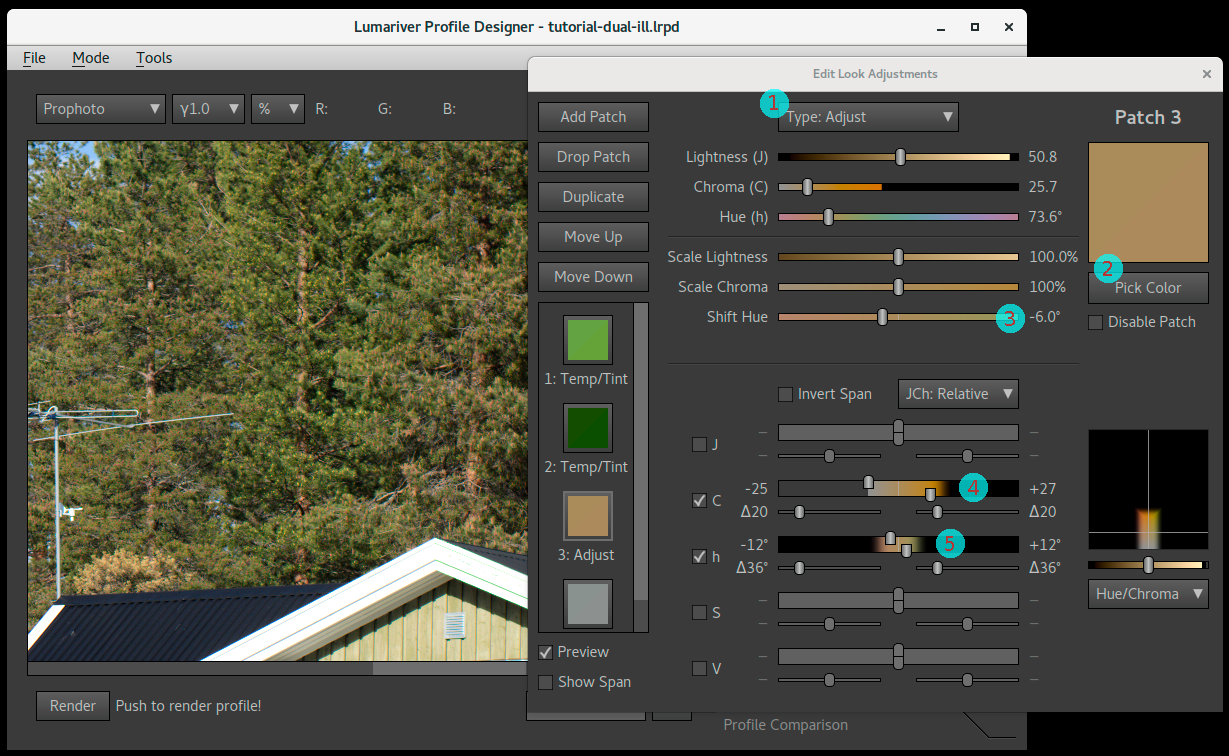
Adjustment patch 3: increase color separation between greens and browns.
- The plain Adjust adjustment type is used.
- A brown is color-picked from the image using the "Pick Color" button.
- The hue is shifted 6 degrees negative, which we see on the slider means that we reduce green content.
- We extend the chroma down to fully desaturated, and a bit up too but not too far.
- We leave only the hue span slider enabled, with a quite tight range, but not too tight.
This simple technique can be used to "improve color separation", which indeed is about adding controlled amounts of error. However do note that while we increase the separation between greens and browns the difference between oranges and reds becomes a bit reduced — to increase distance between a pair of hues, the distance must reduce to the other neighboring hue. This is the key reason we fade out on chroma. Saturated brown is orange, and we want to keep the hue range intact in the saturated range (colors of sunsets etc). The brown/green "problem" is only evident in the lower saturations so that's where we let our adjustment work.
For our final adjustment we're actually doing the opposite — reducing color separation. We're making colors close to gray even less saturated, which makes grays "purer":
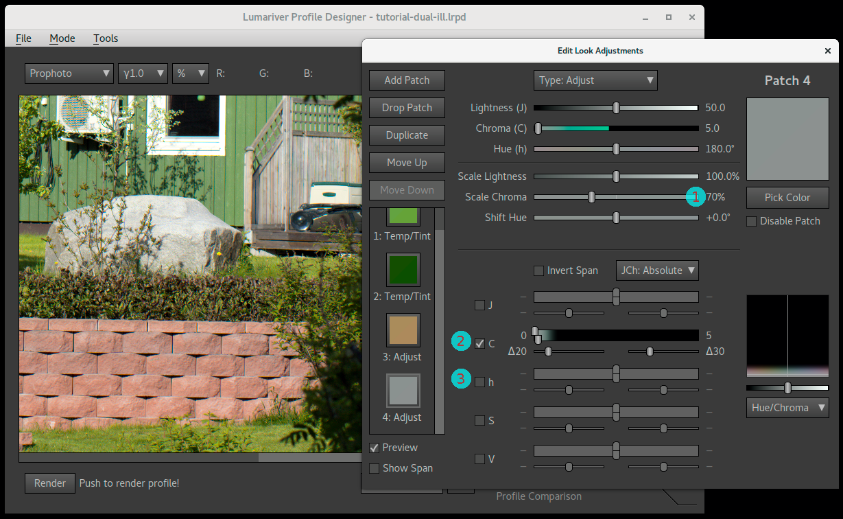
Adjustment patch 4: make neutrals more neutral.
- We reduce chroma to 70% of the original which is a quite strong effect so we need to be careful with the span.
- We set a chroma span with almost completely desaturated colors but a bit longer transition zone towards more saturated colors. This span and the strength of the chroma reduction is something that needs to be balanced together, with help of looking visually at the test image.
- The hue axis is disabled as this should cover the full hue range.
Now we're done with adjustments for this tutorial.
Step 8: exporting the profile
The final step is to export the profile. Set a name of the profile that suits it.
One setting may be worth changing from the defaults, which is the Use ACR color matrices setting. If you're not using Adobe's raw converters you probably want to uncheck it. See the reference documentation for more details on what this setting does.
Test it in your raw converter with a larger amount of images than you used when designing the profile. If you discover a problem image you can then use that when reviewing the design. Note that there will always be "problem images" though; as a profile is static it cannot be perfect for all images, there's always some tradeoff. That's one reason why we prefer neutral, realistic and only subtle subjective adjustments to the profile as it makes it more all-around. However, do note that it's perfectly feasible to make subject-dependent profiles, one for portrait, one for landscape, one for product etc and then you can make more specific adjustments.
Video LUTs for HDR displays
If you want to produce output for HDR displays there are broadly two ways. Either you make a LUT directly fro the HDR display format, usually Rec.2100 HLG or Rec.2100 PQ, both available as display gammas, or you make a scene-referred profile by using a reflectance gamma. Aces workflows are also gaining popularity, and the Aces color spaces and gammas are also available in Lumariver Profile Designer.
There are many variations in the details of the workflows, and probably some of the adjustments are left to the video editor. The intention is that Lumariver Profile Designer should provide enough flexibility so you can use it regardless of which HDR workflow you choose.
Technical color spaces
Lumariver Profile Designer uses a set of technical color spaces in its operations. The most notable are:
- Lutspace v1 and v2
- CAM02-UCS
- Linearly extended CAM02
In the general case for making a color correction LUT we need to operate in a color space that is uniform, that is anywhere in the color space moving one unit in any direction means the same perceptual color difference. This way a bend in the LUT grid will perceptually be equally strong regardless where in the color space it is, so bend relaxation doesn't overdo it in some color range while doing it too little in some other.
CAM02-UCS is a standard color space that has very good perceptual uniformity, and that is used when generating a 3D LUT. However darker colors are harder for the eye do separate and thus they are closer spaced in CAM02-UCS. When we make a 2.5D LUT we don't know the exposure in advance and thus do not want to make a difference between light and dark target colors.
This is where the custom Lutspace come in. It is uniform in the chromaticity plane, and for a reference lightness also uniform in the lightness direction. However it will not differ between dark or light colors, ie dark colors are placed at the same distances as light, so it does not matter which exposure the target has.
In the standard realm CIELUV is such a coordinate system and Lutspace version 1 is based on that. However it's chromaticity is not as uniform as CAM02-UCS, so Lutspace version 2 was introduced which has the same uniformity as CAM02-UCS in the chromaticity plane, but is lightness independent. Unlike CAM02-UCS it is also clipless extending linearly outside the locus into infinity which make it a very robust color space for general-purpose profile making.
In gamut compression (and clipping) it is important to be able to move a color along a constant hue axis, that is to change its saturation and lightness but keep the hue the same. Again CAM02 provides the gold standard for constant hue. However close to the locus this model gets strongly non-linear, and outside the locus the model simply fails. In a realworld scenario with real cameras this is a problem. The more saturated a color is, the more extreme response we will get from a camera and we may get "impossible" colors that are near or outside the locus. To handle this robustly, Lumariver Profile Designer uses a linearly extended CAM02 color space. It's similar to Lutspace v2, but keeps the sensitivity on the lightness axis as this space is used in losely output referred contexts.
Note that older color spaces like Lab, uvY and even the 1931 xyY are also designed to be reasonably uniform. Within limited ranges they are indeed quite uniform, but vastly more computationally intensive models are required to better match the actual human color perception. In the past it was not possible to make better models due to lack of computer power, and even today models with high accuracy like CAM02 is not often used due to its computational requirement.
Lumariver Profile Designer is built to prioritize accuracy over speed, and uses the best models at hand even if it leads to significantly longer run times.
Static settings file
In the Lumariver Profile Designer installation "data" directory
("Resources" in the MacOS version) there is a file
called settings.json which contains various static
settings for the software. It's read once at startup. It is intended
only for settings that normally don't need changing and we therefore
don't want to clutter the graphical user interface with. If you are an
advanced user with very specific use cases you might want to change
one of these settings. Please note that if you do change any of these
settings it may be harder for us to provide support. Currently the
following can be changed:
- DCP LUT size.
- ICC LUT size.
- Toggle between ICC XYZ or Lab LUT.
- List of viewing gammas.
- List of viewing color spaces.
- List of gammas.
- List of gamuts.
The full documentation of each setting is in the file itself. As it's "hidden" inside the installation it's a bit hard to find and edit, which is on purpose, as the file is not intended to be modified by normal users.
Appendix
Related software
Overview
If you're making DNG profiles it's strongly recommended to install Adobe DNG Converter (it's free) as Lumariver Profile Designer will fetch the Adobe Standard profiles from there. When profiling a new camera, make sure to update the DNG converter to the latest version first. If your camera has a special type of color filter array (like Fuji X-Trans) a plain raw DNG cannot be loaded into Lumariver Profile Designer as it only supports classic Bayer arrays. However, by using the "Linear RAW" (demosaiced) conversion option in Adobe DNG Converter the DNG can be opened and you can make a profile.
If you have a spectrometer you can measure your targets and illuminants. For that you can use BabelColor PatchTool, Robin Myers Imaging SpectraShop, or the free and open-source software ArgyllCMS, exporting to CGATS.17 text format which then can be loaded into Lumariver Profile Designer.
Argyll is a command-line software with very rich and broad functionality so it can be cumbersome to use. To make it easier the next sections contains a couple of quick guides for tasks relevant in the Lumariver Profiler Designer context.
If you work with video and need curves for custom input gamma for example, the free LUTCalc tool can be useful, which can generate curves and LUTs from many popular cameras. See the LUTCalc 1D LUT section for a howto.
Scanning targets with Argyll
If you have a spectrometer (usually designed for printer profiling) you can measure your target and generate your own reference text file (CGATS.17 text format) with spectra, which you then can load in the target tab using the "Load Custom Reference" button. The commercial tools like BabelColor PatchTool and Robin Myers Imaging SpectraShop makes this process easy and are well documented. If you're okay with using command line tools, you can as an alternative use the free Argyll, like this:
First create or find an Argyll .ti2 text file which
contains the test target layout needed for the spectrometer scan. Note
that Argyll is distributed with .ti2 files for many of
the popular commercial test targets. For example, the file is
called ColorChecker.ti2 for the X-Rite ColorChecker 24.
Then scan the target with Argyll's chartread :
chartread -v -H ColorChecker
Replace ColorChecker above with the filename of
your .ti2 file, but exclude the actual suffix, that is if
the file is called ColorChecker.ti2, you just
provide ColorChecker to the command.
You now got a new file with the same name but a .ti3
suffix, that is ColorChecker.ti3. That file contains your
reference data with full spectra and is ready to be loaded into Lumariver
Profile Designer.
Lightsource data with Argyll
The best way to measure light source is to do a full spectral measurement using a spectrometer. If you have Argyll installed you can do this with:
spotread -a -H -x
Example output for a voltage-tuned halogen for simulating the StdA standard illuminant:
	  Result is XYZ: 2976.277908 2745.506152 849.883672, Yxy: 2745.506152 0.452895 0.417779

	  Ambient = 2745.5 Lux, CCT = 2856K (Delta E 9.368483)

	  Suggested EV @ ISO100 for 2745.5 Lux incident light = 10.1

	  Closest Planckian temperature = 2749K (Delta E 5.815527)

	  Closest Daylight temperature  = 4000K (Delta E 42.884670)

	  Color Rendering Index (Ra) = 95.5
Here we see that we get CCT 2856K which is very close to the 2850K for
StdA (don't mix it up with the closest Planckian temperature, 2749K
here). This is for about 10 volts of an MR-16 halogen lamp specified to
3000K. As seen here spotread can in addition to storing
spectrum files be used as a guide when voltage-tuning halogen light
sources.
Before quitting save the spectrum ('s' key in spotread),
the resulting file contains the spectrum and can then be loaded into
Lumariver Profile Designer as a
custom illuminant.
Converting CxF3 reference files to CGATS with Argyll
CxF3 or .cxf is a new XML-based color exchange format which among other things can be used to create target reference files. Lumariver Profile Designer does not yet support this format, so if you have a .cxf you need to convert it first to CGATS-like text format. Argyll's new cxfti3 command can do this. Example:
cxf2ti3 R240725.cxf R240725
This command will output an R240725.cie file. If it contains
spectra you may need to add a SPEC_SCALE entry (usually
SPEC_SCALE 100, but go through the file to see the largest
value in the spectral values, SPEC_SCALE should cover that to
avoid clipping to white.
If the reference file is a grid, you may need to add
LGOROWLENGTH to inform Lumariver Profile Designer how many
rows there are. For example if the target has 864 patches in a
36x24 grid, you add LGOROWLENGTH 24, or if the data in the
file is traversed you set it to LGOROWLENGTH 36.
LUTCalc 1D LUT
To generate a 1D LUT that can be used as custom input gamma by Lumariver Profile Designer you can use the online web tool LUTCalc like this:
- Select 1D LUT (instead of 3D)
- Set "Input Range" to 109%
- Set "Output Range" to 100%
- Select "Grading LUT" (instead of Camera/Monitor)
- Set "LUT Type" to "General Cube LUT"
- Set "Hard Clip" to "Unclipped"
- Set Camera to desired camera, or set it to "Generic"
- Set "Rec Gamma" to the input gamma you want to make a LUT for
- Set "Out Gamma" to "Linear / y"
- Set "y Correction" to "Scene Reflectance"
- Press "Generate Lut" to get your LUT
Capture One specifics
Finding Capture One's bundled camera profiles
There's a trick to get Capture One's bundled camera profiles if you don't want to mess around with searching files on disk, and that is simply to open Capture One, open an image for the camera in interest, make sure that the profile you are interested in is selected, and make sure that no adjustments are applied, and then use Color Editor → "Save as ICC profile..." and save the profile somewhere you can find it.
If you prefer to actually find where the files are stored on disk and
get them directly from there you need to make a search. The Capture One
ICC profiles comes with the installation, and the file suffix used
is .icm (ICC profiles either have .icc
or .icm suffix).
On MacOS the Finder is unfortunately not designed to find files inside application packages so it's a bit difficult to use that to find the profiles. While the Finder can open the Capture One application package (right click and choose "Show Package Contents") its search function won't drill down into library directories where most of the profiles are stored so you would have to browse manually. So for the Mac it's actually easier to use the Terminal and run a command like:
locate .icm | grep Capture\ One
and see what you find (there will be hundreds of hits as Capture One contains hundreds of camera profiles), and then copy/paste a found path to the Shift+Command+G "go-to folder" dialog in the Finder and browse from there. If you just want a list of the file names (to figure out the naming convention) you can run this command:
locate .icm | grep Capture\ One | grep Input | awk -F"/" '{print
	  $NF}'
Or redirect it to a text file:
locate .icm | grep Capture\ One | grep Input | awk -F"/" '{print
	  $NF}' > profile-names.txt
On Windows it's a bit easier to find files using the standard file
Explorer, just search for *.icm on the disk where Capture One is
installed (or even better in the directory), and once you have figured
out the directory you can go there and browse.
The file naming is logical so you can figure out which profile that belong to which camera (and the daylight, flash, tungsten variants for those that have that).
Capture One camera profile naming convention
If you give your custom profile just any filename,
like my-profile.icc it will show up under ICC Profile
→ Other → my-profile inside Capture One. This is just fine, however, if you
want the profile to appear in the top of the list among the bundled
camera profiles, you must name the profile the same way Capture One has named
the bundled profile(s).
For example, for the Phase One P45+ digital back the file name is
PhaseOneP45+-Daylight.icm for the bundled daylight
profile. If you make a profile for that digital back and name
it PhaseOneP45+-My Profile.icc (.icm
or .icc suffix doesn't matter) it will appear as "My
Profile" together with the bundled ones. That is the naming convention
is <CameraPrefix>-<Any Profile Name>.icm. The
problem is that you need to figure out what camera prefix Capture One
expects, and to do so you need to find out what camera prefix the bundled profile(s)
has. See the section on finding Capture One's
bundled camera profiles to find them. When you find them you still need
to figure out which profile belongs to which camera, but it's generally
obvious from the file names.
Capture One curve handling

The many curves of Capture One (and raw converters like it). The resulting curve (green) and thus the contrast you see in the rendered images, is the user-selectable base curve (magenta) with a small contrast curve added on top (embedded in the profile, red). As you can see most of the curve's shape come from the base curve, but the extra curve in the profile adds a little bit of midtone contrast and a significant shadow dip.
The reason for splitting curves in two like this is that in Capture One the base curve is applied with the simplistic RGB tone operator, which causes significant over-saturation and hue shifts if used with stronger S-curves. By using a softer curve and combining with a custom tone operator in the ICC profile the negative side effects can be controlled, still allowing user-selectable contrast with the same profile. However, do note that optimal result can only be had when the profile is used together with the base curve it was designed for. (Lumariver Profile Designer takes the curve into account when making profiles, that's why it needs to know exactly what curves that are used in Capture One.)
Input curve and target TF are handled automatically per default, so you can ignore them, but read on if you are interested in what they are: the exported profiling TIFF images are encoded using a special gamma curve (Input Curve, blue). The reason for this is purely technical — to compensate for limitations in the 16 bit integer precision, leaving more precision to shadows and less to highlights (actually it's a bit overkill as cameras themselves are not as precise, and therefore most raw converters use a linear input curve, but Capture One is an exception to this rule).
In the exported TIFF image Capture One embeds a transfer function (Target TF, gray), and this would be the same as the Input Curve if the user-selected curve inside Capture One is "Linear". However, "Linear" in Capture One is not always truly linear, due to handling of highlights and clip levels. This is seen in this example where the target TF follows the same shape as the input curve but has left some space in the highlight range.
All curves shown here can be viewed for your particular project in the tone curve dialog using the template selection.
Most raw converters let the camera profile take care of the tone curve in full, that is the camera profile embeds and applies the tone curve (meaning that the "Result Curve" in the figure would be embedded in the profile). Capture One is however different, and splits the tone curve in two, one user-selectable part inside the raw converter ("Base Curve", magenta), and one smaller part that is embedded in the profile ("Profile Curve", red), which together forms the resulting curve (green).
The user-selectable base curve makes up for 90% of the curve effect, so many assume that the profile itself is linear, but it is not — it applies a small amount of contrast. The reason for this is to battle some of the negative effects of the pure RGB tone curve that is used for the user-selectable part. RGB tone curves distort hues, but by choosing the curve shapes (and RGB primaries) wisely the effect of this can be minimized, and by combining it with a small amount of contrast embedded in the profile using a luminance curve (or similar) you get a nice end result — which is how Capture One does it.
While a third-party profile designer could ignore all this and still make okay profiles, it must be considered to make great profiles. Lumariver Profile Designer does this and therefore you need to go through a few more steps when making a Capture One profile.
The profile designer must know what the end result tone curve will be in order to optimize the profile for that (why this is important is described in the section about tone reproduction operators). It must also know how much contrast that should be put into the profile itself ("Profile Curve"), and how much that will be the user-selectable part ("Base Curve"). As you can change base curve and still keep the profile, you need to choose which base curve the profile should be optimized for, which usually is the one named "Film Standard" inside Capture One. The profile will still, like Capture One's bundled camera profiles, perform well with other curves but the optimal result is only had when used with the same curve used when making the profile.
Let's look in the Lumariver Profile Designer's ICC Profile mode "Tone Curve" tab and how that relates to Capture One:
- Input Curve — this is the curve that the raw converter defines as linear (figure: "Input Curve", blue). It's just an encoding curve, that is nothing that you see as a user of Capture One, but a way to encode integer TIFF images in a more efficient way. Lumariver Profile Designer must know this to interpret the curves embedded in the exported images, and to encode the resulting profile. Most raw converters use a linear encoding curve (that is no curve at all), but Capture One has its own gamma curve. In almost all cases, including when using Capture One, you can (and should) leave this setting at "Auto".
- Base Curve — this is where Capture One's user-selectable curve goes (figure: "Base Curve", blue, showing a typical "Film Standard" curve). If you intend to use the profile with the "Film Standard" curve, you should load a TIFF file that was exported with that curve here, as described in the workflow.
- Curve Mode — setting the curve mode to "Add to Base Curve", sets up Lumariver Profile Designer so that the "Curve" will specify that small additional contrast that should be embedded in the profile (figure: "Profile Curve", red). If you instead set the mode to "Replace Base Curve" Lumariver Profile Designer will adapt the profile's embedded curve so it cancels out the "Base Curve" and the end result becomes the selected "Curve".
- Curve — depending on curve mode this either specifies the small additional contrast embedded in the profile (if so you could specify it by loading Capture One's bundled ICC profile), or it specifies the end result curve (figure: "Result Curve", green).
The easiest way to deal with tone curves in Capture One is just copy what the bundled profile provides. However, much of a general-purpose profile's look is a result of the shape of the tone curve, and you may want to control that, using one of the presets or even designing your own curve. In that case you could use "Curve Mode: Replace Base Curve", and just choose or design the curve you like.
If you select an own curve you should carefully choose which user-selectable curve you use inside Capture One. It's desirable that the user-selectable curve is of lower contrast than the curve you choose for the profile. In theory it doesn't matter as any curve will be compensated, but as the ICC profiles are based on integer math, precision could be hurt if the user-selectable curve is of stronger contrast, and may result in banding.
Also note that even if many of the bundled camera profiles share the "Film Standard" curve name, it's not the same curve for all profiles. If you want to copy a specific profile's curve you need to use that when exporting.
Another and potentially safer way to design your own curve is to use "Curve Mode: Add to Base Curve" and instead of loading the bundled camera profile's curve you design your own to add a smaller amount of contrast on top. This way you won't risk any strongly conflicting curves, but it's also a bit less flexible.
Adobe Enhanced Profiles
In April 2018 Adobe released a new profile format which they call "Enhanced Profiles". This does not make the DCP format (DNG Camera Profile) obsolete, but is instead a profile that you apply on top of DCP and possibly directly on JPEGs to apply color grading effects.
We have naturally got questions when/if Lumariver Profile Designer will support this format. The short answer is that there is no need. The reason is that the enhanced profile format is mainly for creative color grading, to apply a 3DLUT after a camera profile has been applied. Lumariver Profile Designer is made for creating camera profiles which indeed may have some subjective elements to them but are still anchored in realism. Creative color grading is applied on top of a (more or less) realistic camera profile, and there is plenty of software out there to design 3DLUTs for that. In other words it's not the domain of Lumariver Profile Designer which makes camera profiles, not color grading filters. Never say never though, but for the time being there are no plans to include a full-featured 3DLUT designer or any other reason that would need supporting Adobe Enhanced Profiles.
Missing transfer function
To make an ICC profile Lumariver Profile Designer must know how to convert the TIFF RGB data to linear data. Normally this is done automatically and there is no need to know what happens under the hood. However some exotic software, usually scanner software, may not embed the required information in the TIFF file (or worse, embed misleading information, usually an incorrect ICC profile) and then you need to add that manually before the file can be used in Lumariver Profile Designer.
The "transfer function" is needed, and it's found automatically either
from the TIFFTAG_TRANSFERFUNCTION tag or embedded ICC
profile, or in rare cases by looking at the which software generated
the file (like DxO PhotoLab) and then apply a hard-coded rule. If all
this is missing, the data is assumed to be linear, which it most often
is.
However, there are unfortunately some rare exceptions to this rule, software that exports TIFF images encoded with some sort of curve or color space but with no tags embedded so Lumariver Profile Desginer cannot know how to interpret the data. In this case you need to either add the transfer function tag, or an ICC profile to the TIFF file before using it in Lumariver Profile Designer. Fortunately this is only required for making the profile, as the generated profile will know the encoding curve and will thus work on the bare TIFF files. If you want to use test images for comparison in the profile comparison tab also those need to be prepared the same way.
The usual case when tags are lacking and the file is still non-linear is that the TIFF file is encoded with a gamma (an exponential curve). Common values are 1.8 and 2.2. Look in your software's documentation to find out which gamma it is using for encoding the TIFF, or just take a guess (1.8 or 2.2 are then good guesses).
Using the Add transfer function to TIFF tool you can add the desired transfer function to the file before it's loaded for profiling.
Another alternative is to force your software to export linear data, that is gamma 1.0, which may be available as a setting.
Version history
Here's a list of release notes for the different releases of Lumariver Profile Designer, newest first.
- Version 2.0.8
- New: added Leica L-Log.
- Fixed: the MacOS ARM binary would clip negative values to zero in matrix-only ICC profiles.
- Fixed: repro mode white patch selection had no effect.
- Fixed: artificially black (value 0) patches plot better in the report view.
- Version 2.0.7
- New: now possible to embed JSON configuration in CGATS to specify complex layouts for custom grid targets.
- New: added DaVinci Intermediate gamma and DaVinci Wide Gamut.
- Fixed: totally black patches (0,0,0) were displayed as excluded patches in the Customize Reference dialog.
- Fixed: totally black patches (0,0,0) made glare testing confused.
- Changed: very dark patches may be a bit more off-black than previously and still be identified as black (only affects the experimental glare compensation feature).
- Version 2.0.6
- New: added DataColor Spyder Checkr Photo target.
- New: added support for Myiro Measure user illuminant format (.uid2).
- Fixed: the reset to defaults button would not display in the optimization tab in reproduction mode.
- Fixed: on MacOS the quit menu option would not work when main window was closed.
- Fixed: on MacOS missing DNG files in project files would cause crash on open.
- Fixed: would crash if DCP copyright or profile name was set to empty string.
- Improved: better support of a bit older MacOS installations, but at least MacOS 11 (Big Sur) is required.
- Changed: cleanup of ICC Lab gamut edge clipping algorithm, should not have any practical impact (as Lab gamut edge values should not be invoked by real images) but can cause the ICC lookup table values to be slightly different than before at the gamut edge.
- Version 2.0.5
- Fixed: Pro version would crash frequently when working with ICC format.
- Fixed: editing a profile in JSON format and saving would often lead to complaining about missing ColorMatrix3 even if ColorMatrix3 should not be there (bug was introduced in 2.0.4 triple-illuminant).
- Fixed: would crash in some circumstances when dropping a multi-target with custom reference data.
- New: upgraded from QT5 to QT6 GUI library, should be no functional changes but makes the software ready for the future.
- Version 2.0.4
- New: support for triple-illuminant DNG profiles
- New: support for storing custom illuminants in DNG profiles
- Changed: "Target #2" tab for DNG profile projects has been removed, instead DNG profiles has a drop-down on the single target tab to add/remove and select current calibration illuminant.
- New: show a warning if rendered multi-illuminant profile doesn't have an inversable white balance model.
- Fixed: the free-form target function was temporarily broken.
- Fixed: MacOS arm64 version would crash on missing DNG files due to a library linking issue.
- Improved: there was an unnecessary re-render of all matrices and LUTs for multi-illuminant profiles when manually tuning one matrix or LUT.
- Version 2.0.3
- New: Added Arri Log-C v4 and Arri Wide Gamut 4.
- Changed: "Log As-Is" now displays with sRGB gamma rather than gamma 1.0, as it mirrors the typical video workflow better. This also affects look adjustments if workspace is "Log".
- Fixed: Cube LUT R and B channels were swapped in look adjustments LUT, and passthrough LUT application.
- Fixed: log output gamma was not correctly mapped when exporting a Cube profile.
- Fixed: negative range (noise range) in log gamma was not converted correctly.
- Fixed: Look Adjustments Workspace selection was not updated correctly.
- Version 2.0.2
- New: added Calibrite ColorChecker Video and Passport Video as a built-in targets.
- Fixed: the MacOS build will now work on older MacOS versions (from 11 and onward).
- Fixed: image-based flatfield correction would only work with gamma 1.0.
- Fixed: when ACR color matrices were activated for DNG profile export, the preview render would not adapt, which could give a slightly different result on multi-illuminant profiles, depending on white balance setting.
- Fixed: could not handle clipping input curves.
- Fixed: flatfield percentage would not display if glare calculation is not made as well.
- Fixed: minor stack access bug.
- Improved: allow larger deviation from neutral axis for very dark patches to identify black patches on custom targets (for glare detection). Previously very dark patches may not be identified as black in custom targets, for example due to spectrometer noise or limitations in neutrality in the printing technology.
- Improved: clearer messages when trying to apply a v1.0 key to the v2.0 version.
- Version 2.0.1
- Fixed: ICC add-to-base curve render bug.
- Version 2.0.0
-
New: video/cinema support! Now Lumariver Profile Designer
can make video LUTs (Cube format) for video, log or
display encoded.
- Still photographers do not need to worry that we have started to support video; we are not moving away from still image photography and we will continue to have key focus on that. However, today many still photographers also do video work, and we want to provide a link between those two worlds.
- Changed: "Basic" edition is replaced by "Standard" which is about the same as the 1.0 "Pro", and the 2.0 "Pro" adds video (Cube format). "Repro" is still the same, ie the unlimited edition which also adds a reproduction-related feature set.
-
New: version 2 color correction mode.
- More perceptually uniform 2.5D color space used for matrix and LUT optimization.
- Better input curve optimization for ICC profiles.
- Better handling of clipped colors.
- New: optimization report dialog, which in interactive diagrams shows the result of the color correction.
- New: gamut compression version 2, with configuration dialog.
- New: view curves dialog.
- New: passthrough color correction mode.
- New: LUT support in look adjustments.
- New: auto flatfield correction can now be manually controlled, and also be enabled for custom targets.
- New: export reference file tool.
- New: support for tone curves with knee ("HDR" tone curves). Currently only available for video LUTs.
- New: built-in support for SpyderCheckr 48.
- New: 16 bit color rendering to monitor (was 8 bit before).
- New: fine-tune last pressed grid handle position with arrow keys.
- New: on MacOS, native support for Apple Silicon (Intel is also natively supported).
- Improved: much faster DNG file loading.
- Changed behavior: the correct white balance setting for ICC (and Cube) will now use 1.0 as minimal value on white balance rather than maximum (as most raw converters do), meaning that the end result will be a brighter image than before.
- Fixed: glare compensation would always fail.
- Fixed: software crashes if mixed spectral/non-spectral reference data in multi-target use cases.
- Fixed: minor smoothness issue in the strong gamut compression algorithms.
- Fixed: minor TIFF format handling issues due to old version of TIFF library.
-
New: video/cinema support! Now Lumariver Profile Designer
can make video LUTs (Cube format) for video, log or
display encoded.
- Version 1.0.6
- New: viewing/editing gamma can now be specified in the tone curve dialog, default is sRGB (which it was the hard-coded setting before).
- New: data/settings.json file with static settings. This is only intended for niche settings that normally don't need changing and we therefore don't want to clutter the GUI with.
- Fixed: made search for Adobe Standard profiles case-insensitive, as some would not be found otherwise. The DNG specification doesn't say if UniqueCameraModel tag should be that or not, but Adobe has now shown through practice (with "NIKON Z 7" in DNG vs "Nikon Z 7" in profile) that it should be.
- Fixed: could sometimes crash when dropping custom curve and then pressing the render button.
- Fixed: tone curve tab and tone curve dialog could get out of synch if open at the same time.
- Fixed: the tone curve and look adjustments preview could render on comparison images despite the project's profile was not selected.
- Fixed: the correct white balance setting did not apply correctly unless the input file had linear gamma.
- Fixed: white balance setting on comparison page now works also when the "correct white balance" setting is enabled.
- Fixed: add transfer function to TIFF tool now works also with 8 bit files.
- Fixed: now DE Chromaticity patch sort order lists patches in intended order (before it was the same as DE Chroma).
- Fixed: CAM02 JCh ΔE inspector color space showed CIE LCh values instead of CAM02 JCh.
- Fixed: temp/tint setting now works properly also when associated DNG file contains camera calibration.
- Fixed: chroma scaling wasn't transferred for custom base look.
- Improved: GUI is now automatically scaled up in size for high DPI displays on Windows (this already worked on MacOS previously).
- Improved: made it possible to modify the avoid matrix clipping setting in the LUT dialog even when there is no LUT corrections, as the setting has effect regardless.
- Improved: supporting yet some more CGATS format variations.
- Docs: added troubleshooting guide for Capture One for the most common problems.
- Docs: added section about how to make profiles for Hasselblad Phocus.
- Docs: updated section about DxO PhotoLab with more details about ICC profile making, and that it now supports DCP profiles.
- Version 1.0.5
- New: tool for adding missing transfer function to TIFF files.
- Fixed: ICC profiles with the correct white balance setting enabled was displayed incorrectly (double correction).
- Fixed: can now read custom illuminant files from BasicColor Catch (by accepting R_ prefix for spectral data fields).
- Fixed: in Matrix/LUT tuning dialogs make sure the profile is rendered when picking sort orders that require it.
- Fixed: "Adobe profile not found" error message could be shown in the wrong occasion.
- Fixed: correctly identify DxO PhotoLab (only matched DxO Optics before).
- Fixed: don't crash on project load when associated DNG files are missing.
- Fixed: show correct error message for bad JSON or missing fields when saving hand-edited profiles.
- Fixed: a few bugs related to custom input curves.
- Fixed: disable headroom settings when 3D LUT is at disabled ("No Corrections") as those settings can only be applied when the 3D LUT is active.
- Fixed: more robust 3D LUT calculation by automatically ignoring bad patches (usually negative lightness).
- Improved: read camera tag from DCP rather than trusting filenames when scanning DNG profile directories. Previously some oddly named files weren't matched (like iPhone profiles).
- Improved: accepting even more CGATS variants.
- Improved: more robust base curve import.
- Improved: can now specify curves as pure gamma in the JSON format.
- Improved: TIFF files with only transfer function but no ICC will now be displayed with the transfer function curve instead of default sRGB.
- Improved: TIFF files with 1.0 gamma (linear TIFF files) are now displayed with normal gamma before rendering, making them less dark and easier to place the grid.
- Improved: the project file inside archived projects get the
same filename as the archive itself, instead of
anonymous
project.lrpd. - Docs: added some more tips about making scanner profiles.
- Docs: added a section on how to deal with software that exports TIFFs without a transfer function.
- Docs: made it even clearer that the Basic edition does not contain ICC support.
- Docs: clarified the term "bundled camera profile", which is the default (one or more) camera profile(s) for your camera that comes bundled with the raw converter you use.
- Docs: added a caution about using the "Replace Base Curve" mode as it can in some circumstances create banding (when the replacing curve differs too much from the base curve).
- Docs: added note about Adobe's new Enhanced Profile format and why Lumariver Profile Designer doesn't support it and doesn't need to.
- Version 1.0.4
- Fixed: take camera calibration matrices into account when using ACR matrices (fixes white balance shift for custom WB on some cameras).
- Fixed: 1931 observer was due to a bug actually Judd Vos 1978 version, now 1931 really is 1931. For most part this fix has zero visible difference.
- Fixed: give error message instead of crashing when flatfield correction fails (due to too uneven light, clipping etc).
- Fixed: black-body setting was getting lost on dual-illuminant profiles.
- Fixed: button state update bug in comparison tab when dropping images.
- Fixed: the automatic swap of alpha and digits row/column on custom data CGATS files was buggy (that is now able to accept A-F/1-4 instead of A-D/1-6 indexing for a CC24 reference file for example).
- Improved: larger handles and better visibility of target grid.
- Improved: less case-sensitive CGATS file parsing.
- Improved: search for illuminant name in MEASUREMENT_CONDITION tag in CGATS files.
- Improved: now searches for Lightroom installation when looking for Adobe's DNG profiles, not only in Camera Raw / DNG Converter installation.
- Improved: more user-friendly license dialog.
- Docs: added section about Iridient Developer.
- Version 1.0.3
- New: now possible to adjust the target hues with a+b sliders in addition to hue+chroma, for additional control of chromaticity, especially near the neutral axis.
- New: Jab adjustment patch in the look adjustment editor as an alternative to the default JCh adjustment. Again for better control around the neutral axis.
- Fixed: apply any custom target adjustments before finding out whitest patch rather than after.
- Fixed: accept longer patch names to better support SpectraShop CGATS files.
- Fixed: matrix calculate button was in some situations incorrectly disabled with white patch auto setting.
- Fixed: now full unicode support in all filenames on Windows.
- Fixed: now portable filenames in the .zip archives (so Mac archives work on Windows and vice-versa even if non-ASCII filenames are used).
- Fixed: when DCP tone curves are imported they are now interpolated using cubic spline, as said in the DNG specification 1.4.0.0 (before it was linear).
- Fixed: GUI freeze on MacOS when opening project files from the Finder.
- Fixed: glare matching setting didn't stick.
- Fixed: crash with custom grids due to automatic flatfield correction was falsely triggered.
- Fixed: crash when using CMP Digital Target 8.
- Fixed: uninitialized data access on toolbox tab change leading to crashes in some occassions.
- Version 1.0.2
- New: Added "Custom Target (Raw Values)" which makes it possible to import CGATS files complete with raw valus.
- Fixed: hard-coded workaround to handle DxO Optics confusing profiling export images.
- Fixed: adjusted CMP Digital Target 8 layout according to the manufacturer's comments.
- Fixed: now starts on older MacOS versions as advertised.
- Fixed: now finds license key for unicode user names on Windows.
- Fixed: minor issues around glare detection.
- Improved: better auto-layout of custom targets.
- Improved: better handling of manual lut/matrix/target adjustments when adding, changing and removing targets in multi-target mode.
- Improved: support more ICC profile types when extracting curves.
- Docs: added section about DxO OpticsPro.
- Version 1.0.1
- New: Added CMP Digital Target 8, glossy and matte versions.
- New: Added HutchColor HCT target.
- New: Command-W on MacOS will close project window.
- Fixed: wrong sub-target image shown in some situations.
- Fixed: crash when opening huge TIFF files.
- Fixed: broken file format on save (usually when using multi-target), windows-only bug.
- Version 1.0.0 — initial release.
Acknowledgments
We want to thank the beta testers, early adopters, and users of the command line DCamProf (core engine) that has helped making Lumariver Profile Designer into what it is today. Every sold license also means a lot to us, that helps us taking the product even further.
Third-party components
Lumariver Profile Designer uses many third-party libraries. Here's a list:
- The color management engine LittleCMS, which among other things allows Lumariver Profile Designer to have a color-managed display output.
- The Adobe DNG SDK (provides support for opening DNG files), which in turn uses Expat (for XML parsing) and zlib (for DNG decompression).
- The raw format decoder DCRaw, with restricted code removed. This is actually not used in Lumariver Profile Designer, but is inside due to that it's included in the in-house library that provides both DNG and raw support.
- Jarno Elonen's Thin Plate Spline, license cited below. This is used in the 2.5D LUT.
- Mike Hutt's Nelder-Mead simplex used it many of the color matching optimization algorithms.
- The classic libtiff for reading and writing the TIFF file format, license cited below.
- The equally classic libjpeg for reading JPEGs, made by the Independent JPEG Group.
- The multi-format compression library libarchive, license listed below. This is used for making the ZIP archives.
- The cross-platform toolkit QT (dynamically linked), which makes it possible to have the same GUI code for Windows, MacOS and Linux.
- And of course, DCamProf, making up the core engine. Lumariver Profile Designer and DCamProf is made by the same author.
In addition to the above libraries Lumariver Profile Designer also uses standard system libraries, and an OpenMP library that provides multi-core support.
It's important to us to respect third-party software that has made this project possible, and comply to all licenses. Most of these libraries have permissive licenses that doesn't require citing the license or even mentioning that the library is being used (we mention them anyway). Some do require repeating the license in the documentation though, and those are cited below:
Thin plate spline:
	  Copyright (C) 2003, 2004 by Jarno Elonen


	  Permission to use, copy, modify, distribute and sell this
	  software and its documentation for any purpose is hereby
	  granted without fee, provided that the above copyright
	  notice appear in all copies and that both that copyright
	  notice and this permission notice appear in supporting
	  documentation. The authors make no representations about
	  the suitability of this software for any purpose. It is
	  provided "as is" without express or implied warranty.
Libarchive:
	  Copyright (c) 2003-2009 author(s)

	  All rights reserved.


	  Redistribution and use in source and binary forms, with or without
	  modification, are permitted provided that the following conditions
	  are met:

	  1. Redistributions of source code must retain the above copyright
	  notice, this list of conditions and the following disclaimer
	  in this position and unchanged.


	  2. Redistributions in binary form must reproduce the above copyright
	  notice, this list of conditions and the following disclaimer in the
	  documentation and/or other materials provided with the distribution.


	  THIS SOFTWARE IS PROVIDED BY THE AUTHOR(S) ``AS IS'' AND ANY EXPRESS OR
	  IMPLIED WARRANTIES, INCLUDING, BUT NOT LIMITED TO, THE IMPLIED WARRANTIES
	  OF MERCHANTABILITY AND FITNESS FOR A PARTICULAR PURPOSE ARE DISCLAIMED.
	  IN NO EVENT SHALL THE AUTHOR(S) BE LIABLE FOR ANY DIRECT, INDIRECT,
	  INCIDENTAL, SPECIAL, EXEMPLARY, OR CONSEQUENTIAL DAMAGES (INCLUDING, BUT
	  NOT LIMITED TO, PROCUREMENT OF SUBSTITUTE GOODS OR SERVICES; LOSS OF USE,
	  DATA, OR PROFITS; OR BUSINESS INTERRUPTION) HOWEVER CAUSED AND ON ANY
	  THEORY OF LIABILITY, WHETHER IN CONTRACT, STRICT LIABILITY, OR TORT
	  (INCLUDING NEGLIGENCE OR OTHERWISE) ARISING IN ANY WAY OUT OF THE USE OF
	  THIS SOFTWARE, EVEN IF ADVISED OF THE POSSIBILITY OF SUCH DAMAGE.
LibTIFF:
	  Copyright (c) 1988-1997 Sam Leffler

	  Copyright (c) 1991-1997 Silicon Graphics, Inc.


	  Permission to use, copy, modify, distribute, and sell this software
	  and its documentation for any purpose is hereby granted without fee,
	  provided that (i) the above copyright notices and this permission
	  notice appear in all copies of the software and related documentation,
	  and (ii) the names of Sam Leffler and Silicon Graphics may not be used
	  in any advertising or publicity relating to the software without the
	  specific, prior written permission of Sam Leffler and Silicon
	  Graphics.


	  THE SOFTWARE IS PROVIDED "AS-IS" AND WITHOUT WARRANTY OF ANY KIND,
	  EXPRESS, IMPLIED OR OTHERWISE, INCLUDING WITHOUT LIMITATION, ANY
	  WARRANTY OF MERCHANTABILITY OR FITNESS FOR A PARTICULAR PURPOSE.


	  IN NO EVENT SHALL SAM LEFFLER OR SILICON GRAPHICS BE LIABLE FOR ANY
	  SPECIAL, INCIDENTAL, INDIRECT OR CONSEQUENTIAL DAMAGES OF ANY KIND, OR
	  ANY DAMAGES WHATSOEVER RESULTING FROM LOSS OF USE, DATA OR PROFITS,
	  WHETHER OR NOT ADVISED OF THE POSSIBILITY OF DAMAGE, AND ON ANY THEORY
	  OF LIABILITY, ARISING OUT OF OR IN CONNECTION WITH THE USE OR
	  PERFORMANCE OF THIS SOFTWARE.